Matplotlib中多个连通箱线图的坐标轴刻度更改

3
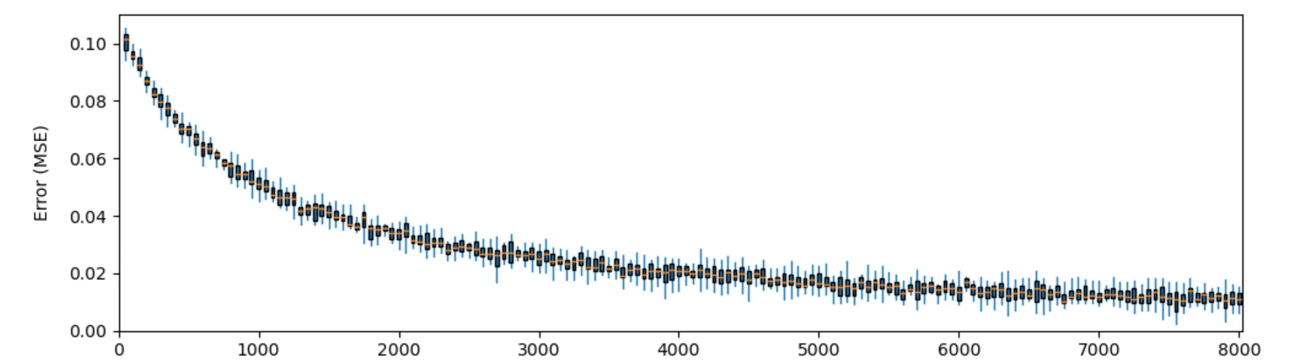
我正在绘制收敛图,并使用连接的箱线图来显示偏差:Connected boxplots 
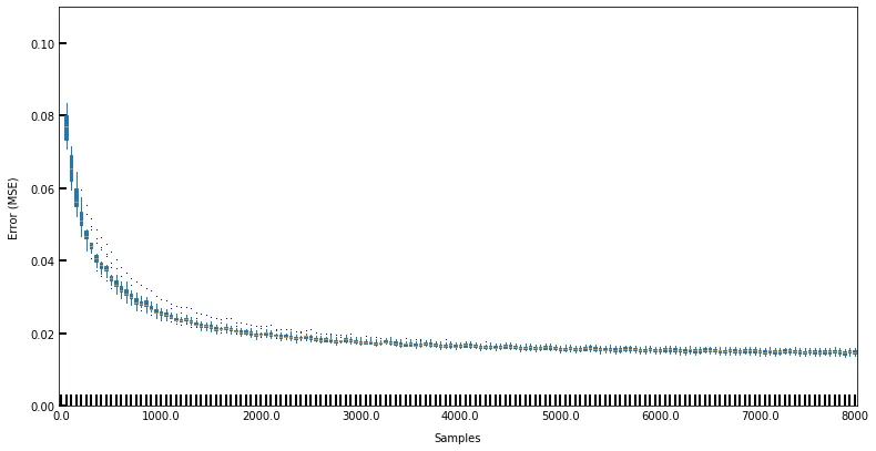
由于某种原因,Matplotlib强制每个箱线图都有刻度线,我似乎无法将它们删除。 我当前绘图的代码大致如下:
    label = ["" for i in range(160)]
    no_labels = int(np.floor(len(label)/20))
    for i in range(no_labels):
        label[i*20] = str(i*no_samples/no_labels)
    # Weird behaviour for the last label so adding it manually
    label[-1] = no_samples

    fig = plt.figure(figsize=(10,5))

    ax = fig.add_axes([0,0,1,1])
    ax.set_xlabel("Samples", labelpad=10)
    ax.set_ylabel("Error (MSE)", labelpad=10)
    ax.set_ylim(0, 0.11)

    ax.boxplot(data, flierprops=flyprops, showcaps=False, 
                boxprops=colorprops, whiskerprops={'color' : 'tab:blue'}, 
                labels=label, patch_artist=True)


我尝试了多种在MPL中可用的轴刻度方式。
1)试图让MPL自动完成工作: ax.xaxis.set_major_locator(MultipleLocator(20)) 2)手动设置刻度:ax.set_xticks([list_of_ticks]) 3)尝试一种变通方法
    ax.xaxis.set_minor_locator(MultipleLocator(20))    

    # Removing major ticks, setting minor ticks
    ax.xaxis.set_tick_params(which='major', size=0, width=2, direction='in')
    ax.yaxis.set_tick_params(which='major', size=5, width=2, direction='in')

我尝试了这些方法但都没有奏效,不确定原因。我认为可能与我的label变量有关,但如果不以这种方式包括它,则MPL会对每个条目都包含轴标签,这样会很混乱。

如何在连通的箱线图中每1000个条目设置一次轴刻度?

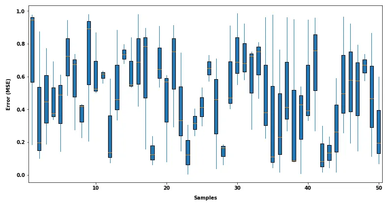
编辑:输入数据是形状为(15,160)的numpy数组,其中绘制了160个由15个样本组成的箱线图。例如,3个样本的5个箱线图的示例数据如下:

       np.random.rand(3,5)

>>>    array([[0.05942481, 0.03408175, 0.84021109, 0.27531937, 0.62428798],
       [0.24658313, 0.77910387, 0.2161348 , 0.39101172, 0.14038211],
       [0.40694432, 0.22979738, 0.87056873, 0.788295  , 0.29337562]])

能否提供一些样本数据(可以使用随机值生成),以便更好地理解数据的结构。 - jayveesea
感谢您的回复,已编辑并添加了示例数据。 - AverageJoe
3个回答

5
主要问题似乎在于在绘制主图后需要更新刻度,而不是之前。
(使用ax = fig.add_axes([0, 0, 1, 1])也相当不寻常。标准方法是fig,ax = plt.subplots(figsize =(10,5)),这允许matplotlib在绘图周围的空白处有一些灵活性。)
问题的代码缺少一些变量和数据,但以下简单示例应该创建类似的内容:
import numpy as np
import matplotlib.pyplot as plt

no_samples = 8000
x = np.linspace(0, no_samples, 160)
no_labels = int(np.floor(len(x) / 20))
label = [f'{i * no_samples / no_labels:.0f}' for i in range(no_labels+1)]

fig = plt.figure(figsize=(10, 5))
ax = fig.add_axes([0.1, 0.1, 0.85, 0.85])

N = 100
data = np.random.normal(np.tile(100 / (x+1000), N), 0.001).reshape(N, -1)

flyprops = {'markersize':0.01}
colorprops = None
ax.boxplot(data, flierprops=flyprops, showcaps=False,
           boxprops=colorprops, whiskerprops={'color': 'tab:blue'},
           patch_artist=True)

ax.set_xlabel("Samples", labelpad=10)
ax.set_ylabel("Error (MSE)", labelpad=10)
ax.set_ylim(0, 0.11)
ax.set_xticks(range(0, len(x)+1, 20))
ax.set_xticklabels(label)

plt.show()

example plot


3

以下是设置刻度标记的示例:

import matplotlib.pyplot as plt
import numpy as np

data=np.random.rand(3,50)

fig = plt.figure(figsize=(10,5))

ax = fig.add_axes([0,0,1,1])
ax.set_xlabel("Samples", labelpad=10)
ax.set_ylabel("Error (MSE)", labelpad=10)

ax.boxplot(data, 
           showcaps=False, 
           whiskerprops={'color' : 'tab:blue'}, 
           patch_artist=True
          )

plt.xticks([10, 20, 30, 40, 50],
           ["10", "20", "30", "40", "50"])

编辑: 您也可以避免处理字符串,并像这样设置标记:

N=50
plt.xticks(np.linspace(0, N, num=6), np.linspace(0, N, num=6))

请看这里和这个例子。点击链接查看更多信息。
请看enter image description here

1

可以通过类似于这里(注意使用转置的numpy数组data)的方式来实现简单的刻度,使用以下方法:

import numpy as np
import matplotlib.pyplot as plt

data = np.array([ np.random.rand(100) for i in range(3) ]).T
plt.boxplot(data)
plt.xticks([1, 2, 3], ['mon', 'tue', 'wed'])

网页内容由stack overflow 提供, 点击上面的
可以查看英文原文,
原文链接