我想在一个阿基米德螺旋线上创建一张条形图,就像这里讨论的那样 here.
最终目标是得到类似于这个,但更简单。
这是一个示例数据框:
    test <- structure(list(month = c(1, 2, 3, 4, 5, 6, 7, 8, 9, 10, 11, 12,
                                     1, 2, 3, 4, 5, 6, 7, 8, 9, 10, 11, 12),
           year = c(2015, 2015, 2015, 2015, 2015, 2015, 2015,
                    2015, 2015, 2015, 2015, 2015, 2016, 2016,
                    2016, 2016, 2016, 2016, 2016, 2016, 2016,
                    2016, 2016, 2016),
           value = c(49, 34, 35, 34, 50, 35, 48, 50, 44, 38, 42,
                   43, 33,30, 42, 43, 58, 55, 47, 36, 35, 53,
                   61, 59)),
          .Names = c("month", "year", "value"),
          class = "data.frame", row.names = c(NA, -24L))
我可以使用以下代码制作一个条形图:
    ggplot(monthly, aes(x = ym, y = value)) +
      geom_bar(stat = "identity")
我可以使用以下代码创建螺旋形:
    a <- 0   #Any number here & it still looks the same to me...
    b <- 10  #Any number here & it still looks the same to me...
    theta <- seq(0,10*pi, 0.01)
    r <- a + b*theta
    df <- data.frame(x = r*cos(theta), y = r*sin(theta))
    ggplot(df, aes(x,y)) +
      geom_point(col = 'red')
但是(如果可能的话)我怎样才能将这些条形图绘制在螺旋线上呢?
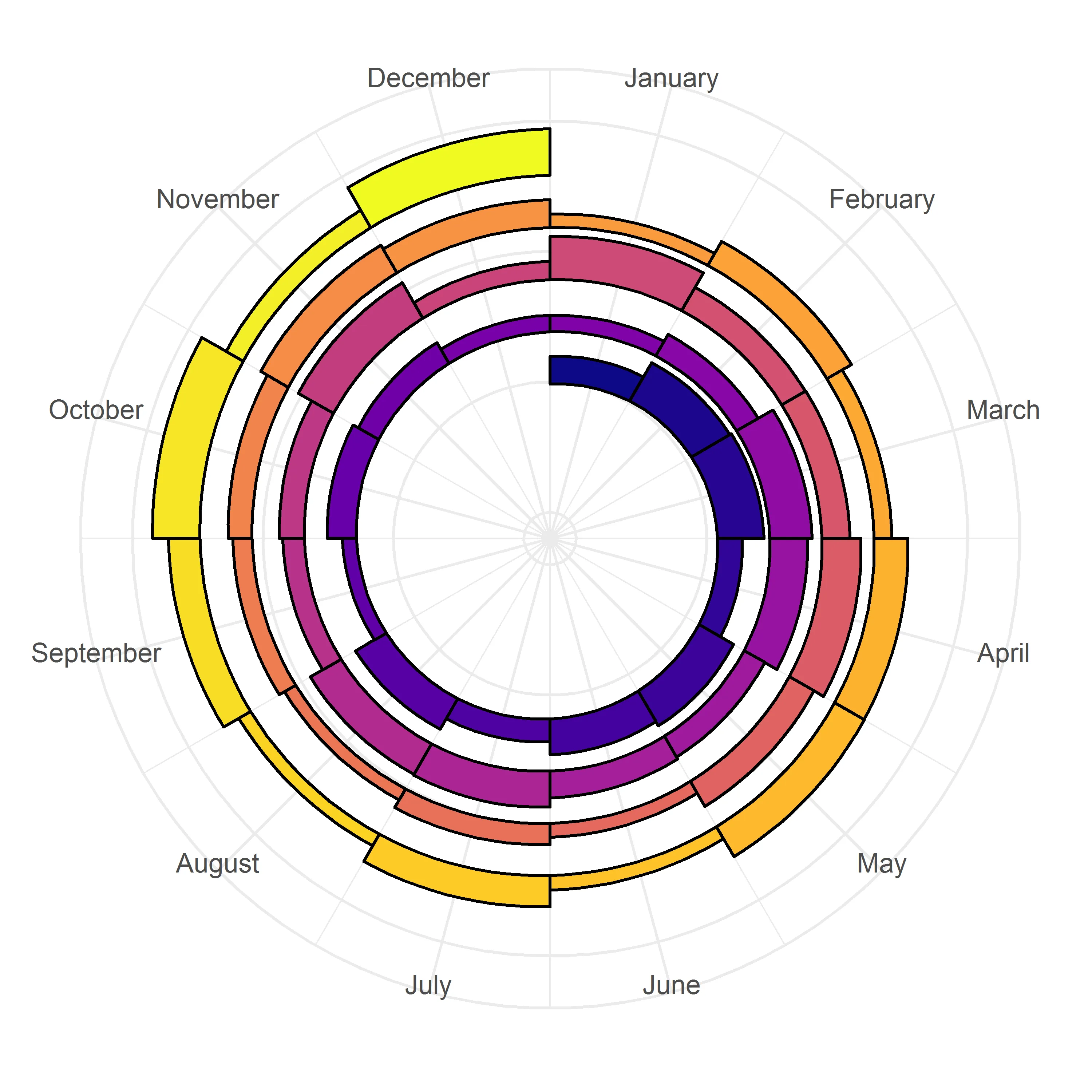
这是我所做到的最接近的:使用我的数据而不是上面的公式创建一个螺旋。但是我的数据实际上没有被显示出来...
    d <- ggplot(monthly, aes(x = month, y = month, color = year)) +
      geom_path(size = 2) +
      coord_polar() +
      theme_minimal() +
      theme(legend.position = "none")
    d
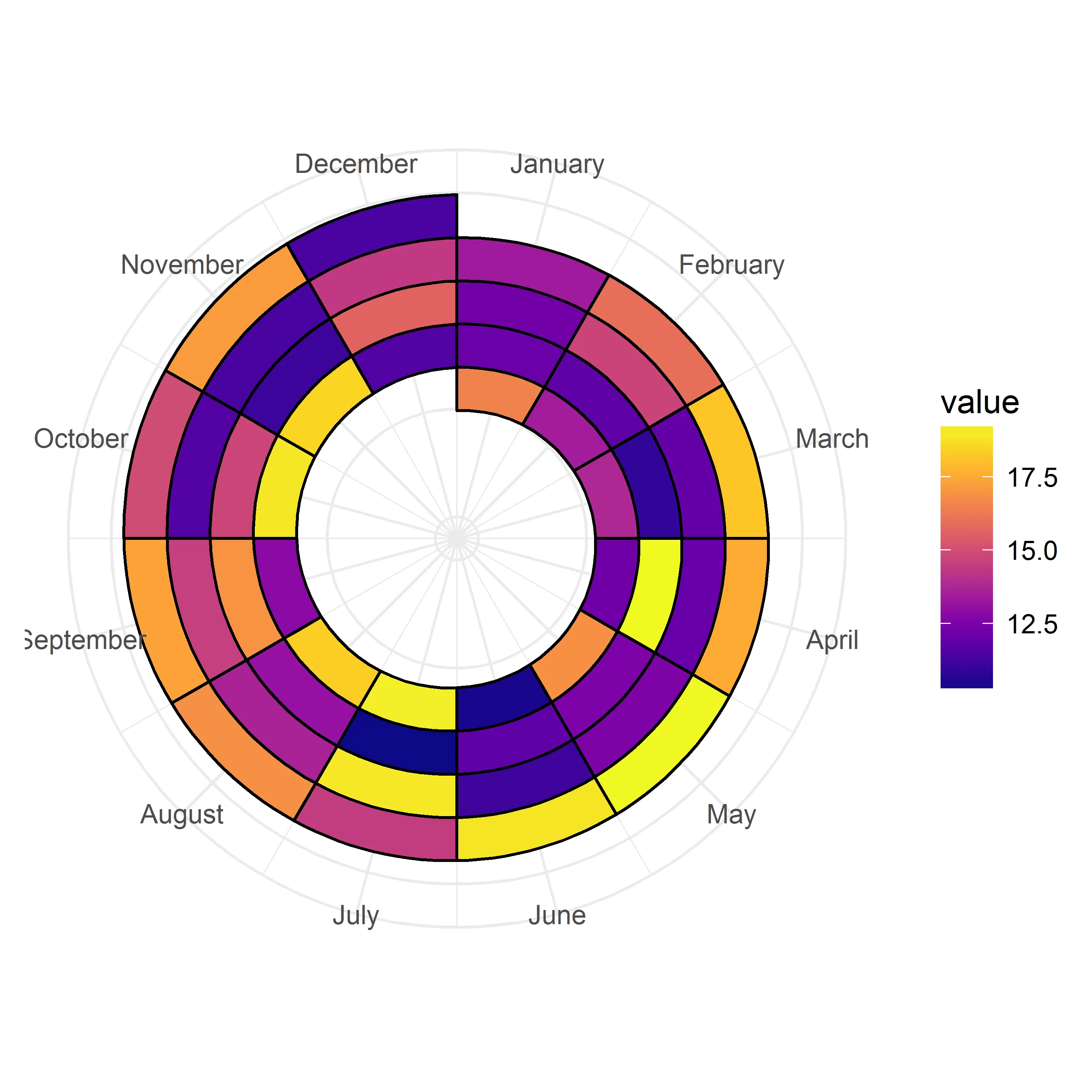
ggplot(poly, aes(x, y, group = interaction(month, year))) + geom_polygon(aes(fill = value, colour = year), size = 1) + coord_polar()- jesstmey = as.numeric(year) - 1 + (month - 1) / 12将需要更改,对于天数,它将类似于y = as.numeric(year) - 1 + (day - 1) / 365。多边形需要调整1/730而不是1/24。 - Axeman