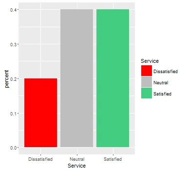
我在处理如何手动更改ggplot2中的柱形颜色方面遇到了困难。奇怪的是,在使用需要图例的更复杂格式时,我可以通过使用scale_fill_manual并设置values、labels等来使其工作。但是当创建一个不需要图例的更简单的图表时,我似乎无法使其起作用。以下是一个示例数据帧、我在dplyr中使用的步骤以获取百分比,以及我认为它应该在ggplot2中起作用的方法。我只想手动将条形颜色更改为红色、seagreen3和灰色。
非常感谢任何帮助。我也很想知道快速计算百分比所使用的不同方法。我一直在使用dplyr的管道,但如果能看到编写代码的其他方式就太好了。
library(dplyr)
library(ggplot2)

Service <- c("Satisfied", "Dissatisfied", "Neutral", "Satisfied", "Neutral")
Service2 <- c("Dissatisfied", "Dissatisfied", "Neutral", "Satisfied", "Satisfied")

Services <- data.frame(Service, Service2)

ServicesProp <- Services %>%
                select(Service) %>% group_by(Service) %>%
                summarise(count=n()) %>%
                mutate(percent = count / sum(count))

ggplot(ServicesProp, aes(x = Service, y = percent)) +
    geom_bar(stat = "identity", position = "dodge") +
    scale_fill_manual(values = c("red", "seagreen3", "grey"))
scale_fill_manual的值/标签数量与您的数据类别数量相同。我只是在看着五行代码,半天都无法理解它在哪里出错了。 - Momchill