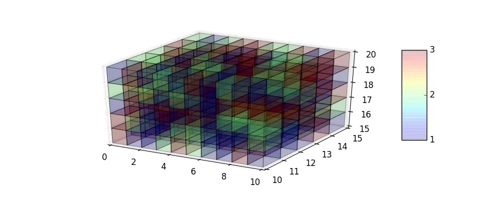
我有一个包含三维数据的Python元组列表,每个元组形式为:(x, y, z, data_value),即我在每个(x, y, z)坐标处都有数据值。我想要制作一个3D离散热图,其中颜色表示我的元组列表中data_value的值。这里给出一个这样的热图示例,其适用于具有列表(x, y, data_value)元组的2D数据集:
这将生成如下图所示的绘图: 如果我的数据有第三个维度,我该如何在三维空间中制作类似的绘图(即具有z轴)?例如,如果...
import matplotlib.pyplot as plt
from matplotlib import colors
import numpy as np
from random import randint

# x and y coordinates
x = np.array(range(10))
y = np.array(range(10,15))
data = np.zeros((len(y),len(x)))

# Generate some discrete data (1, 2 or 3) for each (x, y) pair
for i,yy in enumerate(y):
    for j, xx in enumerate(x):
        data[i,j] = randint(1,3)

# Map 1, 2 and 3 to 'Red', 'Green' qnd 'Blue', respectively
colormap = colors.ListedColormap(['Red', 'Green', 'Blue'])
colorbar_ticklabels = ['1', '2', '3']

# Use matshow to create a heatmap
fig, ax = plt.subplots()
ms = ax.matshow(data, cmap = colormap, vmin=data.min() - 0.5, vmax=data.max() + 0.5, origin = 'lower')

# x and y axis ticks
ax.set_xticklabels([str(xx) for xx in x])
ax.set_yticklabels([str(yy) for yy in y])
ax.xaxis.tick_bottom()

# Put the x- qnd y-axis ticks at the middle of each cell
ax.set_xticks(np.arange(data.shape[1]), minor = False)
ax.set_yticks(np.arange(data.shape[0]), minor = False)

# Set custom ticks and ticklabels for color bar
cbar = fig.colorbar(ms,ticks = np.arange(np.min(data),np.max(data)+1))
cbar.ax.set_yticklabels(colorbar_ticklabels)

plt.show()
这将生成如下图所示的绘图:
如果我的数据有第三个维度,我该如何在三维空间中制作类似的绘图(即具有z轴)?例如,如果...# x and y and z coordinates
x = np.array(range(10))
y = np.array(range(10,15))
z = np.array(range(15,20))
data = np.zeros((len(y),len(x), len(y)))
# Generate some random discrete data (1, 2 or 3) for each (x, y, z) triplet.
# Am I defining i, j and k correctly here?
for i,yy in enumerate(y):
for j, xx in enumerate(x):
for k, zz in enumerate(z):
data[i,j, k] = randint(1,3)
我觉得mplot3d中的plot_surface应该能够做到这一点,但是这个函数的输入参数z实际上是数据在(x, y)坐标处的值,即(x, y, z = data_value),与我的情况不同,即(x, y, z, data_value)。
mayavi的contour3d,它可以让你在三维空间中绘制标量场的等值面。 - berna1111Image3D,ContourPlot3D。 - Kh40tiK