我一直在生成类似这样的条形图:
我的数据存储在sorted_composite中,ind是我用来放置柱形图的值(ytick位置)。我使用linspace来生成均匀间隔的柱形图,但这只能部分起作用,我不确定具体原因。
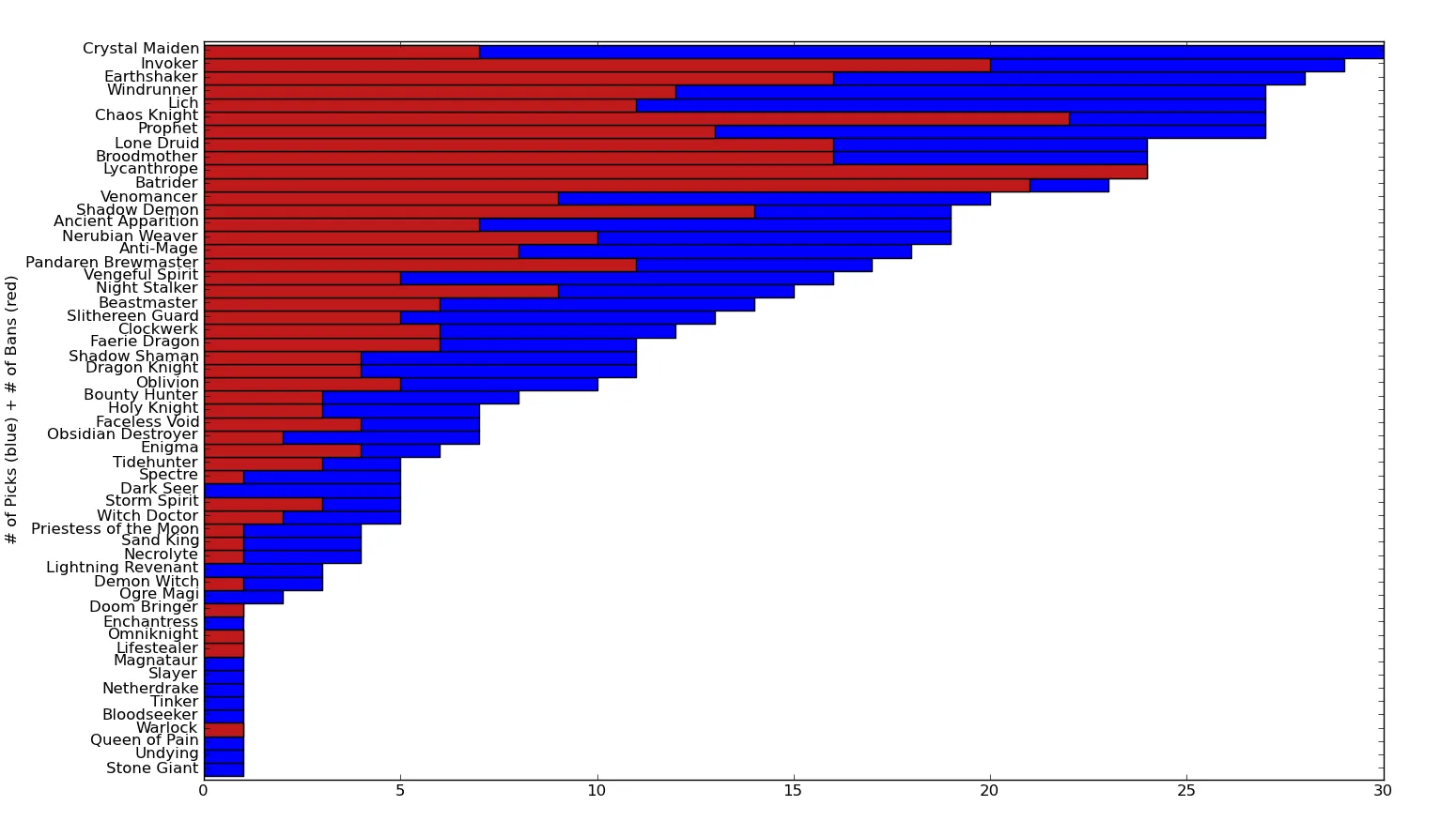
height_factor = 40.0
ind = np.linspace(0,len(sorted_totals)*height_factor,num=len(sorted_totals))
width = 0.25
fig = plt.figure(figsize=(15.5, 8.75),dpi=300)
p1 = plt.barh(ind,map(int,sorted_composite[:,0]),color='blue',align='center',height=height_factor)
p1 = plt.barh(ind,map(int,sorted_composite[:,2]),color=(0.75,0.1,0.1),align='center',height=height_factor)
plt.ylabel('# of Picks (blue) + # of Bans (red)')
plt.yticks(ind, sorted_totals[:,0])
plt.subplots_adjust(bottom=0.05, left=0.14,right=0.95,top=0.95)
plt.ylim([ind.min() - height_factor, ind.max() + height_factor])
我的数据存储在sorted_composite中,ind是我用来放置柱形图的值(ytick位置)。我使用linspace来生成均匀间隔的柱形图,但这只能部分起作用,我不确定具体原因。
from numpy import *from pylab import * data = zeros(50)+10 ind = arange(10) barh(ind,data) show()` 看起来很糟糕。 - user1127062bar(arange(50),zeros(50)+1)得到的样本输出:http://i.imgur.com/wqNrs.png 它几乎从来没有很好地对它们进行间距处理。至于版本:python-2.7.2(32位Windows),mpl-1.1.0,numpy-1.6.1。 - user1127062