Matplotlib 控制柱状图的间距

3

我试图在两个特定的条形图之间插入间距,但找不到任何简单方法。我可以手动添加一个高度为0的虚拟行来创建空白间隔,但这并不能让我控制空白间隔的宽度。是否有更多编程方法可用于在任何位置控制条形图之间的间距?

示例代码:

import pandas as pd
import matplotlib.pyplot as plt
import seaborn as sns

mydict = {
    'Event': ['Running', 'Swimming', 'Biking', '', 'Hiking', 'Jogging'],
    'Completed': [2, 4, 3, 0, 7, 9],
    'Participants': [10, 20, 35, 0, 10, 20]}

df = pd.DataFrame(mydict).set_index('Event')
df = df.assign(Completion=(df.Completed / df.Participants) * 100)

plt.subplots(figsize=(5, 4))

print(df.index)
ax = sns.barplot(x=df.Completion, y=df.index, color="orange", orient='h')

plt.xticks(rotation=60)

plt.tight_layout()
plt.show()

示例DataFrame输出:

          Completed  Participants  Completion
Event                                        
Running           2            10   20.000000
Swimming          4            20   20.000000
Biking            3            35    8.571429
                  0             0         NaN
Hiking            7            10   70.000000
Jogging           9            20   45.000000
示例输出(蓝色箭头添加在代码之外,以显示添加了空行的位置。):

enter image description here

1个回答

1
我认为您可以访问盒子的位置和标签的名称,然后进行修改。根据您的用例,您可能会发现更一般的方法,但这对于给定的示例有效。
#define a function to add space starting a specific label
def add_space_after(ax, label_shift='', extra_space=0):
    bool_space = False
    # get postion of current ticks
    ticks_position = np.array(ax.get_yticks()).astype(float)
    # iterate over the boxes/label
    for i, (patch, label) in enumerate(zip(ax.patches, ax.get_yticklabels())):
        # if the label to start the shift found
        if label.get_text()==label_shift: bool_space = True
        # reposition the boxes and the labels afterward
        if bool_space:
            patch.set_y(patch.get_y() + extra_space)
            ticks_position[i] += extra_space
    # in the case where the spacing is needed
    if bool_space:
        ax.set_yticks(ticks_position)
        ax.set_ylim([ax.get_ylim()[0]+extra_space, ax.get_ylim()[1]])

#note: no more blank row
mydict = {
    'Event': ['Running', 'Swimming', 'Biking', 'Hiking', 'Jogging'],
    'Completed': [2, 4, 3, 7, 9],
    'Participants': [10, 20, 35, 10, 20]}
df = pd.DataFrame(mydict).set_index('Event')
df = df.assign(Completion=(df.Completed / df.Participants) * 100)

ax = sns.barplot(x=df.Completion, y=df.index, color="orange", orient='h')
plt.xticks(rotation=60)
plt.tight_layout()

#use the function
add_space_after(ax, 'Hiking', 0.6)

plt.show()

enter image description here


感谢您抽出时间查看这个问题。我从这个函数中没有得到期望的结果。它在 Hiking 后面添加空格,而不是在 Biking 后面添加空格。另外,如果我将空格增加到0.9,它也会增加 Jogging 后面的空格。您有任何想法为什么会这样吗? - MBasith
@MBasith,第一个问题更多是函数命名不好,它应该被称为add_space_before,因为你可以看到,输入的名称是“Hiking”,所以它会在前面添加空格。 - Ben.T
@MBasith,关于第二个0.9的问题,它与这行代码有关
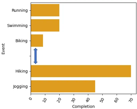
ax.set_ylim([ax.get_ylim()[0]+extra_space, ax.get_ylim()[1]]),我没有测试所有情况,所以无法确定应该在这里放置什么。如果数字不是太大,请尝试ax.set_ylim([ax.get_ylim()[0]+extra_space/2, ax.get_ylim()[1]]) - Ben.T
那个运行得非常好!这个函数也提供了我所寻找的灵活性。非常感谢您的帮助。 - MBasith
@MBasith 根据您的需求可能需要进行一些微调,但希望这个基本思路能为您提供指引 :) - Ben.T

网页内容由stack overflow 提供, 点击上面的
可以查看英文原文,
原文链接