我正在尝试在R中绘制一个图表。最终的图表应该是这样的:
到目前为止,我已经编写了一些代码,并创建了图表的主要组件,如下所示:
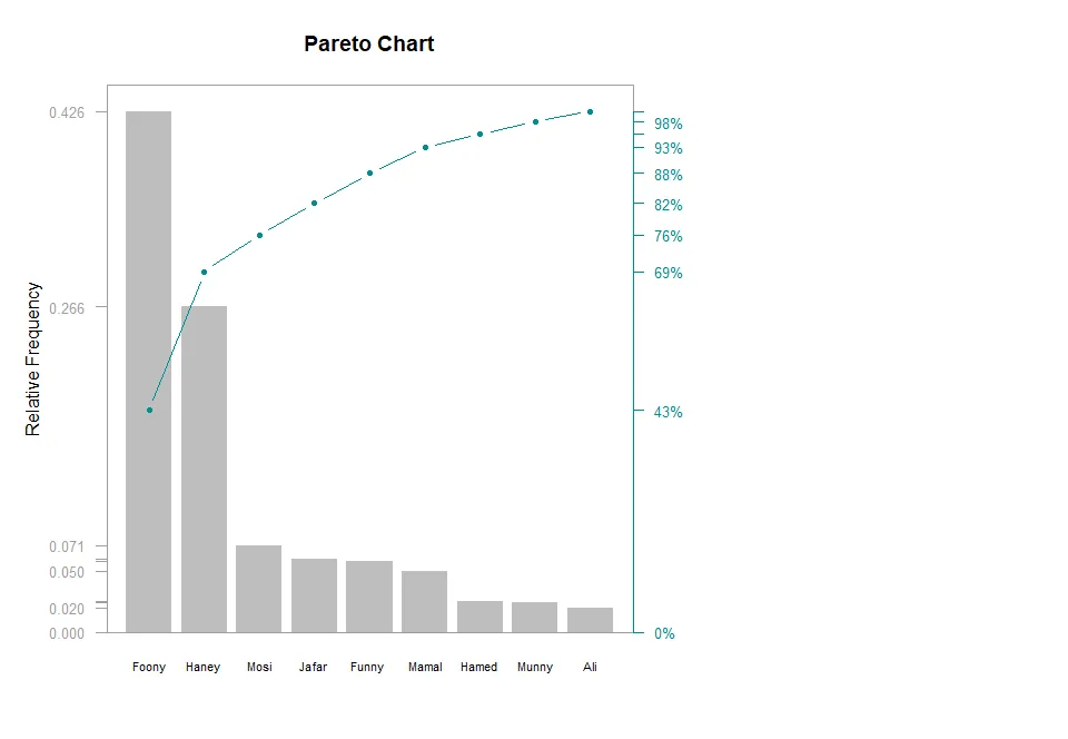
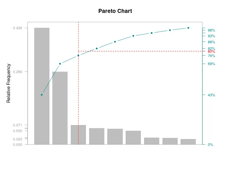
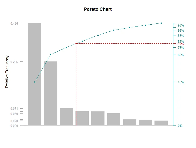
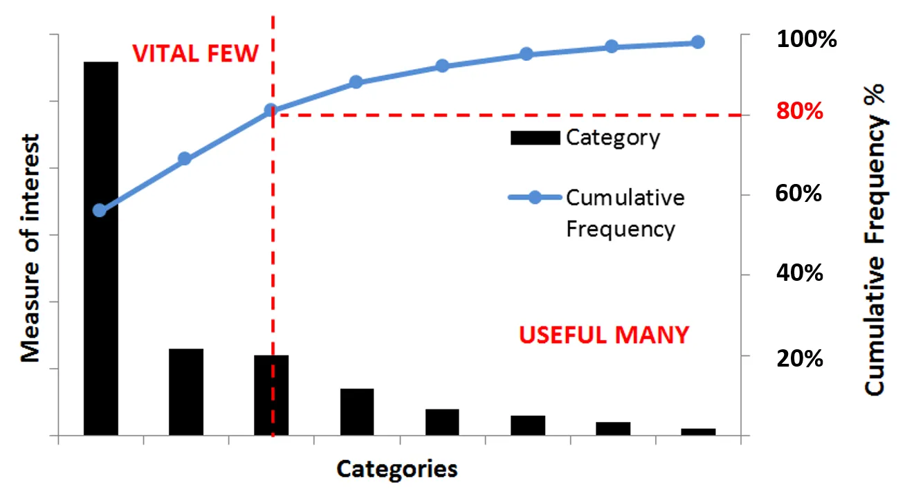
但是,正如您所注意到的那样,理想的图形(上图)有两条红色虚线。我想在次要y轴(右侧垂直轴)的80%值处绘制一条水平线。这条水平线应与绿色曲线相交,然后从该点向下(变为垂直)并与x轴相交(如上图所示)。
我的代码如下所示。
defect <- c( 80, 27, 66, 94, 33, 354, 32, 77, 567)
defect
names(defect ) <- c( "Jafar", "Ali", "Mamal", "Mosi", "Hamed", "Haney", "Munny", "Funny" , "Foony")


d <- data.frame(defect )

d <- arrange(d, desc(defect)) %>%
        mutate(
                cumsum = cumsum(defect),
                freq = round(defect / sum(defect), 3),
                cum_freq = cumsum(freq)
               )
d
## Saving Parameters
def_par <- par()

# New margins
par(mar=c(5,5,4,5))


## plot bars, pc will hold x values for bars
pc = barplot(d$freq,
             width = 1, space = 0.2, border = NA, axes = F,
             ylim = c(0, 1.05 * max(d$freq, na.rm = T)),
             ylab = "Relative Frequency" , cex.names = 0.7,
             names.arg = d$category,
             main = "Pareto Chart")

## anotate left axis
axis(side = 2, at = c(0, d$freq), las = 1, col.axis = "grey62", col = "grey62", tick = T, cex.axis = 0.8)

## frame plot
box( col = "grey62")

## Cumulative Frequency Lines
px <- d$cum_freq * max(d$freq, na.rm = T)
lines(pc, px, type = "b", cex = 0.7, pch = 19, col="cyan4")
par(new=TRUE)

## Annotate Right Axis
axis(side = 4, at = c(0, px), labels = paste(c(0, round(d$cum_freq * 100)) ,"%",sep=""),
     las = 1, col.axis = "grey62", col = "cyan4", cex.axis = 0.8, col.axis = "cyan4", abline(h=0.8) )
如果解决方案不需要任何复杂的编码,我会非常感激。