多年来,我一直使用 ggplot2 绘制气候栅格数据。这些数据通常是投影的 NetCDF 文件。在模型坐标中,单元格是正方形的,但取决于模型使用的投影方式,在真实世界中可能并非如此。
我的常规做法是首先将数据重新映射到适当的规则网格上,然后再绘制。这会对数据进行小的修改,通常是可以接受的。
然而,我已经决定这不再足够好:我想直接绘制投影数据,而不需要重新映射,就像其他程序(例如 ncl)可以做到的那样,如果我没有弄错,而不会接触模型输出值。
但是,我遇到了一些问题。我将从最简单到最复杂地逐步讲解可能的解决方案及其问题。我们能克服它们吗?
编辑:感谢 @lbusett 的回答,我得到了这个很棒的函数(链接),它包含了解决方案。如果您喜欢它,请为@lbusett 的回答点赞!
初始设置
#Load packages
library(raster)
library(ggplot2)

#This gives you the starting data, 's'
load(url('https://files.fm/down.php?i=kew5pxw7&n=loadme.Rdata'))
#If you cannot download the data, maybe you can try to manually download it from http://s000.tinyupload.com/index.php?file_id=04134338934836605121

#Check the data projection, it's Lambert Conformal Conic
projection(s)
#The data (precipitation) has a 'model' grid (125x125, units are integers from 1 to 125)
#for each point a lat-lon value is also assigned
pr <- s[[1]]
lon <- s[[2]]
lat <- s[[3]]

#Lets get the data into data.frames
#Gridded in model units:
pr_df_basic <- as.data.frame(pr, xy=TRUE)
colnames(pr_df_basic) <- c('lon', 'lat', 'pr')
#Projected points:
pr_df <- data.frame(lat=lat[], lon=lon[], pr=pr[])
我们创建了两个数据框,一个包含模型坐标,另一个包含每个模型单元格的实际纬度-经度交点(中心)。
可选:使用较小的域
如果您想更清楚地看到单元格的形状,可以对数据进行子集并仅提取少量的模型单元格。只要小心,您可能需要调整点大小、绘图限制和其他参数。您可以像这样对数据进行子集,然后重新执行上面的代码部分(减去 load() 部分):
s <- crop(s, extent(c(100,120,30,50)))
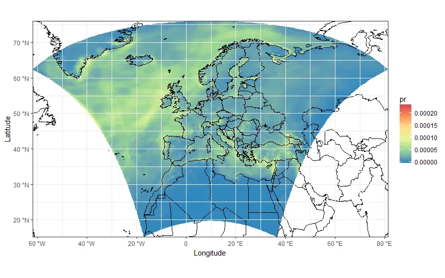
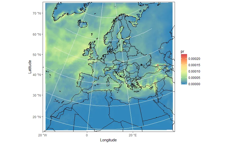
如果你想完全理解问题,也许你想尝试大区域和小区域。代码是相同的,只有点的大小和地图限制不同。下面的值是针对大完整领域的。
好的,现在让我们绘制!
从瓷砖开始
最显而易见的解决方案是使用瓷砖。让我们来尝试一下。
my_theme <- theme_bw() + theme(panel.ontop=TRUE, panel.background=element_blank())
my_cols <- scale_color_distiller(palette='Spectral')
my_fill <- scale_fill_distiller(palette='Spectral')
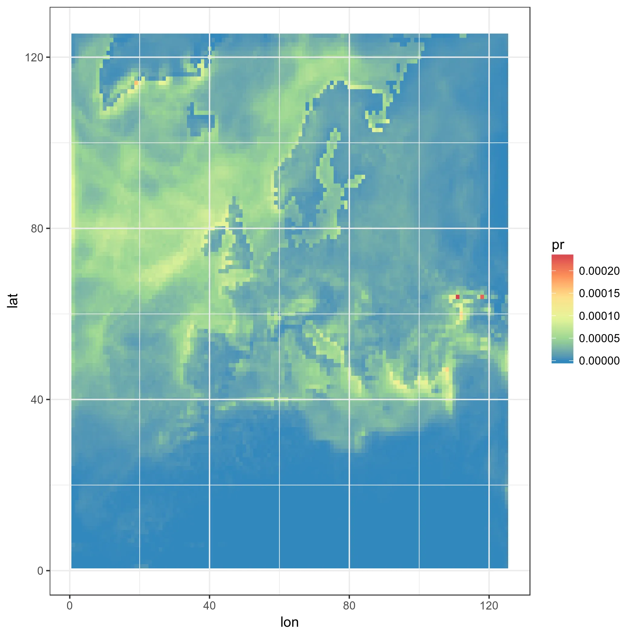
#Really unprojected square plot:
ggplot(pr_df_basic, aes(y=lat, x=lon, fill=pr)) + geom_tile() + my_theme + my_fill
这就是结果:
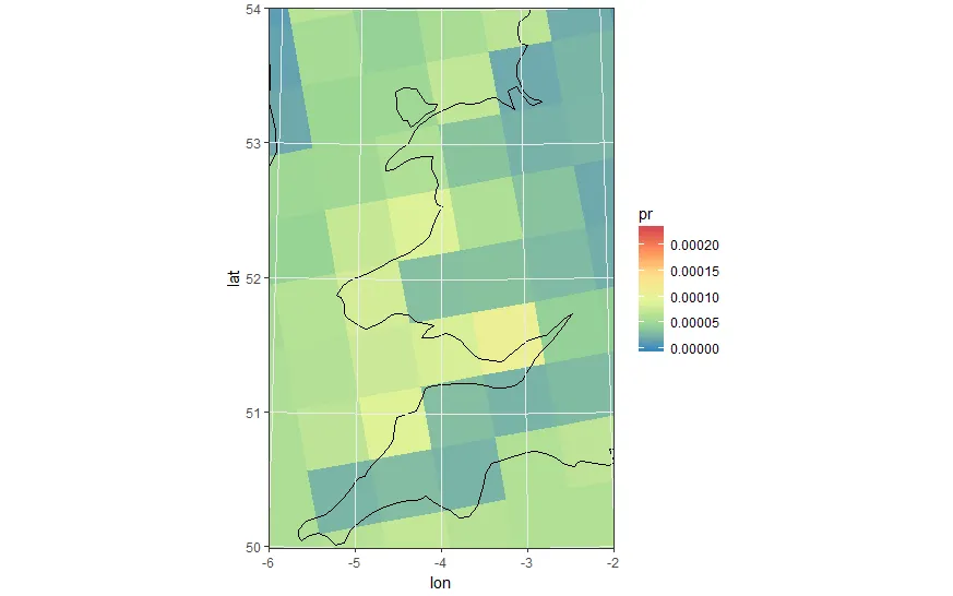
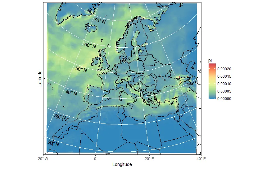
现在更进一步:我们使用真实的LAT-LON,使用方形瓦片
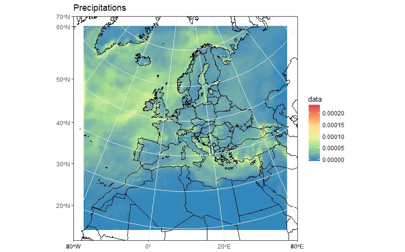
ggplot(pr_df, aes(y=lat, x=lon, fill=pr)) + geom_tile(width=1.2, height=1.2) +
    borders('world', xlim=range(pr_df$lon), ylim=range(pr_df$lat), colour='black') + my_theme + my_fill +
    coord_quickmap(xlim=range(pr_df$lon), ylim=range(pr_df$lat)) #the result is weird boxes...
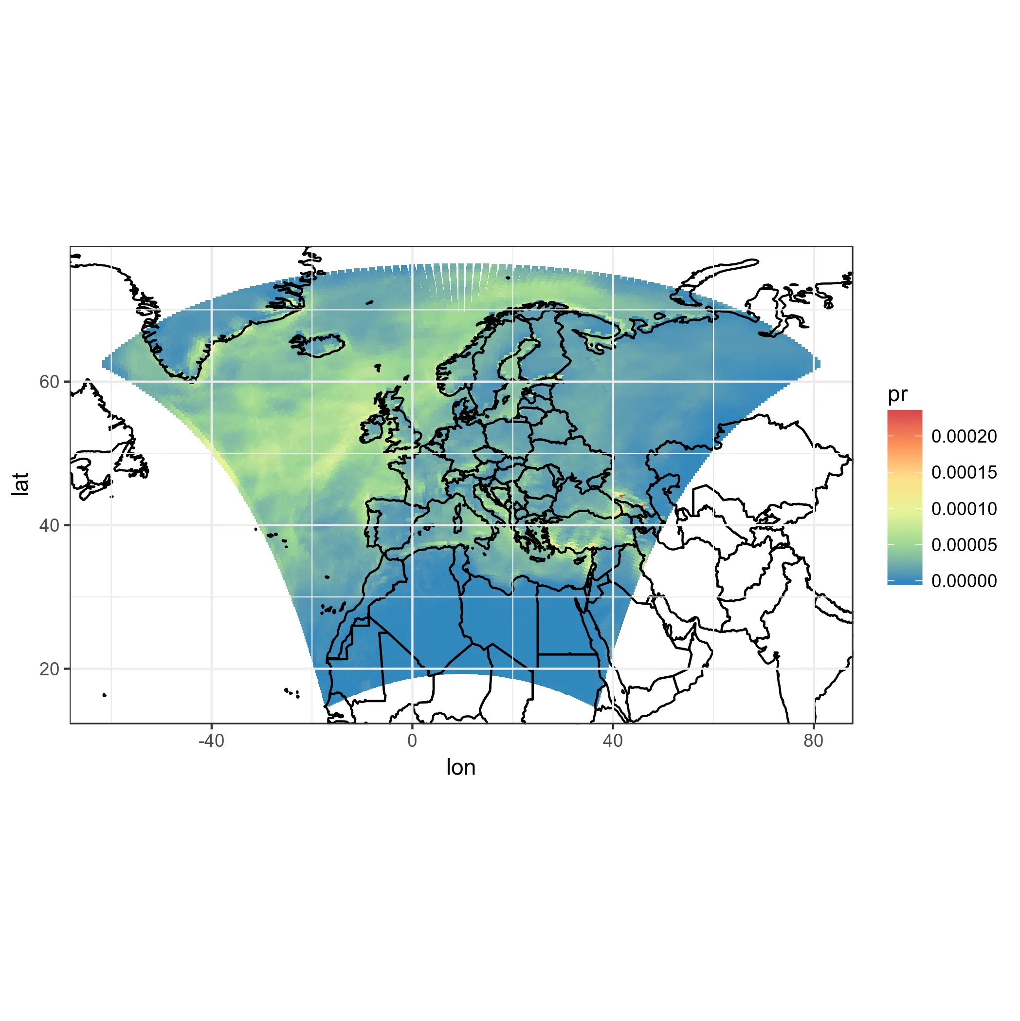
好的,但那些不是真正的模型正方形,这只是一个hack。而且,模型框在域的顶部发散,并且都以相同的方式定向。不好看。让我们投影正方形自己,即使我们已经知道这不是正确的做法...也许看起来不错。
#This takes a while, maybe you can trust me with the result
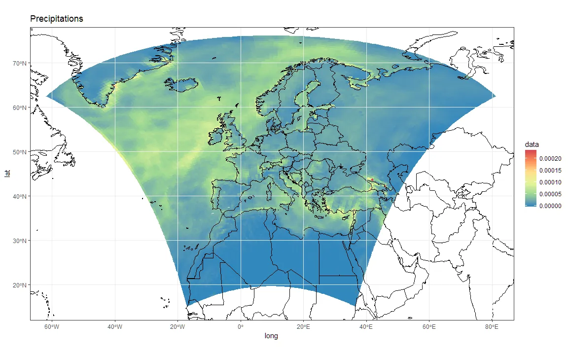
ggplot(pr_df, aes(y=lat, x=lon, fill=pr)) + geom_tile(width=1.5, height=1.5) +
borders('world', xlim=range(pr_df$lon), ylim=range(pr_df$lat), colour='black') + my_theme + my_fill +
coord_map('lambert', lat0=30, lat1=65, xlim=c(-20, 39), ylim=c(19, 75))

首先,这需要很多时间。这是不可接受的。而且,再次强调:这些不是正确的模型单元。
尝试使用点而不是瓷砖
也许我们可以使用圆形或正方形的点来代替瓷砖,并进行投影!
#Basic 'unprojected' point plot
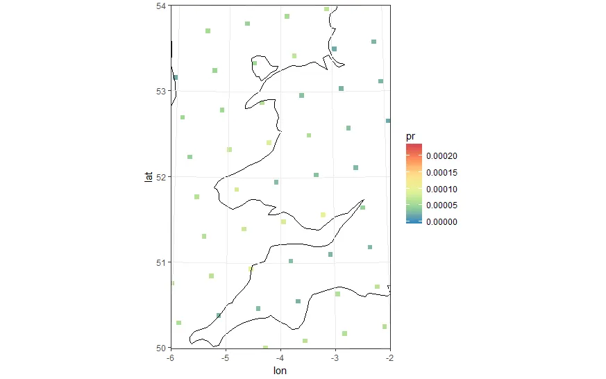
ggplot(pr_df, aes(y=lat, x=lon, color=pr)) + geom_point(size=2) +
borders('world', xlim=range(pr_df$lon), ylim=range(pr_df$lat), colour='black') + my_cols + my_theme +
coord_quickmap(xlim=range(pr_df$lon), ylim=range(pr_df$lat))
我们可以使用方形点...和投影!我们会更接近,尽管我们知道它仍然不正确。
#In the following plot pointsize, xlim and ylim were manually set. Setting the wrong values leads to bad results.
#Also the lambert projection values were tired and guessed from the model CRS
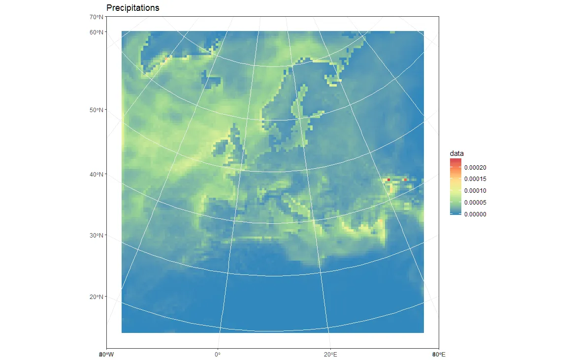
ggplot(pr_df, aes(y=lat, x=lon, color=pr)) +
geom_point(size=2, shape=15) +
borders('world', xlim=range(pr_df$lon), ylim=range(pr_df$lat), colour='black') + my_theme + my_cols +
coord_map('lambert', lat0=30, lat1=65, xlim=c(-20, 39), ylim=c(19, 75))
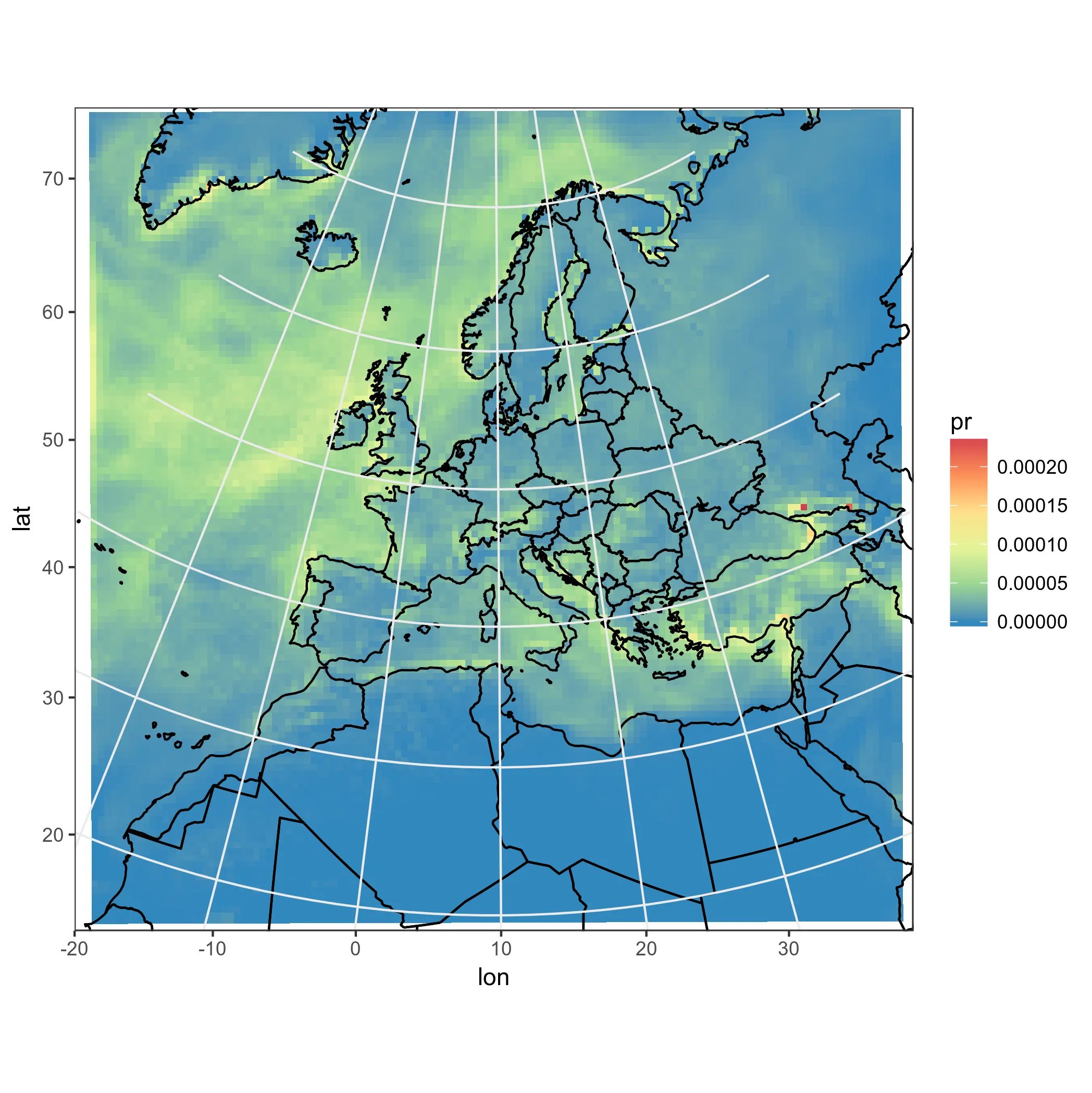
虽然结果还不错,但并不完全是自动化的,而且绘制点也不够好。我需要真正的模型单元格,并在投影中改变它们的形状!
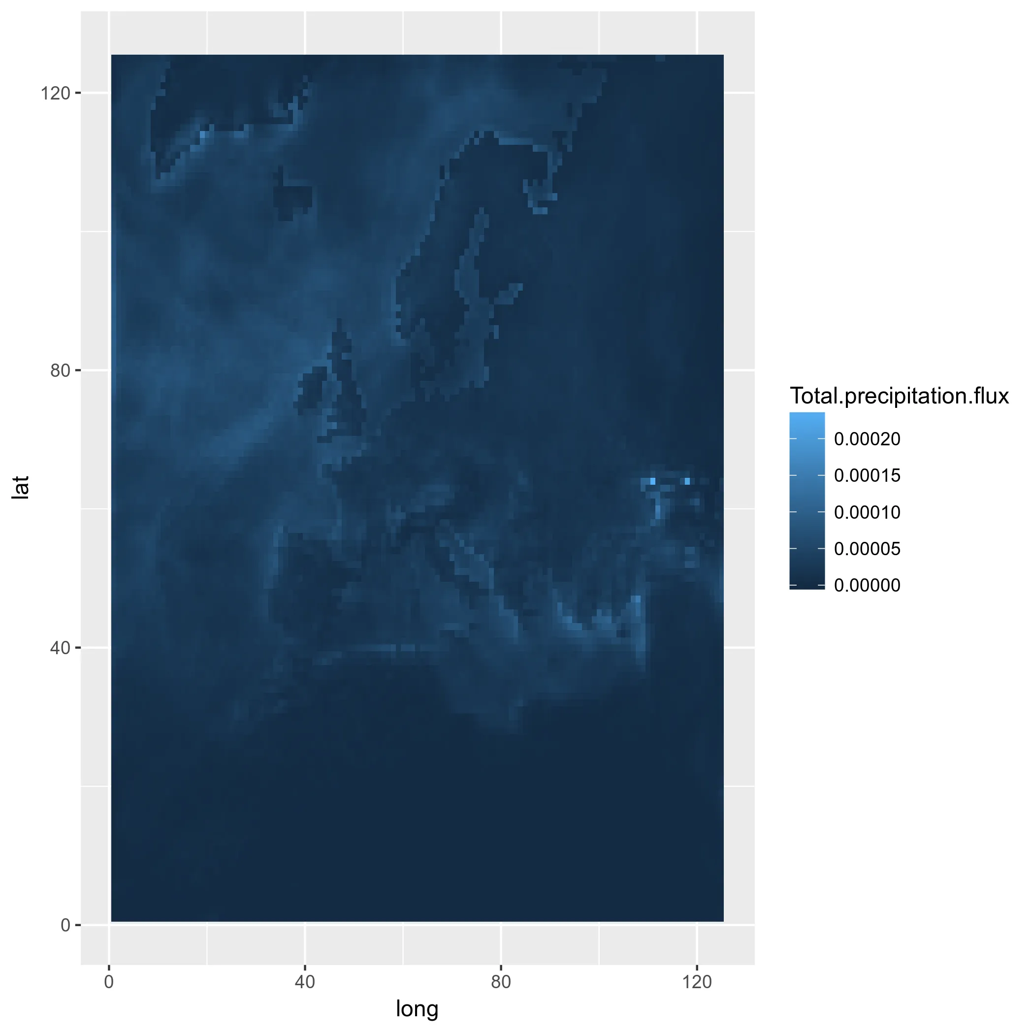
多边形,也许?
所以,正如您所见,我正在寻找一种正确地绘制模型框作为正确形状和位置的投影的方法。当然,模型框,在模型中是正方形,一旦投影后就变成了不规则的形状。所以也许我可以使用多边形,并对它们进行投影?我尝试使用 rasterToPolygons 和 fortify,并遵循这篇文章,但我没有成功。我已经尝试过这个:
pr2poly <- rasterToPolygons(pr)
#http://mazamascience.com/WorkingWithData/?p=1494
pr2poly@data$id <- rownames(pr2poly@data)
tmp <- fortify(pr2poly, region = "id")
tmp2 <- merge(tmp, pr2poly@data, by = "id")
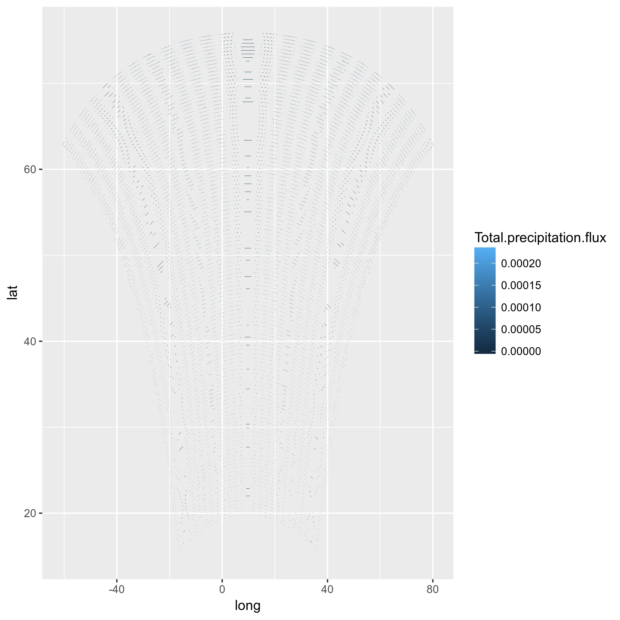
ggplot(tmp2, aes(x=long, y=lat, group = group, fill=Total.precipitation.flux)) + geom_polygon() + my_fill
好的,让我们尝试替换lat-lon...
tmp2$long <- lon[]
tmp2$lat <- lat[]
#Mh, does not work! See below:
ggplot(tmp2, aes(x=long, y=lat, group = group, fill=Total.precipitation.flux)) + geom_polygon() + my_fill
唉,即使用投影方式也不值得尝试。也许我应该尝试计算模型单元格角落处的纬度和经度,并为其创建多边形,然后重新投影?
结论
- 我想在本地网格上绘制投影模型数据,但我无法做到。使用瓷砖是不正确的,使用点是hackish的,而使用多边形似乎由于原因不明而无法正常工作。
- 通过
coord_map()进行投影时,网格线和轴标签是错误的。这使得经过投影的ggplots无法用于出版物。
RasterStack对象。这可能会导致混淆,因为例如标准的raster处理例程,如projectRaster,将无法正常工作。以我的看法,将其保存为SpatialPixelsDataFrame会更好。 - lbusettraster包读取。如果需要在R内部进行投影,则可以按照以下出色的说明操作:https://gis.stackexchange.com/questions/120900/plotting-netcdf-file-using-lat-and-lon-contained-in-variables - AF7