我目前正在创建许多图表,有些看起来很棒,而其他的需要一些调整。从下面的内容中,我该如何使难以看到的图表线更容易看到,而不必手动绘制它们?我一次绘制50-100个这样的图表,然后将它们添加到pdf报告中。我想在线条下方添加空间,例如将ylim最小限制设置为-0.1,但要自动完成。
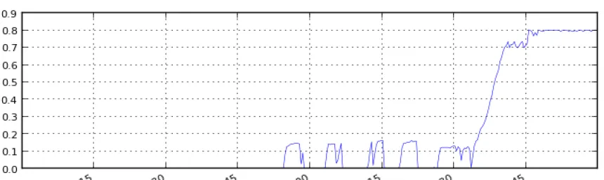
这是一条难以看到的图表线:
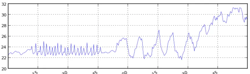
这是一条容易看到的图表线:
这是我的绘图代码:
def plot(chan_data):
'''Uses matplotlib to plot a channel
'''
f, ax = plt.subplots(1, figsize=(8, 2.5))
x = dffinal['time'].keys()
ax.plot(x, dffinal[chan_data].values, linewidth=0.4, color='blue')
ax.xaxis.set_major_formatter(mdates.DateFormatter('%m/%d/%Y - %H:%M'))
ax.xaxis.set_major_locator(mdates.AutoDateLocator(interval_multiples=True))

lgd1 = ax.legend(loc='center left', bbox_to_anchor=(1, 0.5))

f.autofmt_xdate()
ax.set_ylabel(dffinal[chan_data].name)
ax.grid('on')

#I've tried these with no luck
#ax.autoscale(enable=True, axis='y', tight=False)
#ax.set_ymargin(0.5)
#ax.set_autoscaley_on(True)

fname = ".\\plots\\" + chan_data + ".png"
print "Creating: " + fname
plt.savefig(fname, dpi=100, bbox_extra_artist=(lgd1,), bbox_inches='tight')
plt.close()
return fname