factorplot 用于主要独立变量为分类变量的情况,并已更名为catplot。
- 一般来说,接受的答案提供了一个解决方案来调整xticks的间距。
- 主要问题是这应该是一个定量图,而不是一个分类图,这就是为什么每个类别都有一个xtick的原因。
- 主要的要点是使用正确类型的图,即分类或定量。
- 分类图将始终显示所有的xticks。
- 定量图通常会格式化xticks的步长。
- 如果用于x轴的值是
字符串而不是日期时间或数值,则会显示所有的xticks。
import seaborn as sns

titanic = sns.load_dataset('titanic')
g = sns.relplot(x='age', y='fare', hue='survived', col='sex', data=titanic)
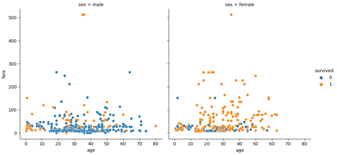
没有使用`relplot`和`scatterplot`,这个图可以直接使用
pandas.DataFrame.plot(或者
ax.scatter)绘制,但这是一个更复杂的实现。
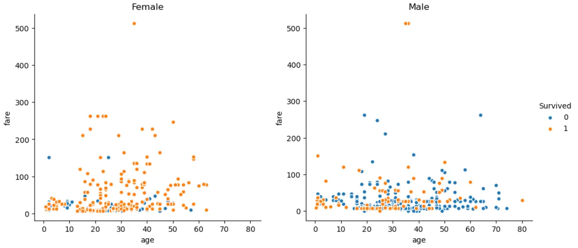
import seaborn as sns
import matplotlib.pyplot as plt

titanic = sns.load_dataset('titanic')

fig, axes = plt.subplots(1, 2, figsize=(12, 5), sharex=True)

axes = axes.flat

for ax, (sex, data) in zip(axes, titanic.groupby('sex')[['survived', 'age', 'fare']]):
    ax.spines[['top', 'right']].set_visible(False)
    for (survived, sel), color in zip(data.groupby('survived'), ['tab:blue', 'tab:orange']):
        sel.plot(kind='scatter', x='age', y='fare', ec='w', s=30,
                 color=color, title=sex.title(), label=survived, ax=ax)

axes[0].get_legend().remove()
axes[1].legend(title='Survived', bbox_to_anchor=(1, 0.5), loc='center left', frameon=False)
plt.show()

FormatStrFormatter('%d')是如何工作的?更具体地说,%d是如何工作的,是否有其他替代方法? - Ali AsgariFormatStrFormatter实例以供set_major_formatter使用。%d来自此处的格式规范迷你语言:https://docs.python.org/3/library/string.html#formatspec。我不知道是否有任何替代方案。 - mechanical_meatfactorplot(现在是catplot)用于分类自变量。 - Trenton McKinney