自定义进度条progressDrawable中是否可以实现圆角?

5
我有一个进度条,应该看起来像附图:enter image description here

我已经做了很多工作。我非常接近成功,唯一不起作用的部分是progressDrawable的圆角。这是我的样子(请注意,红圈内的填充没有圆角):enter image description here

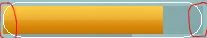
因此,当进度条使用形状、渐变或颜色进行着色时,我找到了几种方法可以使其正常工作。但是,当进度Drawable使用图像时,我无法实现它。
这是扩展ProgressBar的类:
public class RoundedProgressBar extends ProgressBar{
private Paint paint;

public RoundedProgressBar(Context context) {
    super(context);
    setup();
}

public RoundedProgressBar(Context context, AttributeSet attrs) {
    super(context, attrs);
    setup();
}

public RoundedProgressBar(Context context, AttributeSet attrs, int defStyle) {
    super(context, attrs, defStyle);
    setup();    ;
}

protected void setup()
{
    paint = new Paint();
}

@Override
protected synchronized void onDraw(Canvas canvas) {
    // First draw the regular progress bar, then custom draw our text
    super.onDraw(canvas);
    paint.setColor(Color.WHITE);
    paint.setStyle(Paint.Style.STROKE);
    RectF r = new RectF(0,0,getWidth()-1,getHeight()-1);
    canvas.drawRoundRect(r,getHeight()/2,getHeight()/2, paint);
}
 }

这是我的选择器:
<layer-list
 xmlns:android="http://schemas.android.com/apk/res/android"
 >
 <item
 android:id="@android:id/background"
 android:drawable="@drawable/slider_track" />
 <item
 android:id="@android:id/secondaryProgress"
 android:drawable="@drawable/slider_track" />
 <item
 android:id="@android:id/progress"
 android:drawable="@drawable/slider_track_progress" />
 </layer-list>

以下是选择器中使用的图像:

slider_track->enter image description here
slider_track_progress->enter image description here

以下是我在活动布局中嵌入进度条的位置

<com.android.component.RoundedProgressBar
    android:id="@+id/player_hp_bar"
    android:layout_width="fill_parent"
    android:layout_height="36dip"
    android:layout_marginLeft="30dip"
    android:layout_marginRight="30dip"
    android:max="100"
    style="?android:attr/progressBarStyleHorizontal"
    android:progressDrawable="@drawable/slider_layer_list"
    android:progress="20"
    android:maxHeight="12dip"
    android:minHeight="12dip"
/>

有人知道如何使这个工作吗?


我已经解决了这个问题,并在这里发布了一篇文章:博客文章 - b-ryce
https://dev59.com/nF_Va4cB1Zd3GeqPT34s#12219589 - Nykakin
我在这里发布了一个更新的答案,针对一个类似的问题: https://dev59.com/23I95IYBdhLWcg3w8y2N?lq=1 - Funktional
2个回答

1

不确定是否可以通过 API 实现边缘的圆滑,但是您可以非常容易地在白色轮廓和实际进度对象之间添加一个新层吗?该层可以是白色轮廓的精确剪裁,因此进度栏不会显示在轮廓外部。


感谢您的快速反馈!您所说的“layer”是什么意思,它如何遮罩/剪切progressDrawable? - b-ryce
我觉得我知道你在说什么,但我认为那种方法行不通,因为我将把它放在各种背景上。所以我需要一些东西来实际剪辑/遮罩progressDrawable。 - b-ryce
@b-ryce,我只是想说我在其他地方读到过(https://dev59.com/23I95IYBdhLWcg3w8y2N),由于某种原因,使用标准设置实际上不可能将它们圆形化。最好的方法是继续尝试自己剪辑边缘,我现在正在做自己的项目,但如果我有时间,我会试着摆弄一下看看能得出什么结果。如果你找到了解决方案,请务必回复,因为我肯定会对此感兴趣,其他人也一样。 - While-E

1

尝试这个,你可以通过在XML中修改拇指和滑动条的颜色、宽度和高度来实现你想要的效果。

你可以在这里看到图片

这是我能找到的唯一解决方案。希望这有所帮助。

这是我的滑动条:

         <SeekBar
            android:id="@+id/simpleProgressBar"
            android:layout_width="fill_parent"
            android:layout_height="12dp"
            android:max="100"
            android:progress="0"
            android:background="@null"
            android:shape="oval"
            android:splitTrack="false"
            android:progressDrawable="@drawable/progress_background"
            android:secondaryProgress="0"
            android:thumbOffset="10dp"
            android:thumb="@drawable/oval_seekbar_thumb" />

这是(progress_background.xml):

<item android:id="@android:id/background">
    <shape android:shape="rectangle">
        <corners android:radius="5dp" />

        <gradient
            android:angle="270"
            android:endColor="@color/grey_line"
            android:startColor="@color/grey_line" />
    </shape>
</item>
<item android:id="@android:id/secondaryProgress">
    <clip>
        <shape android:shape="oval">
            <corners android:radius="5dp" />
            <gradient
                android:angle="270"
                android:endColor="@color/blue"
                android:startColor="@color/blue" />
        </shape>
    </clip>
</item>
<item android:id="@android:id/progress">
    <clip>
        <shape android:shape="rectangle">
            <corners android:radius="90dp" />

            <gradient
                android:angle="90"
                android:endColor="@color/colorPrimaryDark"
                android:startColor="@color/colorPrimary" />
        </shape>
    </clip>
</item>

这是拇指(oval_seekbar_thumb.xml):

<?xml version="1.0" encoding="utf-8"?>
<selector xmlns:android="http://schemas.android.com/apk/res/android">
    <item>
        <shape android:shape="oval">
            <solid android:color="#ffffff" />
            <stroke android:color="@color/colorPrimaryDark" android:width="3dp"/>
            <size android:height="12dp" android:width="12dp"/>
        </shape>
    </item>
</selector>

拇指的高度应与滑动条的高度相同,以使其看起来更加协调。

网页内容由stack overflow 提供, 点击上面的
可以查看英文原文,
原文链接