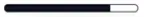
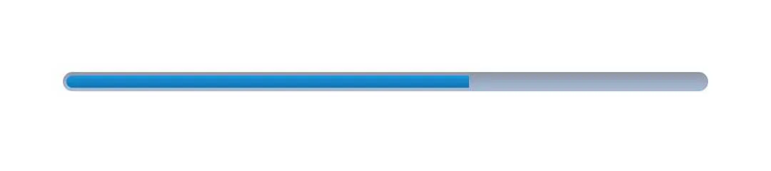
带圆角的进度条?

131

我想要实现这个进度条的设计:enter image description here

目前我的代码产生了这个结果:enter image description here

这是我的代码:

<item android:id="@android:id/background">
    <shape>
        <corners android:radius="8dp"/>
        <solid android:color="@color/dirtyWhite"/>
    </shape>
</item>

<item android:id="@android:id/progress">
    <clip>
        <shape>
            <corners android:radius="8dp"/>
            <solid android:color="@color/colorPrimaryDark"/>
        </shape>
    </clip>
</item>

我的进度条:

 <ProgressBar
            android:id="@+id/activeProgress"
            style="?android:attr/progressBarStyleHorizontal"
            android:layout_width="300dp"
            android:layout_height="wrap_content"
            android:layout_weight="1"
            android:progress="10"
            android:progressDrawable="@drawable/rounded_corners_progress_bar"/>

我尝试在<clip>中给<shape>添加<size>属性,以使进度形状变小,但没有成功。另外,进度条是平的,我希望它像设计一样呈弧形。为了实现这个设计,我需要改变什么?


2
https://github.com/akexorcist/Android-RoundCornerProgressBar - Rajesh Koshti
8个回答

215

如何使进度条形状变得更小?

您需要给进度条元素添加一些填充,像这样:


<item android:id="@android:id/progress"
    android:top="2dp"
    android:bottom="2dp"
    android:left="2dp"
    android:right="2dp">

如何使进度条按照设计曲线呈现?

<clip></clip>元素替换为<scale android:scaleWidth="100%"></scale>。这将使形状在增长时保持其形式,而不会被截断。 不幸的是,在开始时它会产生一些不必要的视觉效果-因为形状角落没有足够的空间来绘制。但对于大多数情况来说,这可能已经足够了。

完整代码:

<layer-list xmlns:android="http://schemas.android.com/apk/res/android">
 <item android:id="@android:id/background">
    <shape>
        <corners android:radius="8dp"/>
        <solid android:color="@color/dirtyWhite"/>
    </shape>
 </item>

 <item android:id="@android:id/progress"
    android:top="1dp"
    android:bottom="1dp"
    android:left="1dp"
    android:right="1dp">

    <scale android:scaleWidth="100%">
        <shape>
            <corners android:radius="8dp"/>
            <solid android:color="@color/colorPrimaryDark"/>
        </shape>
    </scale>
 </item>
</layer-list>

4
@habibullah 使用原生的 ProgressBar 和 Layer-List 的限制很大。你可以轻松地实现一个自定义进度条以适应你的需求。例如,如果你有一个纯色背景 - 简单地使用前景 9-path 来隐藏除进度之外的所有内容。如果你的目标是较新的 Android 版本,你可以简单地使用内置的遮罩支持(不支持旧版本)。另一种选择是使用库,这可能对你有好处:https://github.com/akexorcist/Android-RoundCornerProgressBar 。如果你仍然有问题,请发布一个新的问题。干杯。 - Eyal Biran
1
@AkshayMahajan 请查看上面的评论。 - Eyal Biran
1
当我应用了你的完整代码后,整个进度条都被我的主颜色(colorPrimaryDark)染色了,即使进度不到100%。我在@android:id/background下添加了clip标签,它修复了这个问题,但背景已经被移除了。我的临时解决方案是删除背景项并将背景颜色添加到布局中(没有圆角)。 - Oğuzhan Koşar
8
在我的情况下,使用 android:scaleWidth="100%" 属性的 scale 功能成功地使其以圆角显示。非常感谢。 - Edison Spencer
1
主要是使用“scale”而不是“clip”来完成。然后,其余的就是你自己的定制,无论你想在两侧还是只有一侧拥有圆角。 :) 感谢@EyalBiran提供的答案。 - Abhishek
显示剩余5条评论

60

使用Material组件库,您可以使用LinearProgressIndicatorapp:trackCornerRadius 属性。
例如:

    <com.google.android.material.progressindicator.LinearProgressIndicator
        android:indeterminate="true"
        app:trackThickness="xxdp"
        app:trackCornerRadius="xdp"/>

在此输入图片描述

对于确定性进度指示器,也可以通过删除 android:indeterminate="true" 或使用 android:indeterminate="false" 来实现。

注意: 至少需要版本 1.3.0


2
@Arunachalamk 线性进度指示器 已经在 1.3.0-alpha04 版本中引入,目前是最新的 alpha 版本。 - Gabriele Mariotti
我试图在一个圆形进度视图上实现相同的效果,这对我很有帮助。trackCornerRadius 也适用于此。线性和圆形进度指示器的文档可在此处找到:https://github.com/material-components/material-components-android/blob/master/docs/components/ProgressIndicator.md - speedynomads
当indeterminate="false"时,我们可以给LinearProgressIndicator添加圆角边框吗? - nilesh
@nilesh 目前还没有添加描边的参数。 - Gabriele Mariotti
2
如果你不知道这个视图,要实现类似于原生水平圆角动画的不确定性可能会非常困难。谢谢! - Vahab Ghadiri

16

感谢 Georgi Koemdzhiev 提供的好问题和图片。想要做类似于他的人,按照以下步骤进行。

1)为进度条创建一个背景。

progress_bar_background.xml:

<?xml version="1.0" encoding="utf-8"?>
<shape xmlns:android="http://schemas.android.com/apk/res/android"
    android:shape="rectangle"
    >
    <corners android:radius="3dp" />
    <stroke android:color="@color/white" android:width="1dp" />
</shape>

2) 为ProgressBar创建一个刻度。

curved_progress_bar.xml:

<?xml version="1.0" encoding="utf-8"?>
<layer-list xmlns:android="http://schemas.android.com/apk/res/android">
    <item android:id="@android:id/background">
        <shape>
            <corners android:radius="2dp" />
            <solid android:color="@color/transparent" />
        </shape>
    </item>

    <item android:id="@android:id/progress">
        <clip>
            <shape>
                <corners android:radius="2dp" />
                <solid android:color="#ffff00" />
            </shape>
        </clip>
    </item>
</layer-list>

3)在布局文件中添加 ProgressBar

<FrameLayout
    android:layout_width="match_parent"
    android:layout_height="6dp"
    android:layout_marginStart="20dp"
    android:layout_marginTop="10dp"
    android:layout_marginEnd="20dp"
    android:background="@drawable/progress_bar_background"
    >

    <ProgressBar
        android:id="@+id/progress_bar"
        style="@style/Widget.AppCompat.ProgressBar.Horizontal"
        android:layout_width="match_parent"
        android:layout_height="4dp"
        android:layout_margin="1dp"
        android:indeterminate="false"
        android:progressDrawable="@drawable/curved_progress_bar"
        />

</FrameLayout>

1
android:indeterminate="false"这行代码救了我的一天 :) - user1510006
仍然在2022年有效,好棒! - Guimo

6
<com.google.android.material.progressindicator.LinearProgressIndicator
                android:id="@+id/pb_team2"
                android:layout_width="0dp"
                android:layout_height="8dp"
                android:layout_marginStart="55dp"
                android:layout_marginEnd="15dp"
                app:trackColor="#E0E0E0"
                app:trackCornerRadius="6dp"
                app:trackThickness="8dp"
                android:progress="2"
                app:indicatorColor="@color/red"
                android:scaleX="-1"
                app:layout_constraintEnd_toEndOf="parent"
                app:layout_constraintStart_toEndOf="@id/tv_versus"
                app:layout_constraintTop_toBottomOf="@id/tv_team2_score" />

4

以下代码会生成进度条
您可以通过设置内部进度颜色、边框颜色和透明颜色的空白进度来实现进度条。

<?xml version="1.0" encoding="utf-8"?>
<layer-list xmlns:android="http://schemas.android.com/apk/res/android">
<item android:id="@android:id/background">
    <shape>
        <corners android:radius="15dip" />
        <stroke android:width="1dp" android:color="@color/black" />
    </shape>
</item>

<item android:id="@android:id/secondaryProgress">
    <clip>
        <shape>
            <corners android:radius="5dip" />
            <gradient
                android:startColor="@color/black"
                android:centerColor="@color/trans"
                android:centerY="0.75"
                android:endColor="@color/black"
                android:angle="270"

                />
        </shape>
    </clip>
 </item>


 <item
    android:id="@android:id/progress"
    >
    <clip>
        <shape>
            <corners
                android:radius="5dip" />
            <gradient
                android:startColor="@color/black"
                android:endColor="@color/black"
                android:angle="270" />
        </shape>
    </clip>
 </item>
 </layer-list>

嗨,Ravichandra,感谢您的回答!您能否添加解释为什么您的代码可以回答他的问题?否则,其他用户将很难使用。谢谢! - Nander Speerstra
感谢您提供这段代码片段,它可能会为一些问题提供有限的立即帮助。通过展示为什么这是一个好的解决方案,适当的解释将极大地提高其长期价值,并使它对未来读者更有用。请编辑您的答案以添加一些说明,包括您所做的假设。此外,请尝试解释为什么您的答案比已经给出的其他答案更好。 - Qw3ry

2

build.gradle(Module) 中添加材料依赖项 implementation 'com.google.android.material:material:1.6.0'

回到 activity_main.xml,添加

<com.google.android.material.progressindicator.LinearProgressIndicator>
...
 app:trackCornerRadius="3dp"
    </com.google.android.material.progressindicator.LinearProgressIndicator>

希望这能够帮到你的工作。
注:已保留HTML标签。

1
你可以使用Drawable创建自定义进度条。
1)首先创建一个名为custom_progress_bar_horizontal.xml的Drawable。
<?xml version="1.0" encoding="UTF-8"?>
<layer-list xmlns:android="http://schemas.android.com/apk/res/android">
    <item android:id="@android:id/background">
        <shape>
            <padding
                android:bottom="2dip"
                android:left="2dip"
                android:right="2dip"
                android:top="2dip" />
            <corners android:radius="5dip" />
            <gradient
                android:angle="270"
                android:centerColor="#80385682"
                android:centerY="0.50"
                android:endColor="#80577AAF"
                android:startColor="#80222F44" />
        </shape>
    </item>
    <item android:id="@android:id/progress">
        <clip>
            <shape>
                <corners android:radius="5dip" />
                <gradient
                    android:angle="90"
                    android:endColor="#FF1997E1"
                    android:startColor="#FF0E75AF" />
            </shape>
        </clip>
    </item>
</layer-list>
2) 在 style.xml 文件中创建样式。
<style name="CustomProgressBar" parent="android:Widget.ProgressBar.Horizontal">
   <item name="android:indeterminateOnly">false</item>
   <item name="android:progressDrawable">@drawable/custom_progress_bar_horizontal</item>
   <item name="android:minHeight">10dip</item>
   <item name="android:maxHeight">20dip</item>
</style>
3) 在项目中任何地方使用。
<ProgressBar
    android:id="@+id/mProgressBar"
    style="@style/CustomProgressBar"
    android:layout_width="match_parent"
    android:layout_height="wrap_content" />

输出结果:

在此输入图片描述


0
  1. 创建一个新的样式
<style name="ProgressBar.Horizontal.Rounded" parent="Widget.AppCompat.ProgressBar.Horizontal">
    <item name="android:progressDrawable">@drawable/progress_horizontal_material</item>
</style>
  1. 创建一个名为 "progress_horizontal.xml" 的新可绘制对象。
<?xml version="1.0" encoding="utf-8"?><!-- Copyright (C) 2014 The Android Open Source Project

     Licensed under the Apache License, Version 2.0 (the "License");
     you may not use this file except in compliance with the License.
     You may obtain a copy of the License at

          http://www.apache.org/licenses/LICENSE-2.0

     Unless required by applicable law or agreed to in writing, software
     distributed under the License is distributed on an "AS IS" BASIS,
     WITHOUT WARRANTIES OR CONDITIONS OF ANY KIND, either express or implied.
     See the License for the specific language governing permissions and
     limitations under the License.
-->

<layer-list xmlns:android="http://schemas.android.com/apk/res/android">
    <item
        android:id="@android:id/background"
        android:gravity="center_vertical|fill_horizontal">
        <shape
            android:shape="rectangle"
            android:tint="?attr/colorControlNormal">
            <corners android:radius="8dp" />
            <size android:height="4dp" />
            <solid android:color="@color/white_disabled" />
        </shape>
    </item>
    <item
        android:id="@android:id/secondaryProgress"
        android:gravity="center_vertical|fill_horizontal">
        <scale android:scaleWidth="100%">
            <shape
                android:shape="rectangle"
                android:tint="?attr/colorControlActivated">
                <corners android:radius="8dp" />
                <size android:height="4dp" />
                <solid android:color="@color/white_disabled" />
            </shape>
        </scale>
    </item>
    <item
        android:id="@android:id/progress"
        android:gravity="center_vertical|fill_horizontal">
        <scale android:scaleWidth="100%">
            <shape
                android:shape="rectangle"
                android:tint="?attr/colorControlActivated">
                <corners android:radius="8dp" />
                <size android:height="4dp" />
                <solid android:color="@android:color/white" />
            </shape>
        </scale>
    </item>
</layer-list>
  1. 创建一个名为"white_disabled.xml"的新颜色
<?xml version="1.0" encoding="utf-8"?><!-- Copyright (C) 2015 The Android Open Source Project

     Licensed under the Apache License, Version 2.0 (the "License");
     you may not use this file except in compliance with the License.
     You may obtain a copy of the License at

          http://www.apache.org/licenses/LICENSE-2.0

     Unless required by applicable law or agreed to in writing, software
     distributed under the License is distributed on an "AS IS" BASIS,
     WITHOUT WARRANTIES OR CONDITIONS OF ANY KIND, either express or implied.
     See the License for the specific language governing permissions and
     limitations under the License.
-->

<selector xmlns:android="http://schemas.android.com/apk/res/android">
    <item android:alpha="?android:attr/disabledAlpha" android:color="@android:color/white" />
</selector>
  1. 然后在您的布局中像这样使用它:
<ProgressBar
     android:id="@+id/progress_bar_indicator"
     style="@style/ProgressBar.Horizontal.Rounded"
     android:layout_width="match_parent"
     android:layout_height="wrap_content" />

网页内容由stack overflow 提供, 点击上面的
可以查看英文原文,
原文链接