如何使用CSS单一元素创建镜像图像效果

4

我有一个带有背景图片的HTML元素,想要创建一个镜像效果到底部,就像这样反射图片:
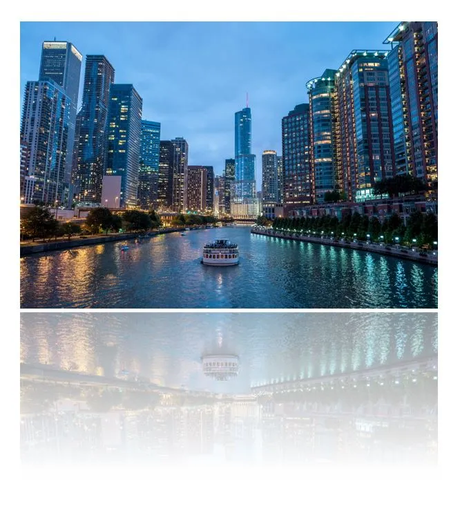
Image with mirror

我想要创建这个反射效果的最佳解决方案是仅使用CSS而不使用比这个单一元素更多的元素,并且不重复使用图像URL(出于维护原因)。我只找到了类似这样的解决方案,需要“复杂”的HTML标记。
这是我的代码:

div {
  position: relative;
  background: url(https://istack.dev59.com/P56gr.webp);
  width: 300px;
  height: 200px;
}
div:after {
  content: "";
  position: absolute;
  background: url(https://istack.dev59.com/P56gr.webp);
  display: block;
  width: 300px;
  height: 200px;
  bottom: -210px;
}
<div></div>


有点类似(它是关于文本的)- https://dev59.com/Z4_ea4cB1Zd3GeqPLj_r#32651828 - Harry
1
谢谢你的提示! - andreas
2个回答

11
你确实可以使用伪元素:after:before,首先使用transform: scaleY(-1);将图像镜像,然后用线性渐变将镜像的图像覆盖上半透明白色rgba(255, 255, 255, 0.5)到不透明白色#fff

为了不必两次注明图片URL,只需使用background: inherit;

div {
  position: relative;
  background: url(https://istack.dev59.com/P56gr.webp) bottom;
  width: 300px;
  height: 200px;
}
div:after,
div:before {
  content: "";
  position: absolute;
  display: block;
  width: inherit;
  height: 50%;
  bottom: -52%;
}
div:after {
  background: inherit;
  transform: scaleY(-1);
}
div:before {
  z-index: 1;
  background: linear-gradient(to bottom, rgba(255, 255, 255, 0.5), #fff);
}
<div></div>

注意:您需要在不同的浏览器中使用厂商前缀以获得支持。


1
只需添加
transform: rotate(180deg);
-webkit-mask-image:-webkit-gradient(linear, left 50%, left bottom, from(rgba(0,0,0,.7)), to(rgba(0,0,0,1)));

很明显,使用CSS进行此类操作时,没有任何东西可以在所有浏览器上都达到100%的兼容性。

div {
  position: relative;
  background: url(https://istack.dev59.com/P56gr.webp);
  width: 300px;
  height: 200px;
}
div:after {
  content: "";
  position: absolute;
  background: url(https://istack.dev59.com/P56gr.webp);
  display: block;
  width: 300px;
  height: 200px;
  bottom: -210px;
  transform: rotate(180deg);
  -webkit-mask-image:-webkit-gradient(linear, left 50%, left bottom, from(rgba(0,0,0,0)), to(rgba(0,0,0,.5)));
}
<div></div>


2
Andreas的答案可能有更多的供应商支持。mask-image并不被广泛支持,但是当它被支持时,你已经完成了95%的工作。 - Leeish
2
这不会在水平轴上添加镜像图像。注意水中的曲线走向错误。你应该使用rotateX(180度)而不是rotate(180度)。 - Rob Monhemius
好眼力,我甚至没注意到。 - Leeish
旋转180度并不等同于镜像操作!它是双重镜像操作(请参见群论)。 - Soleil

网页内容由stack overflow 提供, 点击上面的
可以查看英文原文,
原文链接