根据我的数据(如下图所示)称为GDP。我希望知道如何在一张图中绘制所有国家的数据,并且希望每个国家都有一个图例,例如每条线用不同的颜色或形状表示。
我知道如何绘制单个系列的图表,例如:
ts.plot(GDP$ALB)
但不知道如何绘制所有系列并包含图例。
谢谢。
我知道如何绘制单个系列的图表,例如:
ts.plot(GDP$ALB)
但不知道如何绘制所有系列并包含图例。
谢谢。
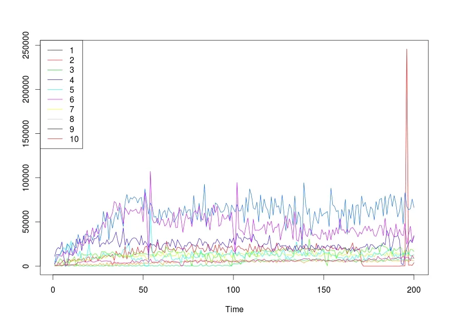
使用 ts.plot 仅需 2 行代码
    ts.plot(time,gpars= list(col=rainbow(10)))
    legend("topleft", legend = 1:10, col = 1:10, lty = 1)
结果:如何在R中使用图例绘制多个(时间)序列
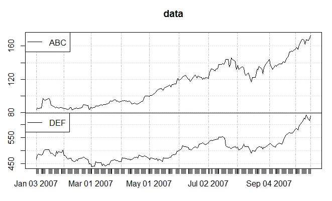
xts创建时间序列数据,您可以使用来自xtsExtra包的plot.xts来获得所需的结果。#Uncomment below lines to install required packages
#install.packages("xts")
#install.packages("xtsExtra", repos="http://R-Forge.R-project.org")
library(xts)
library(xtsExtra)
head(data)
## ABC DEF
## 2007-01-03 83.80 467.59
## 2007-01-04 85.66 483.26
## 2007-01-05 85.05 487.19
## 2007-01-08 85.47 483.58
## 2007-01-09 92.57 485.50
## 2007-01-10 97.00 489.46
plot.xts(data, screens = factor(1, 1), auto.legend = TRUE)
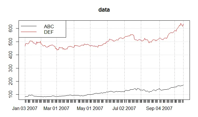 。
。plot.xts(data, auto.legend = TRUE)
install.packages("xtsExtra", repos="http://R-Forge.R-project.org") 或者只是 install.packages("xtsExtra") 吗? - CHPplot.ts 一件事就是不显示 x 轴标签作为日期。此外,现在已经没有 auto.legend = TRUE 选项了。取而代之的是:legend.loc = 'topleft'。 - James Hirschornset.seed(1)
DF <- data.frame(2000:2009,matrix(rnorm(50, 1000, 200), ncol=5))
colnames(DF) <- c('Year', paste0('Country', 2:ncol(DF)))
DF.TS <- ts(DF[-1], start = 2000, frequency = 1)
DF.TS
# Time Series:
# Start = 2000
# End = 2009
# Frequency = 1
# Country2 Country3 Country4 Country5 Country6
# 2000 874.7092 1302.3562 1183.7955 1271.7359 967.0953
# 2001 1036.7287 1077.9686 1156.4273 979.4425 949.3277
# 2002 832.8743 875.7519 1014.9130 1077.5343 1139.3927
# 2003 1319.0562 557.0600 602.1297 989.2390 1111.3326
# 2004 1065.9016 1224.9862 1123.9651 724.5881 862.2489
# 2005 835.9063 991.0133 988.7743 917.0011 858.5010
# 2006 1097.4858 996.7619 968.8409 921.1420 1072.9164
# 2007 1147.6649 1188.7672 705.8495 988.1373 1153.7066
# 2008 1115.1563 1164.2442 904.3700 1220.0051 977.5308
# 2009 938.9223 1118.7803 1083.5883 1152.6351 1176.2215
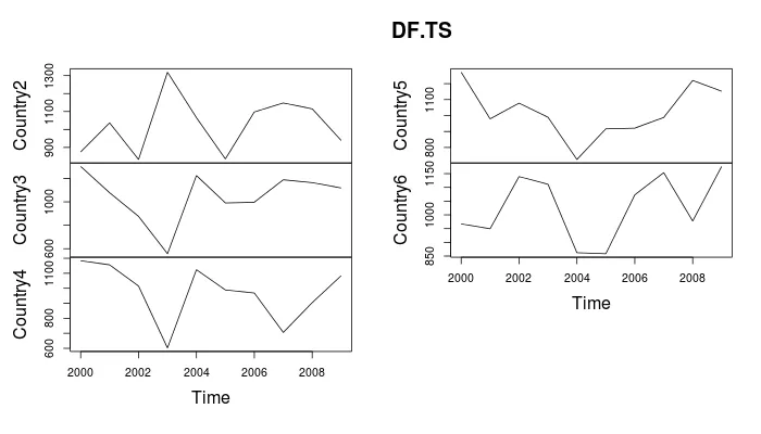
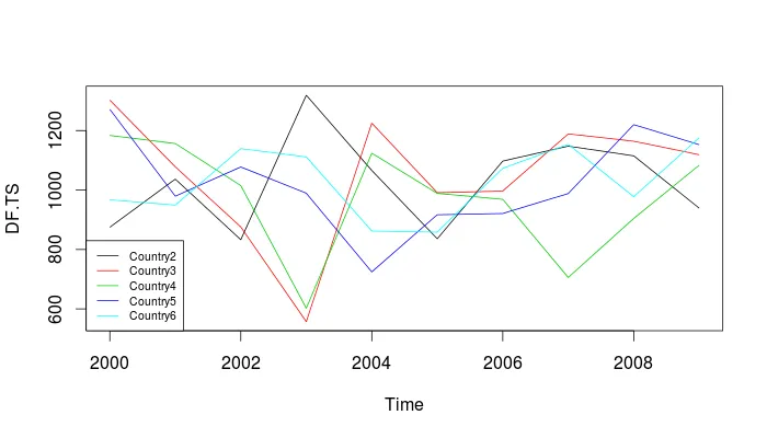
现在,这里有两个基本的绘图选项:
# Each country in a separate panel, no legends required
plot(DF.TS)
# All countries in one plot... colorful, common scale, and so on
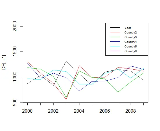
plot(DF.TS, plot.type="single", col = 1:ncol(DF.TS))
legend("bottomleft", colnames(DF.TS), col=1:ncol(DF), lty=1, cex=.65)
> set.seed(1)
> DF <- data.frame(2000:2009,matrix(rnorm(50, 1000, 200), ncol=5))
> colnames(DF) <- c('Year', paste0('Country', 2:ncol(DF)))
> DF # this is how the data.frame looks like:
   Year  Country2  Country3  Country4  Country5  Country6
1  2000  874.7092 1302.3562 1183.7955 1271.7359  967.0953
2  2001 1036.7287 1077.9686 1156.4273  979.4425  949.3277
3  2002  832.8743  875.7519 1014.9130 1077.5343 1139.3927
4  2003 1319.0562  557.0600  602.1297  989.2390 1111.3326
5  2004 1065.9016 1224.9862 1123.9651  724.5881  862.2489
6  2005  835.9063  991.0133  988.7743  917.0011  858.5010
7  2006 1097.4858  996.7619  968.8409  921.1420 1072.9164
8  2007 1147.6649 1188.7672  705.8495  988.1373 1153.7066
9  2008 1115.1563 1164.2442  904.3700 1220.0051  977.5308
10 2009  938.9223 1118.7803 1083.5883 1152.6351 1176.2215
> matplot(DF[,-1], col=1:ncol(DF), type='l', lty=1, ylim=range(DF), axes=FALSE)
> axis(1, 1:nrow(DF), as.character(DF[,1]))
> axis(2)
> box() #- to make it look "as usual"
> legend('topright', names(DF), col=1:ncol(DF), lty=1, cex=.65)