在一个图中绘制多个时间序列

13
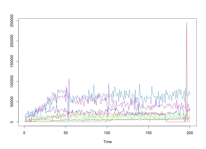
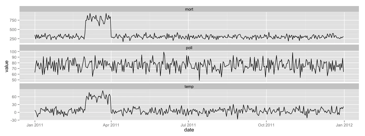
我有几年的时间序列数据需要在一个图中绘制。最大的系列平均值为340,最小值为245,最大值为900。最小的系列平均值为7,最小值为-28,最大值为31。其余系列的值在6到700的范围内。该系列遵循一定的年度和季节性模式,直到突然出现了一个月的温度激增,随后死亡人数远高于平常。
我无法提供任何真实数据,但我已经模拟了以下数据,并尝试了以下代码,该代码基于此处找到的示例代码http://www.r-bloggers.com/multiple-y-axis-in-a-r-plot/。但是这个图没有产生我想要的效果。我有以下问题:
  1. 在图中,很难清晰地描述任何系列,重要的事实被隐藏在细节中。如何更好地呈现这些数据?
  2. Y轴的长度不同。如何使用相同长度的轴?我欢迎在改进这段代码并呈现更好的图形方面提出任何想法和建议。我模拟的数据并未反映出极端天气事件期间镜像的极端值。
非常感谢。
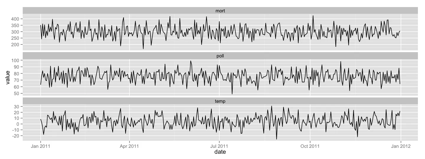
temp<- rnorm(365, 5, 10)
mort<- rnorm(365, 300, 45)
poll<- rpois(365,  lambda=76)
date<-seq(as.Date('2011-01-01'),as.Date('2011-12-31'),by = 1)
df<-data.frame(date,mort,poll,temp)

windows(600,600)
par(mar=c(5, 12, 4, 4) + 0.1)

with(df, {
  plot(date, mort, axes=F, ylim=c(170,max(mort)), xlab="", ylab="",type="l",col="black", main="")
  points(date,mort,pch=20,col="black")
  axis(2, ylim=c(170,max(mort)),col="black",lwd=2)
  mtext(2,text="Mortality",line=2)

})

par(new=T)
plot(date, poll, axes=F, ylim=c(45,max(poll)), xlab="", ylab="", 
     type="l",col="red",lty=2, main="",lwd=1)
axis(2,  ylim=c(45,max(poll)),lwd=1,line=3.5)
points(date, poll,pch=20)
mtext(2,text="PM10",line=5.5)

par(new=T)
plot(date,  temp, axes=F, ylim=c(-28,max(temp)), xlab="", ylab="", 
     type="l",lty=3,col="brown", main="",lwd=1)
axis(2, ylim=c(-28,max(temp)),lwd=1,line=7)

points(date,  temp,pch=20)
mtext(2,text="Temperature",line=9)

axis(1,pretty(range(date),10))
mtext("date",side=1,col="black",line=2)

1
以下是一些旧的答案:https://dev59.com/8GvXa4cB1Zd3GeqPLq0V#13715205 https://dev59.com/zG035IYBdhLWcg3wVuh1#5480489 - bill_080
3个回答

14

这里有六种方法:

library(zoo)
z <- read.zoo(df)

# classic graphics in separate and single plots
plot(z)
plot(z, screen = 1)

# lattice graphics in separate and single plots
library(lattice)
xyplot(z)
xyplot(z, screen = 1)

# ggplot2 graphics in separate and single plots
library(ggplot2)
autoplot(z) + facet_free()
autoplot(z, facet = NULL)

2
不错的例子!谢谢。+1 - Henrik
对于ggplot答案的一些解释将非常有帮助。我在这里得到了相同的时间序列图,按组/季节拆分,而不是一个图中的两个单独的图形。 - FLonLon

10

我有同样的任务,经过一些研究,我发现r中的ts.plot {stats}函数非常有帮助。

该函数的使用方法如下:

    ts.plot(..., gpars = list())

gpars是图形参数,您可以在其中指定绘图的图形组件。

我的数据与此类似,并存储在一个名为time的变量中:

           [,1] [,2]  [,3]  [,4] [,5]  [,6]  [,7]  [,8]   [,9] [,10]
    V3     1951 1100   433  5638 1760  2385  2602 11007   2490   421
    V5      433  880   216  4988  220  8241 13229 18704   6289   421
    V7     4001  440   433  3686  880  9976 12795 21036  13229  1263
    V9     2385 1320   650  8241  440 12795 13229 19518  11711  1474
    V11    4771  880  1084  6723    0 17783 17566 27326  11060   210
    V13    6940  880  2168  2602 1320 21036 16265 10843  15831  1474
    V15    3903 1760  1951  3470    0 18217 14964     0  13663  2465
    V17    4771  440  2819  8458  880 25591 24940  1518  17783  1895
    V19    7807 1760  5205  2385    0 14096 22771 13880  12578  1263
    V21    5205  880  5205  6506  880 28410 18217 13229  19952  1474
    V23    6506 1760  5638  7590  880 14747 26675 11928  12795  1474
    V25    7373  440  5855 10626    0 19301 21470 15398  19952  1895
    V27    5638 2640  6289     0  880 16482 20603 30796  14313  2316
    V29    8241  440  6506  6723  880 11277 35784 25157  23205  4423
    V31    7373 2640  6072  8891  220 17133 27109 31013  27287  4001
    V33    6723  660  5855 14313  660  6940 26892 17566  24111  4844
    V35    9325 2420  9325 12578    0  6506 30796 34483  23422  5476
    V37    4771  440  6872 12361  880  9325 36218 25808  30362  4844
    V39    9976 2640  7658 12361  440 11277 36001 31013  40555  4633
    V41   10410  880  6506 12795  440 26241 33398 27976  24940  5686
    V43    5638 2200  7590 14313    0  9976 34483 29928  33832  6108
    V45   10843  440  8675 11711  440  7807 29278 24940  43375  4633
    V47    8675 1760  8891 13663    0  9108 38386 31230  33398  4633
    V49   10410 1760  9542 13880  440  8675 39051 31446  42507  5476
        .   .   .   .   .   .   .   .   .

我需要为每个列绘制一个时间序列图并将它们叠加在同一幅图中。 代码如下:

    ts.plot(time,gpars= list(col=rainbow(10)))

一张图中显示多个时间序列


8

我会为每个变量使用单独的图形,使它们的y轴不同。我认为这比在一个图形中引入多个y轴更好。我将使用ggplot2来实现这一点,具体来说是使用facetting的概念:

library(ggplot2)
library(reshape2)

df_melt = melt(df, id.vars = 'date')
ggplot(df_melt, aes(x = date, y = value)) + 
    geom_line() + 
    facet_wrap(~ variable, scales = 'free_y', ncol = 1)

enter image description here

请注意,我将这些分面叠放在一起。这样可以轻松比较每个系列中事件的时间。或者,您可以将它们并排放置(使用facet_wrap中的nrow = 1),这样可以轻松比较y值。

我们还可以引入一些极端情况:

df = within(df, {
        temp[61:90] = temp[61:90] + runif(30, 30, 50)
        mort[61:90] = mort[61:90] + runif(30, 300, 500)
    })
df_melt = melt(df, id.vars = 'date')
ggplot(df_melt, aes(x = date, y = value)) + 
    geom_line() + 
    facet_wrap(~ variable, scales = 'free_y', ncol = 1)

显示图片描述

通过上图,您可以轻松看出温度的升高与死亡率的增加有关。


不错的例子!+1!干杯。 - Henrik
@Paul 和 G.Grothendieck,非常感谢您提供的这些优秀示例,它们都非常适合展示我的数据。我将接受 Paul 的答案,因为他是第一个回答的。 - Meso

网页内容由stack overflow 提供, 点击上面的
可以查看英文原文,
原文链接