在时间序列图中标记一段时间。

3

首先,让我们创建一些虚假数据:

d <- c("2019-01-01", "2019-01-02", "2019-01-03", "2019-01-04", "2019-01-03", "2019-04-06", "2019-04-03", "2019-05-07", "2019-05-03", "2019-05-03", "2019-05-03", "2019-05-03", "2019-06-03", "2019-06-03", "2019-06-03", "2019-06-03", "2019-06-03", "2019-06-03", "2019-06-03", "2019-07-03", "2019-07-03", "2019-07-04", "2019-08-03", "2019-09-05", "2019-09-03", "2019-09-03", "2019-09-06", "2019-09-08", "2019-10-03", "2019-11-03", "2019-11-03", "2019-11-03", "2019-11-03", "2019-11-03", "2019-11-03", "2019-12-03", "2019-12-03")

df <- data.frame(dates=as.Date(d))

现在,我创建了一个时间序列图表:
# aggregate data
df_plot <- df %>% mutate(month = lubridate::floor_date(dates, "month")) %>% 
  group_by(month) %>% summarise(count = n())

# plot data
ggplot(aes(x = month, y = count), data = df_plot) + geom_line() +
  scale_x_date() +
  geom_vline(xintercept = as.numeric(as.Date("2019-01-30")), linetype=4)

使用geom_vline(xintercept = as.numeric(as.Date("2019-01-30")), linetype=4),我可以用一条垂直线标记某个日期。是否有可能用彩色框或其他方式标记时间范围(比如从2019-01-30到2019-02-15)?
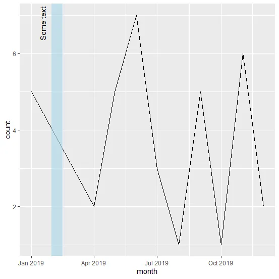

2
http://www.sthda.com/english/wiki/be-awesome-in-ggplot2-a-practical-guide-to-be-highly-effective-r-software-and-data-visualization - 查找 geom_ribbon,其中有一个使用 geom_rect 的示例。 - Jonny Phelps
1个回答

5
使用 geom_rect,并设置 ymin = -Infymax = Inf
xmin <- as.Date("2019-01-30")
xmax <- as.Date("2019-02-15")

ggplot(df_plot, aes(month, count)) + 
  geom_line() +
  scale_x_date() +
  geom_rect(aes(xmin = xmin, xmax = xmax, ymin = -Inf, ymax = Inf, 
    alpha = I(.1), fill  = I("lightblue"))) +
  annotate("text", label = "Some text", x = xmin, y = Inf, angle = 90,
    hjust = 1.1, vjust = -1)

(截图后继续)

screenshot

另一个可能性是创建一个数据框 regimes 来保存边界和标签。这与先前的代码类似,但如果我们需要添加更多的区域,只需向 regimes 添加行即可。
regimes <- data.frame(xmin = as.Date("2019-01-30"),
                      xmax = as.Date("2019-02-15"),
                      label = "Some text")

ggplot(regimes) + 
  geom_line(aes(month, count), df_plot) +
  scale_x_date() +
  geom_rect(aes(xmin = xmin, xmax = xmax, ymin = -Inf, ymax = Inf), 
    alpha = I(.5), fill = I("lightblue")) +
  geom_text(aes(x = xmin, y = Inf, label = label), angle = 90, 
    hjust = 1.1, vjust = -1)

网页内容由stack overflow 提供, 点击上面的
可以查看英文原文,
原文链接