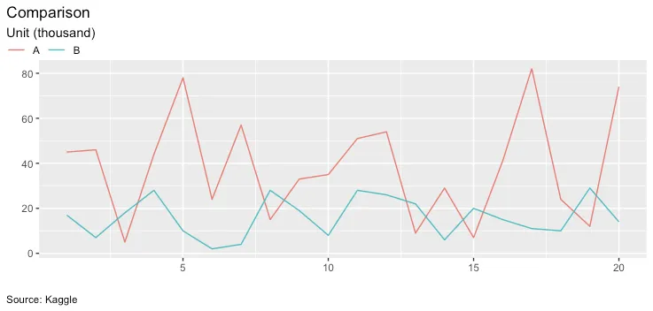
如何将 ggplot2 图表中的图例框移动到最左边并与标题和副标题对齐?

4

我有以下数据和图片设置如下所示

df <- data_frame(group = rep(c("A", "B"), each = 20),
       y = c(sample(1:90, 20, replace = TRUE),
             sample(1:30, 20, replace = TRUE)),
       x = rep(1:20, 2)
       )
ggplot(df, aes(x = x, y = y, color = group))+
   geom_line()+
   labs(x = "", y = "", title = "Comparison", 
     subtitle = "Unit (thousand)", 
     caption = "Source: Kaggle")+
   theme(legend.title = element_blank(), 
     legend.position = "top", 
     legend.justification='left',
     legend.box = "horizontal",
     legend.key = element_blank(),
     legend.box.margin = margin(0,0,0,0,"cm"),
     plot.title.position = "plot",
     plot.caption.position =  "plot",
     plot.caption = element_text(hjust = 0))

并在这里生成图表:

enter image description here

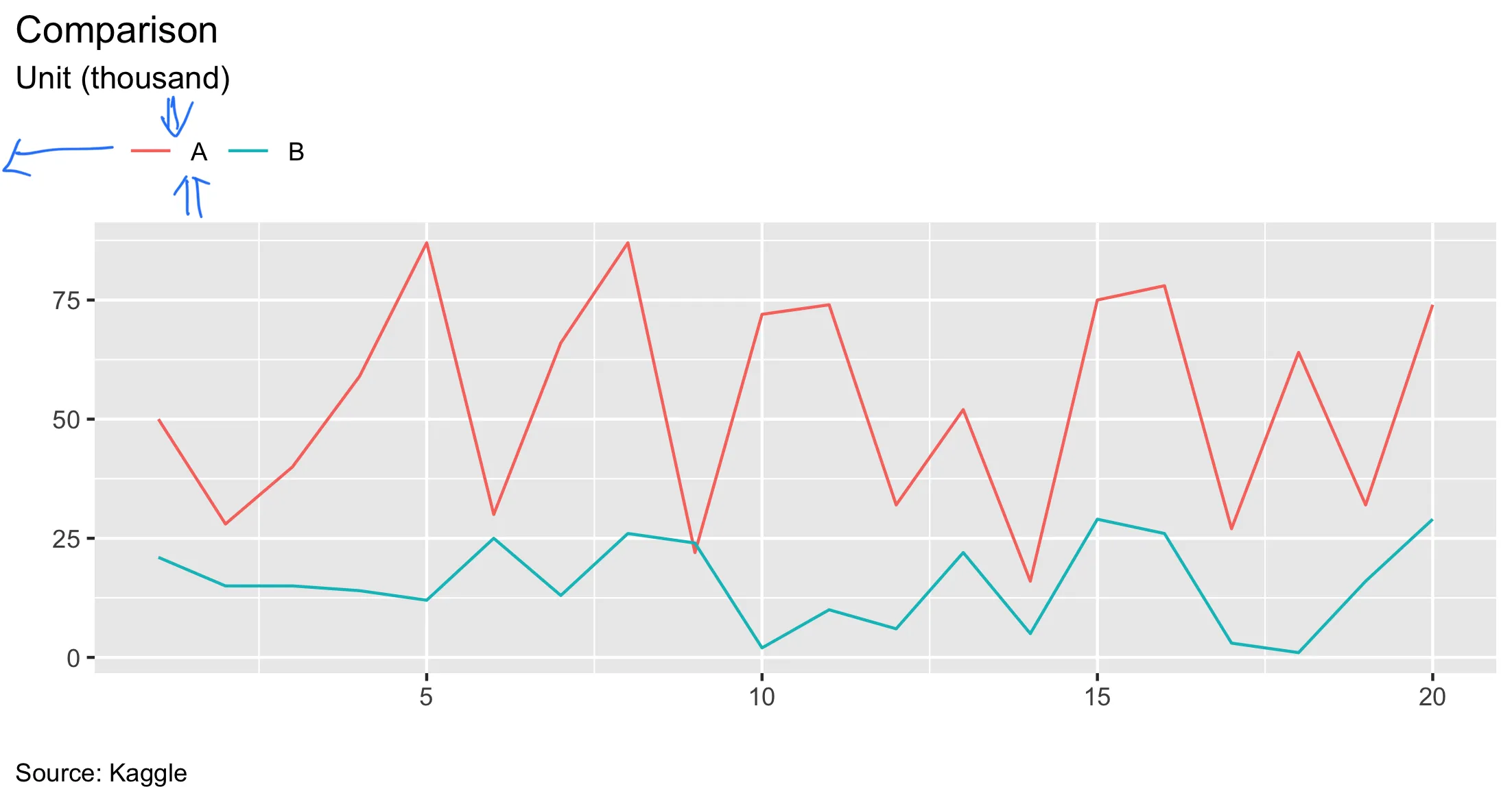
如何将图例框移动到绘图区的最左侧,并与标题和副标题对齐?还必须考虑到legend.key中的边距。

如果您能告诉我如何减少图例周围的空间,我将不胜感激。谢谢!


可能会有所帮助,使用画图或预览准确地确定您要放置图例的位置。 - Ian Campbell
请阅读R Cookbook中关于图例的部分。 - Daniel_j_iii
2个回答

2
这里提供一种手动指定legend.position的方法,并在副标题中添加\n以创建额外的空间。您还需要legend.direction = "horizontal"legend.margin = margin(0)
请注意,由于每个绘图设备略有不同,您可能需要调整legend.position中的数字。
ggplot(df, aes(x = x, y = y, color = group))+
   geom_line()+
   labs(x = "", y = "", title = "Comparison", 
     subtitle = "Unit (thousand)\n", 
     caption = "Source: Kaggle")+
   theme(legend.title = element_blank(), 
     legend.position = c(-0.065,1.05), 
     legend.justification='left',
     legend.box = "horizontal",
     legend.margin = margin(0),
     legend.key = element_blank(),
     legend.direction = "horizontal",
     plot.title.position = "plot",
     plot.caption.position =  "plot",
     plot.caption = element_text(hjust = 0))

enter image description here


谢谢!如果我想将刻度线与标题、副标题和说明对齐怎么办?我已经尝试了几个选项,但迄今为止都没有成功。 - pysy9987

1
这里有另一种方法,我认为您希望图例位于标题/副标题旁边。通过更改绘图边距的方法,您可以获得一些灵活性。您可以使用边距扩大绘图区域并定位图例。
library(ggplot2)

df <- data.frame(group = rep(c("A", "B"), each = 20),
                 y = c(sample(1:90, 20, replace = TRUE),
                       sample(1:30, 20, replace = TRUE)),
                 x = rep(1:20, 2)
)
ggplot(df, aes(x = x, y = y, color = group))+
  geom_line()+
  labs(x = "", y = "", title = "Comparison", 
       subtitle = "Unit (thousand)", 
       caption = "Source: Kaggle")+
  theme(legend.title = element_blank(), 
        legend.position = "top", 
        legend.justification='left',
        legend.box = "horizontal",
        legend.key = element_blank(),
        legend.box.margin = margin(-1,0,0,-2,"cm"),
        plot.margin = unit(c(0, 0, 0, 2), "cm"),
        plot.title = element_text(hjust = 0.2),
        plot.subtitle = element_text(hjust = 0.2),
        plot.caption.position =  "plot",
        plot.caption = element_text(hjust = 0)
        )

2020年06月13日由reprex package (v0.3.0)创建


网页内容由stack overflow 提供, 点击上面的
可以查看英文原文,
原文链接