如何使用CSS制作一个剪切的半圆形(D形)?

3

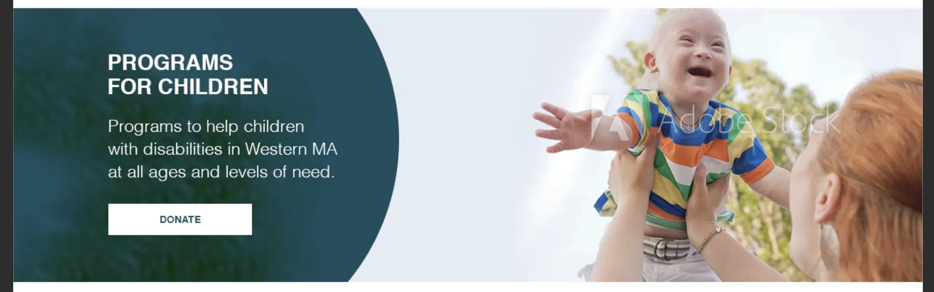
我需要帮助理解clip-path CSS属性,以便制作下面的裁剪圆形版本...

My circle

更像设计版本:

Design circle

如果您能看到灰色背景上的圆圈,当它被裁剪时,我的圆圈会显得更大而且不够圆。我应该怎么做才能让圆圈更加圆润?我想到的方法有:
  1. 像下面代码片段中使用clip-path
  2. 使用伪元素:after或带有半径的右侧边框
  3. 从Photoshop中裁剪一个圆形图像,并将其用作背景图像。
最好避免使用背景图片,但是需要考虑响应式,因为随着调整窗口大小,圆形不能发生大的形状变化。clip-path是否正确?有人可以提供另一种使用CSS的更简单和优雅的解决方案吗?
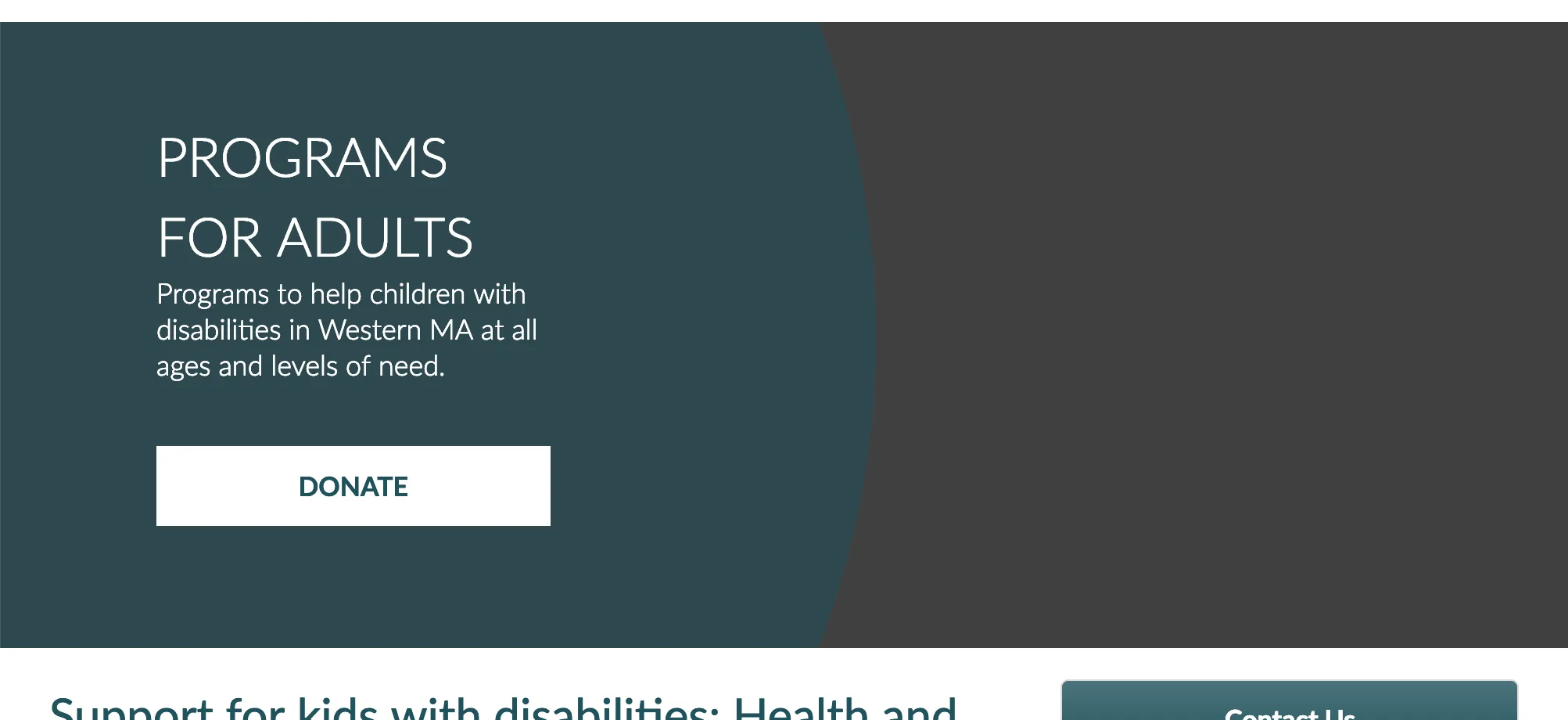
谢谢,下面是我编写的代码片段,说明了如何裁剪“绿/蓝”背景:

.page-banner {
  background: grey;
  width: 100%;
  height: 300px;
  background-position: top;
  overflow: hidden;
}

.page-banner-text {
  position: absolute;
  background: #00525d8a;
  padding-left: 100px;
  width: 60%;

  /* adjustments to snippet */
  top: 10px;
  left: 10px;
  height: 300px;
  
  /* this is the code for circle */
  clip-path: circle(560px at left);
  padding-right: 250px;
}
<div class="page-banner">
  <div class="container">
    <div class="page-banner-text">
      <h1 class="block-title">Programs For Adults</h1>
      <p>Programs to help children with disabilities in Western MA at all ages and levels of need.</p>
      <div id="banner-donate-button"><a href="#" class="" target="_self" title="Donate">DONATE</a></div>
    </div>
  </div>
</div>


1
为什么要使用剪辑(clip),而不是使用带有边框半径和不透明背景的adiv? - Pete
这里有一个类似的问题,可以获取一些想法:https://dev59.com/y1UL5IYBdhLWcg3wYXF8 - Temani Afif
访问 https://bennettfeely.com/clippy/,制作自己的剪贴路径是最好的方式,它具有响应性。 - Hammad tariq
3个回答

5
对于想要使用clip-path属性解决问题的任何人,你可以通过ellipse剪裁路径获得更多控制。使用原帖提供的代码,将圆替换为椭圆,并切换到百分比以实现更好的响应式效果。 clip-path:ellipse(67% 100% at 8% 50%); 前两个数字表示椭圆的高度和宽度。第一个数字越大,可见区域就越宽。第二个数字越大,高度就越高。我们的目标是D形状,所以通过调整第一个数字,我们可以使D更或者更不明显。
这就是第二组数值——定位所起作用的地方。at 50% 50%使其居中。通过调整第一个数字,即X位置,我们可以将其移到需要的位置。调整数值后,您应该能够完全按照您的意愿来获取D形状。

.page-banner {
  background: grey;
  width: 100%;
  height: 300px;
  background-position: top;
  overflow: hidden;
}

.page-banner-text {
  position: absolute;
  background: #00525d8a;
  padding-left: 100px;
  width: 60%;

  /* adjustments to snippet */
  top: 10px;
  left: 10px;
  height: 300px;
  
  /* this is the code for circle */
  clip-path: ellipse(67% 100% at 8% 50%);
  padding-right: 250px;
}
<div class="page-banner">
  <div class="container">
    <div class="page-banner-text">
      <h1 class="block-title">Programs For Adults</h1>
      <p>Programs to help children with disabilities in Western MA at all ages and levels of need.</p>
      <div id="banner-donate-button"><a href="#" class="" target="_self" title="Donate">DONATE</a></div>
    </div>
  </div>
</div>


4

根据我的评论,不要使用剪切路径来创建您的 D(这在浏览器中支持得不是很好),为什么不在您的 div 上使用边框半径呢。

* {
  box-sizing: border-box;
}

.page-banner {
  position: relative;
  background: url(https://www.fillmurray.com/300/900) center center no-repeat;
  background-size: cover;
  width: 100%;
  overflow: hidden;         /* hide overflowing bits of circle */
  min-height: 300px;        /* just give enough height to fit text at smallest screen width size */
}

.circle {
  background-color: rgba(50, 108, 116, 0.9);   /* use rgba for transparent effect */
  color: white;
  transform: translate(-50%, -50%);            /* move the circle left 50% of it's own width and up 50% of it's own height */
  border-radius: 50%;
  padding-top: 100%;                           /* this gives us a responsive square */
  position: absolute;
  top:50%;                                     /* this vertically centers the circle */
  left:0;
  width:100%;
  min-width:600px;                              /* this is the miniimum dimensions to allow circle to fill smaller screens */
  min-height:600px;
}

.page-banner-text {
  position: absolute;                           /* just positions the text on the right of the cirecle */
  left: 50%;
  top: 50%;
  transform: translateY(-50%);
  padding:2em;
  width:40%;
}
<div class="page-banner">
  <div class="circle">
    <div class="page-banner-text">
      <h1 class="block-title">Programs For Adults</h1>
      <p>Programs to help children with disabilities in Western MA at all ages and levels of need.</p>
      <div id="banner-donate-button"><a href="#" class="" target="_self" title="Donate">DONATE</a></div>
    </div>
  </div>
</div>

在响应式设计中唯一的问题就是随着屏幕变宽,D会变得更扁平(因为半径增加),但您可以通过向圆形DIV添加最大宽度和高度来解决这个问题。

-1

您可以简单地使用:

  • 内部圆形元素,通过将 border-radius 设置为元素 heightwidth 的一半来实现
  • 通过设置负值的 topleft 来实现 position: relative
  • 在外部边界框内,通过 overflow: hidden 进行剪裁

一个简单的实现:

#container {
  height: 300px;
  width: 100%;
  background-color: gray;
  overflow: hidden;
}

#circle {
  height: 600px;
  width: 600px;
  background-color: rgba(0, 0, 255, 0.5);
  
  position: relative;
  top: -150px;
  left: -375px;
}
<div id="container">
    <div id="circle"></div>
</div>


网页内容由stack overflow 提供, 点击上面的
可以查看英文原文,
原文链接