如何制作带箭头形侧边的 div,而不使用 CSS 边框技巧?

4
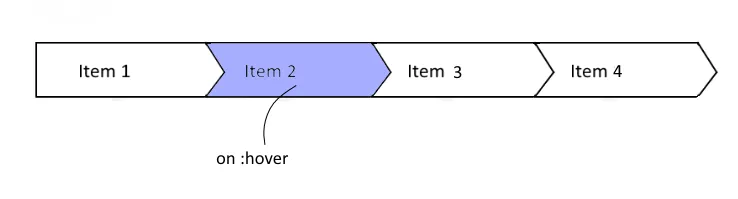
我想制作一个菜单导航栏,其中包含多个inline-block的li元素,每个元素必须右侧带有箭头。就像这样: my dream menu aww 我在Google上搜索了一下,最常见的答案是使用带透明边框的CSS技巧。就像这个例子: http://jsfiddle.net/jx99z/5/ HTML:
<div class="text">Some Text<span class="arrow"></span></div>

CSS:

.text {
    background-color:#ff0000;
    color:#fff;
    display:inline-block;
    padding-left:4px;
}
.arrow {
    border-style: dashed;
    border-color: transparent;
    border-width: 0.20em;
    display: -moz-inline-box;
    display: inline-block;
    /* Use font-size to control the size of the arrow. */
    font-size: 100px;
    height: 0;
    line-height: 0;
    position: relative;
    vertical-align: middle;
    width: 0;
    background-color:#fff; /* change background color acc to bg color */ 
    border-left-width: 0.2em;
    border-left-style: solid;
    border-left-color: #ff0000;
    left:0.25em;
}

这看起来还不错,但是当我尝试使用:hover添加其他元素时,它们的外观和行为就不正常了:http://jsfiddle.net/txayr2j6/

HTML:

<div class="text">Some Text<span class="arrow"></span></div>

CSS:

.text {
    background-color:#ff0000;
    color:#fff;
    display:inline-block;
    padding-left:4px;
}
.arrow {
    border-style: dashed;
    border-color: transparent;
    border-width: 0.20em;
    display: -moz-inline-box;
    display: inline-block;
    /* Use font-size to control the size of the arrow. */
    font-size: 100px;
    height: 0;
    line-height: 0;
    position: relative;
    vertical-align: middle;
    width: 0;
    background-color:#fff; /* change background color acc to bg color */ 
    border-left-width: 0.2em;
    border-left-style: solid;
    border-left-color: #ff0000;
    left:0.25em;
}
.text:hover {
    background-color:#ccc;
    border-left-color: #ccc;
}

我发现另一个解决方法是,我可以使用SVG(可缩放矢量图形)绘制任何元素,类似于这样:http://codepen.io/anon/pen/OXWoXd

HTML:

<svg xmlns="http://www.w3.org/2000/svg" version="1.1">
  <polygon points="
    0,0 
    0,200
    270,200
    300,100
    270,0
    150,0
    " />
<div>Item 1</div>
</svg>

CSS:

svg polygon {
    fill: transparent;
    stroke: black;
    stroke-width: 2px;
}

svg {
    background-color: #ccc;
    height: 50%; 
}

body, html {
    height: 100%;
    margin: .2em; 
}

但那个解决方案更加糟糕:我无论如何都不能让元素变得大于300像素,还有那些丑陋的边框和背景。此外,我希望那个条可以响应式。谢谢!


使用图像可能更好。 - user6360214
3个回答

5

使用SVG在HTML中创建形状非常棒

使用多边形元素来创建形状。
使用文本元素来描述链接。
使用链接元素来创建链接。

#arrow-menu a polygon {
  fill: #888;
  stroke: #222;
}
#arrow-menu a:hover polygon {
  stroke: #222;
  fill: black;
}
#arrow-menu a:hover text {
  fill: cornflowerblue;
}
#arrow-menu a {
  font-size: 5px;
}
<svg id="arrow-menu" viewBox="-1 -1 112 22" xmlns:xlink="http://www.w3.org/1999/xlink">
  <a xlink:href="#">
    <polygon points="0,0 20,0 25,10 20,20 0,20 0,0"></polygon>
    <text x="1.5" y="11.5">Menu link</text>
  </a>
  <a xlink:href="#">
    <polygon transform="translate(22)" points="0,0 20,0 25,10 20,20 0,20 5,10 0,0"></polygon>
  </a>
  <a xlink:href="#">
    <polygon transform="translate(44)" points="0,0 20,0 25,10 20,20 0,20 5,10 0,0"></polygon>
  </a>
  <a xlink:href="#">
    <polygon transform="translate(66)" points="0,0 20,0 25,10 20,20 0,20 5,10 0,0"></polygon>
  </a>
</svg>


哇..太棒了!我知道,一定有正确的方法来做到这一点。你可能会讨厌我,但是也许你可以提示我如何将这个构造放入WordPress菜单中?认真提问。 - Artur Miller
我为此做了一些搜索,似乎WordPress没有插件可以添加自定义svg菜单。因此,您唯一的选择是在文件home.php中编辑此菜单,如果您对php代码不是110%确定,则不建议这样做。 - Persijn
@ArturMiller,我可以建议您考虑选择这个优秀的解决方案作为被接受的方案吗? - Asons
@LGSon,也许你是对的,我应该这样做。虽然我非常感激第一个解决方案,并且我已经在我的网站上成功使用它。 - Artur Miller
@ArturMiller SO不是关于问题的最佳解决方案,而是第一个有效的解决方案。 - Persijn

3

您是在寻找这个吗?它是用beforeafter制作的,Fiddle展示了实现过程。

使用CSS比使用图像更好。


这正是我所需要的!需要进行一些响应式的更改,但它完美地工作着!感谢你,伙计! - Artur Miller

0

非常有趣的问题。我认为最好使用图片,因为您希望鼠标悬停事件起作用,同时,在边界处点击存在问题。这是设计与事件的完整实现:

<!DOCTYPE html>
<html>
    <head>
        <style type="text/css">
            .text {
                background-color: rgb(237, 28, 36);
                color:white;
                padding-left:4px;
                height: 30px;
                padding-top: 10px;
            }
        </style>
        <script type="text/javascript">
            function mouseoverText(index) {
                var images = document.querySelectorAll(".image");
                var currentText = document.querySelectorAll(".text")[index];
                currentText.style["background-color"] = "white";
                currentText.style["color"] = "red";
                images[index].src = ((images.length - 1 === index) ? "white-white" : "white-red") + "-arrow.png";
                if (index > 0) {
                    images[index - 1].src = "red-white-arrow.png";
                }
            }

            function mouseoutText(index) {
                var currentText = document.querySelectorAll(".text")[index];
                currentText.style["background-color"] = "rgb(237, 28, 36)";
                currentText.style["color"] = "white";
                var images = document.querySelectorAll(".image");
                if (index >= 0) {
                    images[index].src = ((images.length - 1 === index) ? "red-white" : "red-red") + "-arrow.png";
                    if (index > 0) {
                        images[index - 1].src = "red-red-arrow.png";
                    }
                }
            }

            var lastIndex = -1;

            function mouseoverArrow(event, index) {
                if (!!event) {
                    var x = event.offsetX;
                    var y = event.offsetY;
                    var height = 40;
                    if (((y < height / 2) && (x > y)) || ((y >= height / 2) && (x > (height - y)))) {
                        mouseoverArrow(null, index + 1);
                        return;
                    }
                }
                if (lastIndex !== -1) {
                    mouseoutArrow();
                    lastIndex = -1;
                }
                lastIndex = index;
                var texts = document.querySelectorAll(".text");
                if (index === texts.length) {
                    return;
                }
                texts[index].style["background-color"] = "white";
                texts[index].style.color = "red";
                mouseoverText(index);
            }

            function mouseoutArrow() {
                if (lastIndex < 0) {
                    return;
                }
                var texts = document.querySelectorAll(".text");
                if (lastIndex >= texts.length) {
                    return;
                }
                texts[lastIndex].style.color = "white";
                texts[lastIndex].style["background-color"] = "rgb(237, 28, 36)";
                mouseoutText(lastIndex);
                lastIndex = -1;
            }

            function clk(index) {
                console.log("Element " + (lastIndex === -1 ? index : lastIndex) + " was clicked");
            }
        </script>
    </head>
    <body>
        <div style="display: inline-flex;">
            <div class="text" onmousemove="mouseoverText(0);" onmouseout="mouseoutText(0);" onclick="clk(0);">Some Text</div>
            <img class="image" src="red-red-arrow.png" onmousemove="mouseoverArrow(event, 0);" onmouseout="mouseoutArrow();" onclick="clk();" />
            <div class="text" onmousemove="mouseoverText(1);" onmouseout="mouseoutText(1);" onclick="clk(1);">Some Text</div>
            <img class="image" src="red-red-arrow.png" onmousemove="mouseoverArrow(event, 1);" onmouseout="mouseoutArrow();" onclick="clk();" />
            <div class="text" onmousemove="mouseoverText(2);" onmouseout="mouseoutText(2);" onclick="clk(2);">Some Text</div>
            <img class="image" src="red-white-arrow.png" onmousemove="mouseoverArrow(event, 2);" onmouseout="mouseoutArrow();" onclick="clk();" />
        </div>
    </body>
</html>

我也附上了有用的图片:

enter image description here enter image description here enter image description here enter image description here


网页内容由stack overflow 提供, 点击上面的
可以查看英文原文,
原文链接