如何在R中的线性判别分析图上绘制分类边界

3
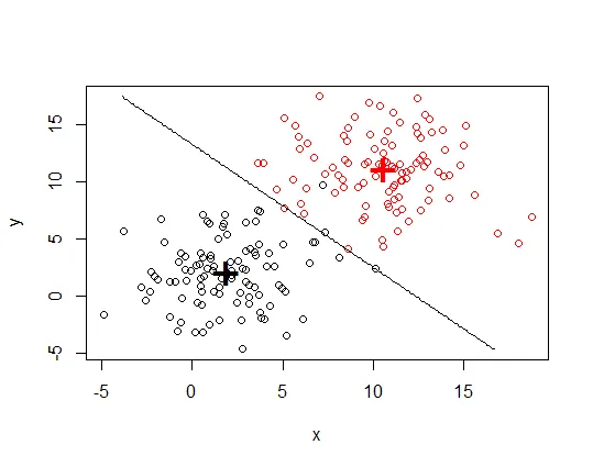
我使用线性判别分析(LDA)来研究一组变量在区分3组方面的效果。然后我使用 
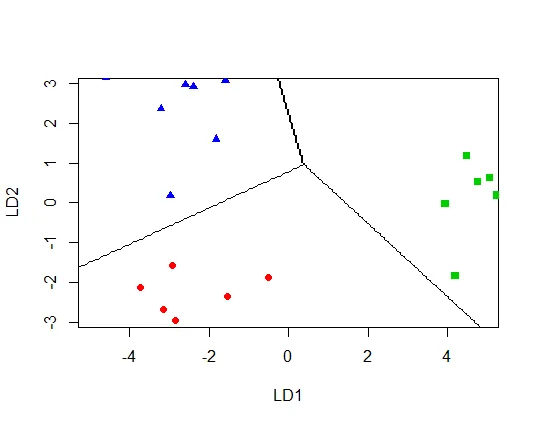
plot.lda() 函数将我的数据绘制在两个线性判别分析图上(LD1 在x轴上,LD2 在y轴上)。现在我想将LDA的分类边界添加到图中,但我没有看到函数中允许这样做的参数。虽然 partimat() 函数允许可视化LD分类边界,但在此情况下,变量用作x和y轴,而不是线性判别分析图。如何向 plot.lda 添加分类边界的任何建议都将不胜感激。以下是一些示例代码:
library(MASS)

# LDA
t.lda = lda(Group ~ Var1 + Var2, data=mydata, 
                na.action="na.omit", CV=TRUE) 

# Scatter plot using the two discriminant dimensions 
plot(t.lda, 
     panel = function(x, y, ...) { points(x, y, ...) },
     col = c(4,2,3)[factor(mydata$Group)], 
     pch = c(17,19,15)[factor(mydata$Group)],
     ylim=c(-3,3), xlim=c(-5,5))

以下是一些示例数据(3组,2个变量):
> dput(mydata)
structure(list(Group = c("a", "a", "a", "a", "a", "a", "a", "a", 
"b", "b", "b", "b", "b", "b", "b", "b", "c", "c", "c", "c", "c", 
"c", "c", "c"), Var1 = c(7.5, 6.9, 6.5, 7.3, 8.1, 8, 7.4, 7.8, 
8.3, 8.7, 8.9, 9.3, 8.5, 9.6, 9.8, 9.7, 11.2, 10.9, 11.5, 12, 
11, 11.6, 11.7, 11.3), Var2 = c(-6.5, -6.2, -6.7, -6.9, -7.1, 
-8, -6.5, -6.3, -9.3, -9.5, -9.6, -9.1, -8.9, -8.7, -9.9, -10, 
-6.7, -6.4, -6.8, -6.1, -7.1, -8, -6.9, -6.6)), .Names = c("Group", 
"Var1", "Var2"), class = "data.frame", row.names = c(NA, -24L
))

> head(mydata)

  Group Var1 Var2
1     a  7.5 -6.5
2     a  6.9 -6.2
3     a  6.5 -6.7
4     a  7.3 -6.9
5     a  8.1 -7.1
6     a  8.0 -8.0

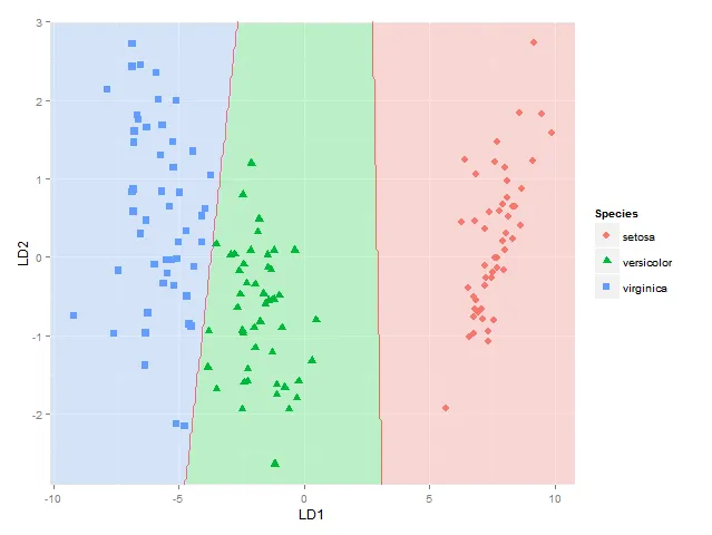
编辑:在Roman的答案之后,我试图修改代码以在线性判别比例尺上绘制分类边界(这是我想要实现的),而不是在原始变量的比例尺上绘制。然而,边界没有停留在它应该停留的地方。如果您对我在这里做错了什么有任何建议,将不胜感激:

#create new data
np = 300
nd.x = seq(from = min(mydata$Var1), to = max(mydata$Var1), length.out = np)
nd.y = seq(from = min(mydata$Var2), to = max(mydata$Var2), length.out = np)
nd = expand.grid(Var1 = nd.x, Var2 = nd.y)

#run lda and predict using new data
new.lda = lda(Group ~ Var1 + Var2, data=mydata) 
prd = as.numeric(predict(new.lda, newdata = nd)$class)

#create LD sequences from min - max values 
p = predict(new.lda, newdata= nd)
p.x = seq(from = min(p$x[,1]), to = max(p$x[,1]), length.out = np) #LD1 scores
p.y = seq(from = min(p$x[,2]), to = max(p$x[,2]), length.out = np) #LD2 scores

#create original plot 
quartz()
plot(t.lda, panel = function(x, y, ...) { points(x, y, ...) },
     col = c(4,2,3)[factor(mydata$Group)], 
     pch = c(17,19,15)[factor(mydata$Group)],
     ylim=c(-3,3), xlim=c(-5,5))

#add classification border on scale of linear discriminants (NOTE: this step currently doesn't work)
contour(x = p.x, y = p.y, z = matrix(prd, nrow = np, ncol = np), 
         levels = c(1, 2, 3), add = TRUE, drawlabels = FALSE)

你也可以在这里查看 ggplot2 的解决方案。链接 - Tom Wenseleers
2个回答

4

我根据这里的示例修改了我的代码。

require(MASS)

# generate data
set.seed(357)
Ng <- 100 # number of cases per group
group.a.x <- rnorm(n = Ng, mean = 2, sd = 3)
group.a.y <- rnorm(n = Ng, mean = 2, sd = 3)

group.b.x <- rnorm(n = Ng, mean = 11, sd = 3)
group.b.y <- rnorm(n = Ng, mean = 11, sd = 3)

group.a <- data.frame(x = group.a.x, y = group.a.y, group = "A")
group.b <- data.frame(x = group.b.x, y = group.b.y, group = "B")

my.xy <- rbind(group.a, group.b)

# construct the model
mdl <- lda(group ~ x + y, data = my.xy)

# draw discrimination line
np <- 300
nd.x <- seq(from = min(my.xy$x), to = max(my.xy$x), length.out = np)
nd.y <- seq(from = min(my.xy$y), to = max(my.xy$y), length.out = np)
nd <- expand.grid(x = nd.x, y = nd.y)

prd <- as.numeric(predict(mdl, newdata = nd)$class)

plot(my.xy[, 1:2], col = my.xy$group)
points(mdl$means, pch = "+", cex = 3, col = c("black", "red"))
contour(x = nd.x, y = nd.y, z = matrix(prd, nrow = np, ncol = np), 
        levels = c(1, 2), add = TRUE, drawlabels = FALSE)

图像描述

编辑

如果我尝试

library(MASS)

mydata <- structure(list(Group = c("a", "a", "a", "a", "a", "a", "a", "a", 
                                   "b", "b", "b", "b", "b", "b", "b", "b", "c", "c", "c", "c", "c", 
                                   "c", "c", "c"), Var1 = c(7.5, 6.9, 6.5, 7.3, 8.1, 8, 7.4, 7.8, 
                                                            8.3, 8.7, 8.9, 9.3, 8.5, 9.6, 9.8, 9.7, 11.2, 10.9, 11.5, 12, 
                                                            11, 11.6, 11.7, 11.3), Var2 = c(-6.5, -6.2, -6.7, -6.9, -7.1, 
                                                                                            -8, -6.5, -6.3, -9.3, -9.5, -9.6, -9.1, -8.9, -8.7, -9.9, -10, 
                                                                                            -6.7, -6.4, -6.8, -6.1, -7.1, -8, -6.9, -6.6)), .Names = c("Group", 
                                                                                                                                                       "Var1", "Var2"), class = "data.frame", row.names = c(NA, -24L
                                                                                                                                                   ))

np <- 300    

nd.x = seq(from = min(mydata$Var1), to = max(mydata$Var1), length.out = np)
nd.y = seq(from = min(mydata$Var2), to = max(mydata$Var2), length.out = np)
nd = expand.grid(Var1 = nd.x, Var2 = nd.y)

#run lda and predict using new data
new.lda = lda(Group ~ Var1 + Var2, data=mydata) 
prd = as.numeric(predict(new.lda, newdata = nd)$class)

#create LD sequences from min - max values 
p = predict(new.lda, newdata= nd)
p.x = seq(from = min(p$x[,1]), to = max(p$x[,1]), length.out = np) #LD1 scores
p.y = seq(from = min(p$x[,2]), to = max(p$x[,2]), length.out = np) #LD2 scores

# notice I don't use t.lda for first variable
plot(new.lda, panel = function(x, y, ...) { points(x, y, ...) },
     col = c(4,2,3)[factor(mydata$Group)], 
     pch = c(17,19,15)[factor(mydata$Group)],
     ylim=c(-3,3), xlim=c(-5,5))

contour(x = p.x, y = p.y, z = matrix(prd, nrow = np, ncol = np), 
        levels = c(1, 2, 3), add = TRUE, drawlabels = FALSE)

我明白了。

这里输入图片描述


@ Roman:谢谢你的回答。我有点困惑于生成的数据如何输入到图形中(即plot.lda()函数在y轴和x轴上绘制LD1和LD2分数),但我的想法是你的代码绘制了原始变量值?是否有一种方法来绘制LD分数呢?我尝试用LD分数补充生成的数据,但无法使其正常工作。现在,我已经添加了一些带有3个组的示例数据,以使事情更具可转移性。非常感谢您的帮助! - jjulip
@ Roman:我现在已经尝试修改您的代码,以便在线性判别分析得分图上绘制分类边界(这是我想要实现的)。任何建议都将不胜感激! - jjulip
@jjulip 如果这是你要找的,请看我的编辑? - Roman Luštrik
@ Roman:谢谢!这很奇怪。它可以处理上面的简单示例,但无法处理我的大型数据集。我肯定是在数据方面漏了什么!谢谢。 - jjulip

3

这里还有一种使用 ggplot2 的方法:

library(MASS)
library(ggplot2)
fit <- lda(Species ~ ., data = iris, prior = rep(1, 3)/3)
datPred <- data.frame(Species=predict(fit)$class,predict(fit)$x)
#Create decision boundaries
fit2 <- lda(Species ~ LD1 + LD2, data=datPred, prior = rep(1, 3)/3)
ld1lim <- expand_range(c(min(datPred$LD1),max(datPred$LD1)),mul=0.05)
ld2lim <- expand_range(c(min(datPred$LD2),max(datPred$LD2)),mul=0.05)
ld1 <- seq(ld1lim[[1]], ld1lim[[2]], length.out=300)
ld2 <- seq(ld2lim[[1]], ld1lim[[2]], length.out=300)
newdat <- expand.grid(list(LD1=ld1,LD2=ld2))
preds <-predict(fit2,newdata=newdat)
predclass <- preds$class
postprob <- preds$posterior
df <- data.frame(x=newdat$LD1, y=newdat$LD2, class=predclass)
df$classnum <- as.numeric(df$class)
df <- cbind(df,postprob)
head(df)

           x        y     class classnum       setosa   versicolor virginica
1 -10.122541 -2.91246 virginica        3 5.417906e-66 1.805470e-10         1
2 -10.052563 -2.91246 virginica        3 1.428691e-65 2.418658e-10         1
3  -9.982585 -2.91246 virginica        3 3.767428e-65 3.240102e-10         1
4  -9.912606 -2.91246 virginica        3 9.934630e-65 4.340531e-10         1
5  -9.842628 -2.91246 virginica        3 2.619741e-64 5.814697e-10         1
6  -9.772650 -2.91246 virginica        3 6.908204e-64 7.789531e-10         1

colorfun <- function(n,l=65,c=100) { hues = seq(15, 375, length=n+1); hcl(h=hues, l=l, c=c)[1:n] } # default ggplot2 colours
colors <- colorfun(3)
colorslight <- colorfun(3,l=90,c=50)
ggplot(datPred, aes(x=LD1, y=LD2) ) +
    geom_raster(data=df, aes(x=x, y=y, fill = factor(class)),alpha=0.7,show_guide=FALSE) +
    geom_contour(data=df, aes(x=x, y=y, z=classnum), colour="red2", alpha=0.5, breaks=c(1.5,2.5)) +
    geom_point(data = datPred, size = 3, aes(pch = Species,  colour=Species)) +
    scale_x_continuous(limits = ld1lim, expand=c(0,0)) +
    scale_y_continuous(limits = ld2lim, expand=c(0,0)) +
    scale_fill_manual(values=colorslight,guide=F)

enter image description here

这种使用等高线/分界线在1.5和2.5处显示分类边界的方法并不总是正确的。对于物种1和2以及物种2和3之间的边界是正确的,但如果物种1区域紧邻物种3,则会出现两个边界,可能需要使用这里的方法,将每个物种对之间的边界分别考虑。


网页内容由stack overflow 提供, 点击上面的
可以查看英文原文,
原文链接