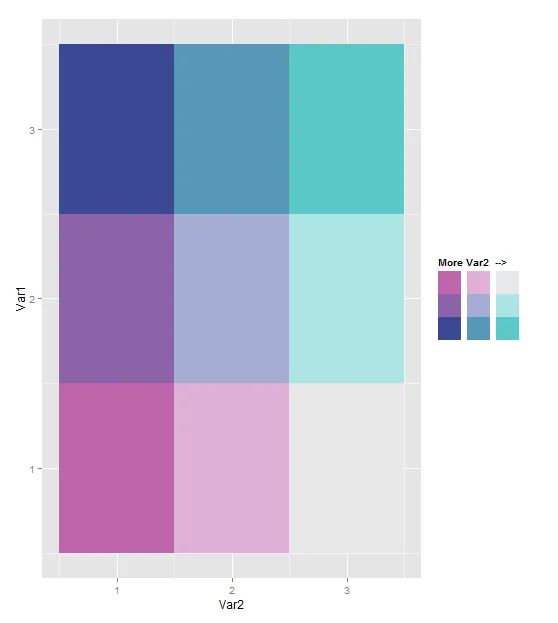
library(ggplot2)
library(reshape2)
bvColors=c("#be64ac","#8c62aa","#3b4994","#dfb0d6","#a5add3","#5698b9","#e8e8e8","#ace4e4","#5ac8c8")
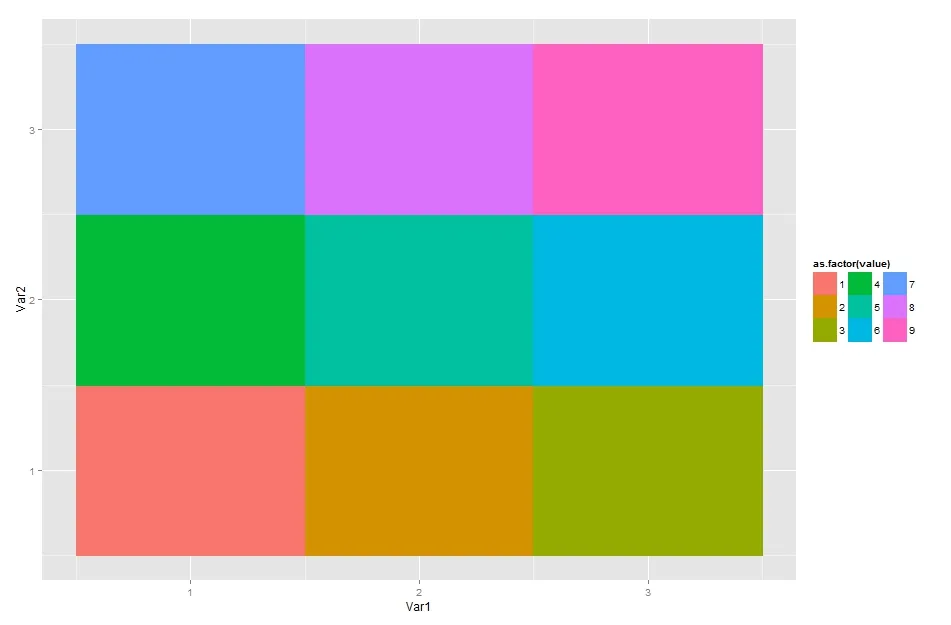
melt(matrix(1:9,nrow=3))
legendGoal=melt(matrix(1:9,nrow=3))
test<-ggplot(legendGoal, aes(Var2,Var1,fill = as.factor(value)))+ geom_tile()
test<- test + scale_fill_manual(name="More Var2 -->",values=bvColors,drop=FALSE)
test<-test+guides(fill = guide_legend(nrow = 3))
test<-test + theme(legend.text=element_blank())
test
唯一的问题是如何在图例侧面添加垂直文本 "More Var1 -->。" 这里有一个丑陋的方法:
test<-ggplot(legendGoal, aes(Var2,Var1,fill = as.factor(value)))+ geom_tile()
test<- test + scale_fill_manual(name="More Var2 -->",values=bvColors,labels=c("","","","","","","More","Var 1"," v "))
test<-test+guides(fill = guide_legend(nrow = 3))
test
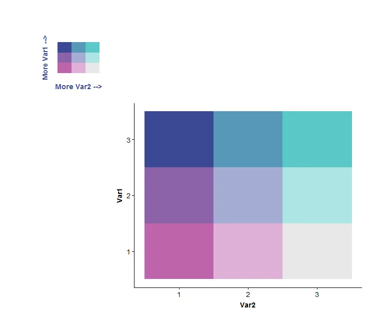
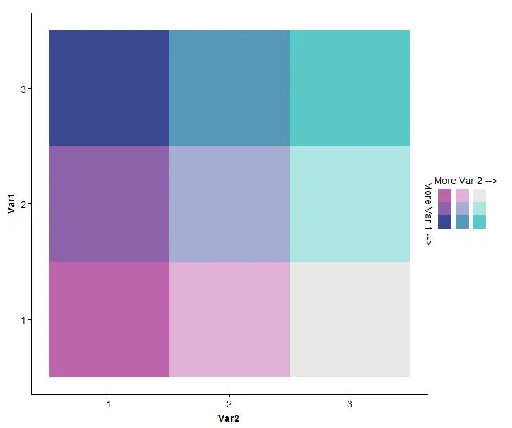
然而,正如zx所展示的那样,使用cowplot包扩展ggplot2是完整的解决方案:
library(ggplot2)
library(cowplot)
library(reshape2)
bvColors=c("#be64ac","#8c62aa","#3b4994","#dfb0d6","#a5add3","#5698b9","#e8e8e8","#ace4e4","#5ac8c8")
melt(matrix(1:9,nrow=3))
legendGoal=melt(matrix(1:9,nrow=3))
test<-ggplot(legendGoal, aes(Var2,Var1,fill = as.factor(value)))+ geom_tile()
test<- test + scale_fill_manual(name="",values=bvColors)
test<-test+guides(fill = guide_legend(nrow = 3))
test<-test + theme(legend.text=element_blank())
test<-ggdraw(test) + draw_text(text = "More Var 2 -->",x=0.91,y=0.58)
test<-ggdraw(test) + draw_text(text = "More Var 1 -->",x=0.84,y=0.5,angle=270)
test
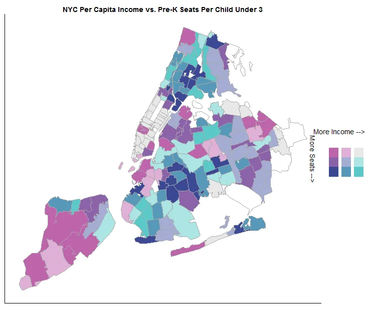
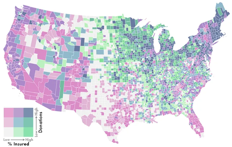
仅供娱乐,这是我用这种技术制作的地图: