我有一个输入文件file1.txt:
V1          V2      Score
rs4939134   SIFT    1
rs4939134   Polyphen2   0
rs4939134   MutationAssessor    -1.75
rs151252290 SIFT    0.101
rs151252290 Polyphen2   0.128
rs151252290 MutationAssessor    1.735
rs12364724  SIFT    0
rs12364724  Polyphen2   0.926
rs12364724  MutationAssessor    1.75
rs34448143  SIFT    0.005
rs34448143  Polyphen2   0.194
rs34448143  MutationAssessor    0.205
rs115694714 SIFT    0.007
rs115694714 Polyphen2   1
rs115694714 MutationAssessor    0.895
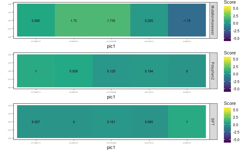
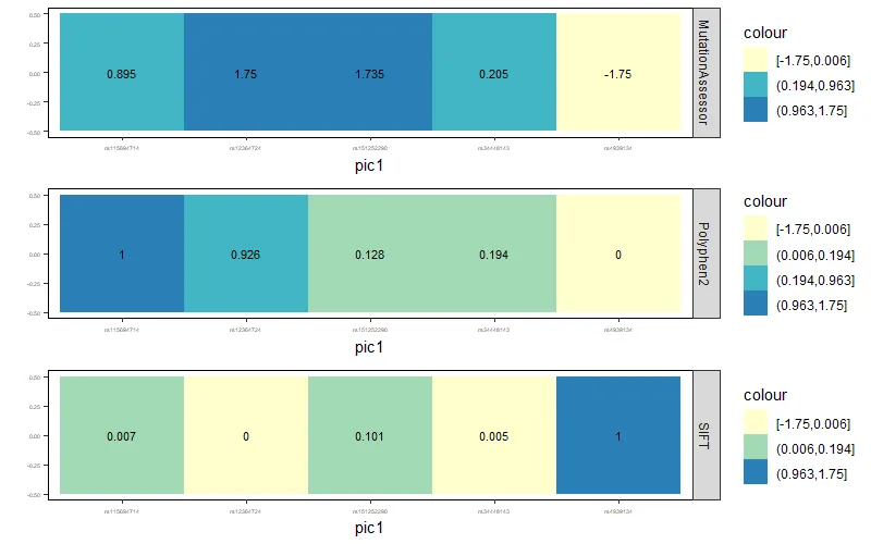
这是我用R语言绘制热图的代码:
library(ggplot2)

mydata <- read.table("file7.txt", header = FALSE, sep = "\t")
names(mydata) <- c("V1", "V2", "Score")

ggplot(data = mydata, aes(x = V1, y = V2, fill = Score)) +
  geom_tile() +
  geom_text(aes(V1, V2, label = Score), color = "black", size = 3) +
  scale_fill_continuous(type = "viridis", limits = c(-5.76, 5.37)) +
  labs(x = "pic1", y = "") +
  theme_bw()
  theme(panel.border = element_rect(colour = "black"),
        panel.grid.major = element_blank(),
        panel.grid.minor = element_blank(),
        axis.line = element_line(colour = "black"),
        axis.text = element_text(size = 4))
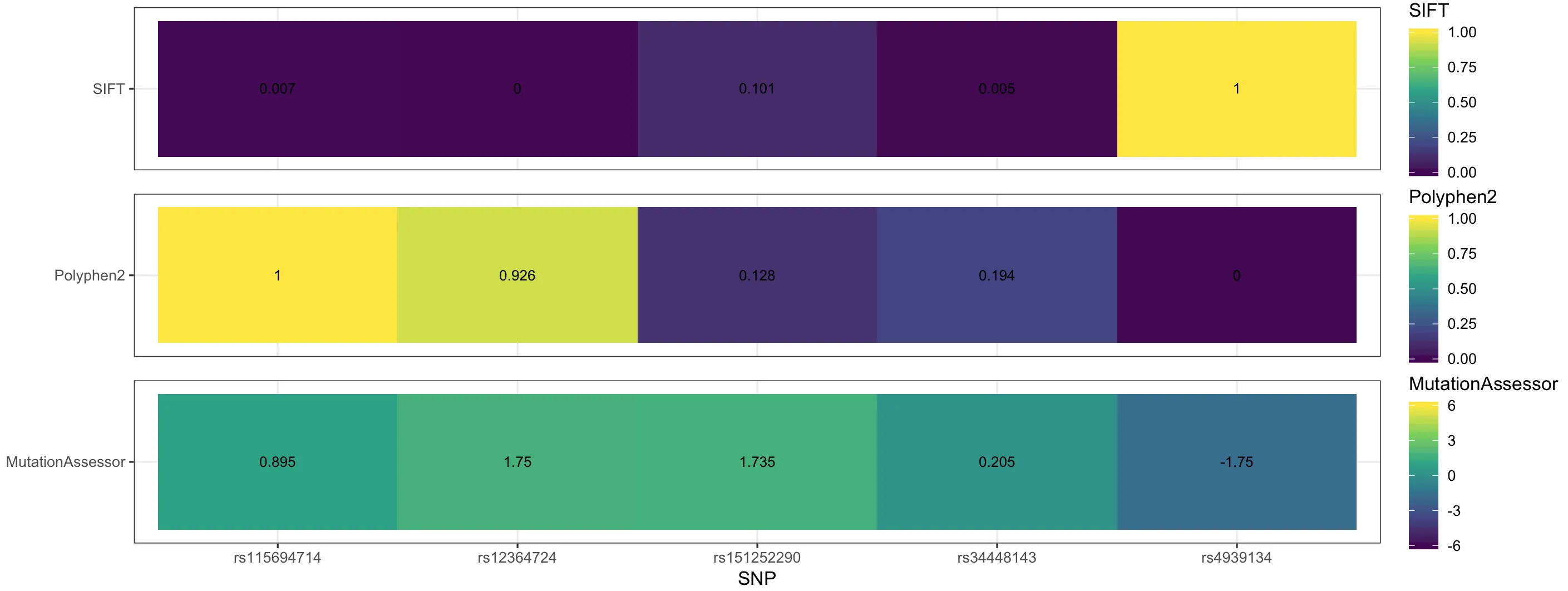
这是我得到的图:
我需要为每一行(V2 中的每个类型)放置一个代表的图例,因此最终将会有3个图例,分别代表SIFT、Polyphen和MutationAssessor,并且它们具有不同的范围,我可以指定。
例如:SIFT 范围为 (0,1), Polyphen 范围为 (0,1), MutationAssessor 范围为 (-6,6)。
我尝试了之前提出的问题的不同方法,但都没有成功。
感谢任何帮助。