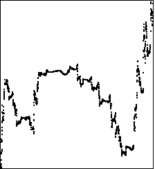
我希望在Python中生成这个:
http://classes.yale.edu/fractals/RandFrac/Market/TradingTime/Example1/Example1.html
但是我对这个概念非常困惑,也很陌生。有人知道这方面的库或者代码片段吗?
我希望在Python中生成这个:
http://classes.yale.edu/fractals/RandFrac/Market/TradingTime/Example1/Example1.html
但是我对这个概念非常困惑,也很陌生。有人知道这方面的库或者代码片段吗?
我不是100%确定你在问什么,但是根据你的评论,我理解你想要使用链接中描述的递归算法生成一个真实看起来的股市曲线。
就我所理解的链接页面和一些父页面的描述,它的工作原理如下:
您将获得起点和终点以及一些转折点,形式为(t1, v1),(t2, v2)等,例如start=(0,0), end=(1,1), turns = [(1/4, 1/2), (3/4, 1/4)],其中ti和vi是介于0和1之间的分数。
这是我刚刚写的一些Python代码:
from __future__ import division
from random import shuffle

def make_graph(depth, graph, start, end, turns):
    # add points to graph
    graph.add(start)
    graph.add(end)

    if depth > 0:
        # unpack input values
        fromtime, fromvalue = start
        totime, tovalue = end

        # calcualte differences between points
        diffs = []
        last_time, last_val = fromtime, fromvalue
        for t, v in turns:
            new_time = fromtime + (totime - fromtime) * t
            new_val = fromvalue + (tovalue - fromvalue) * v
            diffs.append((new_time - last_time, new_val - last_val))
            last_time, last_val = new_time, new_val

        # add 'brownian motion' by reordering the segments
        shuffle(diffs)

        # calculate actual intermediate points and recurse
        last = start
        for segment in diffs:
            p = last[0] + segment[0], last[1] + segment[1]
            make_graph(depth - 1, graph, last, p, turns)
            last = p
        make_graph(depth - 1, graph, last, end, turns)

from matplotlib import pyplot
depth = 8
graph = set()
make_graph(depth, graph, (0, 0), (1, 1), [(1/9, 2/3), (5/9, 1/3)])
pyplot.plot(*zip(*sorted(graph)))
pyplot.show()
以下是一些示例输出:
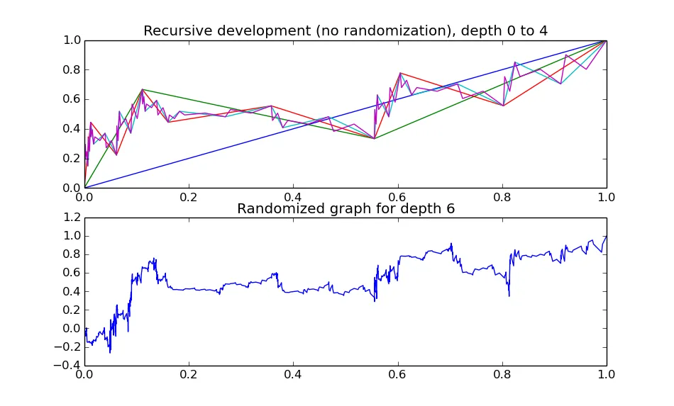
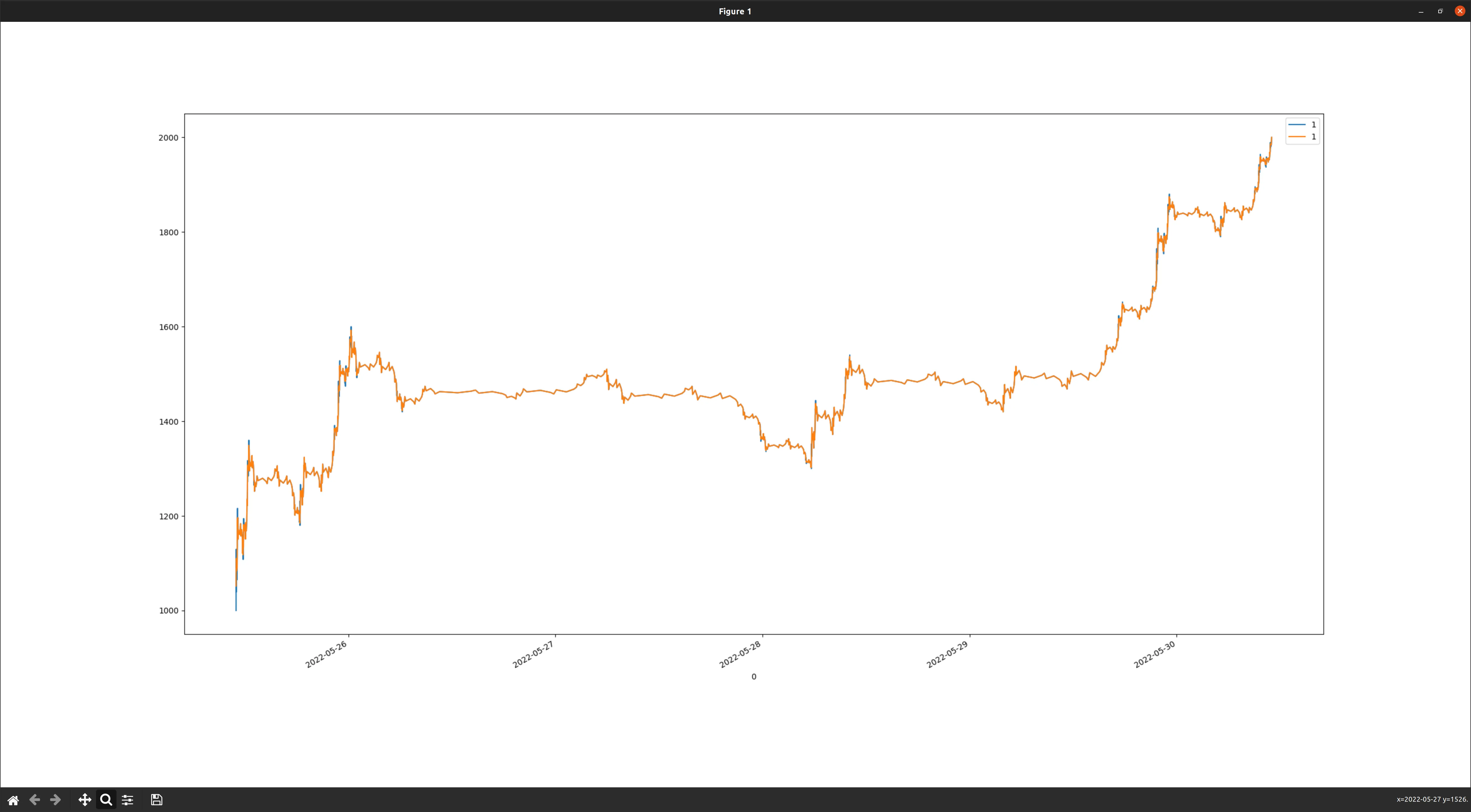
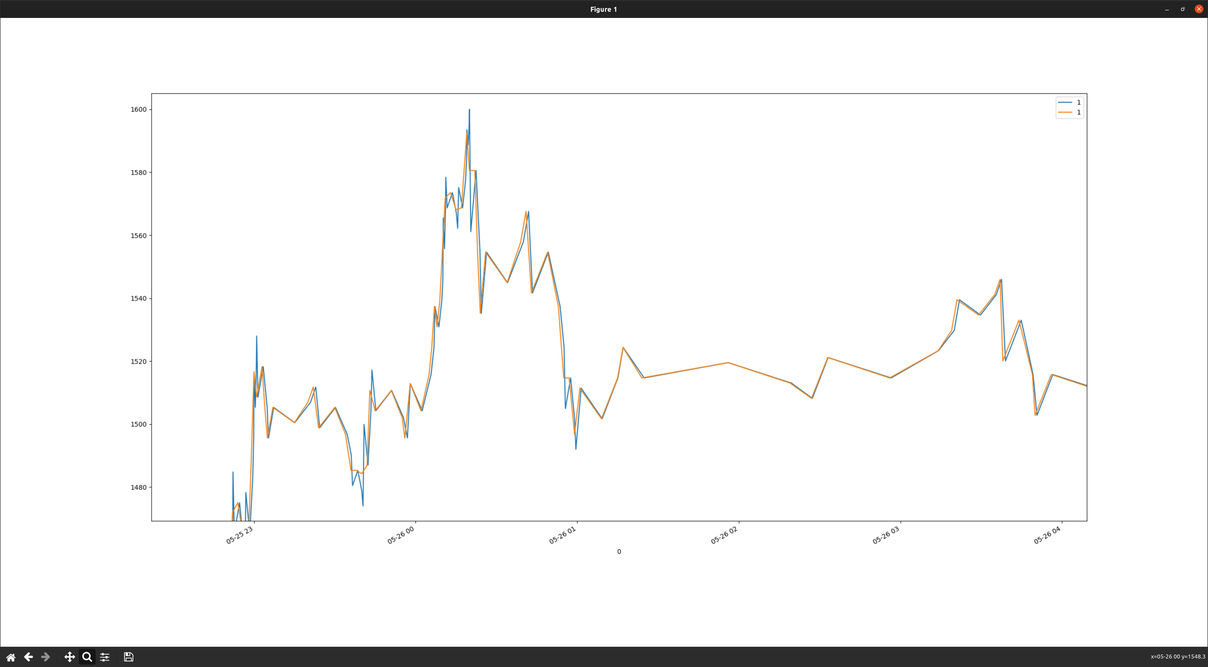
depth = 1 应该给出 len(graph) 等于4,等等。是否可以从一开始就使用一个 set,或者我应该在之后使 graph 成为唯一的? - Tjorriemorrie0.0 替换为开盘时间,将 1.0 替换为收盘时间,并相应地插值计算中间值即可。 - tobias_k使用 @tobias_k 的解决方案和 pandas,我们可以将归一化分形图形进行翻译和缩放,变成基于时间的图形。
import arrow
import pandas as pd
import time

depth = 5
# the "geometry" of fractal
turns = [
        (1 / 9, 0.60),
        (5 / 9, 0.30),
        (8 / 9, 0.70),
    ]

# select start / end time
t0 = arrow.now().floor("hours")
t1 = t0.shift(days=5)
start = (pd.to_datetime(t0._datetime), 1000)
end = (pd.to_datetime(t1._datetime), 2000)

# create a non-dimensionalized [0,0]x[1,1] Fractal
_start, _end = (0, 0), (1, 1)
graph = set()
make_graph(depth, graph, _start, _end, turns)
# just check graph length
assert len(graph) == (len(turns) + 1) ** depth + 1

# create a pandas dataframe from the normalized Fractal
df = pd.DataFrame(graph)
df.sort_values(0, inplace=True)
df.reset_index(drop=True, inplace=True)

# translate to real coordinates
X = pd.DataFrame(
        data=[(start[0].timestamp(), start[1]), (end[0].timestamp(), end[1])]
        ).T
delta = X[1] - X[0]
Y = df.mul(delta) + X[0]
Y[0] = [*map(lambda x: pd.to_datetime(x, unit="s"), Y[0])]

# now resample and interpolate data according to *grid* size
grid ="min"
Z = Y.set_index(0)
A = Z.resample(grid).mean().interpolate()

# plot both graph to check errors
import matplotlib.pyplot as plt
ax = Z.plot()
A.plot(ax=ax)
plt.show()
显示两个图表:
并缩放以查看插值和对齐到网格的差异:
我有类似的兴趣,并开发了一个Python3库,可以做到你想要的。
pip install fractalmarkets
请查看https://github.com/hyperstripe50/fractal-market-analysis/blob/master/README.md