为因子变量(分类数据)绘制类似于相关矩阵的图表?同时包含混合类型数据?

22

事实上有两个问题,其中一个比另一个更高级。

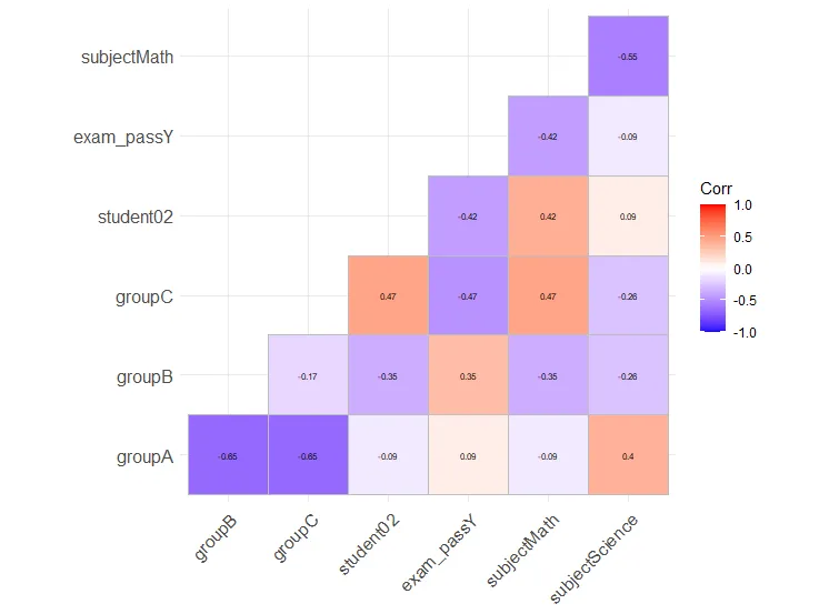
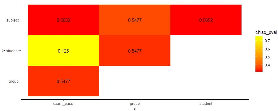
Q1:我正在寻找一种类似于corrplot()的方法,但可以处理因子数据。

我最初尝试使用chisq.test()然后计算p值Cramer's V作为相关性,但是由于列太多而无法解决。 所以,有人能告诉我是否有一种快速创建“corrplot”的方法,使每个单元格都包含Cramer's V的值,而颜色是由p值呈现的。或者任何其他类似的图表。

关于Cramer's V,假设tbl是一个二维因子数据框。

chi2 <- chisq.test(tbl, correct=F)
Cramer_V <- sqrt(chi2$/nrow(tbl)) 
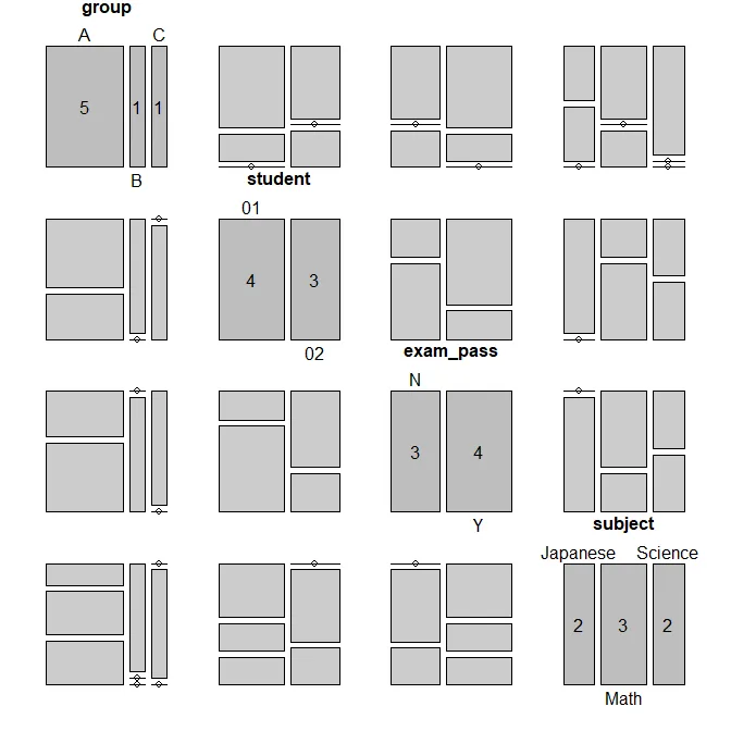
我准备了一个包含因子的测试数据框:

df <- data.frame(
group = c('A', 'A', 'A', 'A', 'A', 'B', 'C'),
student = c('01', '01', '01', '02', '02', '01', '02'),
exam_pass = c('Y', 'N', 'Y', 'N', 'Y', 'Y', 'N'),
subject = c('Math', 'Science', 'Japanese', 'Math', 'Science', 'Japanese', 'Math')
) 

问题2:我希望能够在一个混合类型的数据框上计算相关性/关联矩阵,例如:

df <- data.frame(
group = c('A', 'A', 'A', 'A', 'A', 'B', 'C'),
student = c('01', '01', '01', '02', '02', '01', '02'),
exam_pass = c('Y', 'N', 'Y', 'N', 'Y', 'Y', 'N'),
subject = c('Math', 'Science', 'Japanese', 'Math', 'Science', 'Japanese', 'Math')
) 
df$group <- factor(df$group, levels = c('A', 'B', 'C'), ordered = T)
df$student <- as.integer(df$student)

3
与相关性/corrplot()类似且可处理因子的方法被称为关联度量(measure of association)。标准软件包例如DescTools中包含了像Cramer's V这样的关联度量。 - smci
这个问题在SO和CrossValidated上都是相关的。关于如何计算分类-分类和分类-数值的关联性,请参见CV:“测量关联度”分类...因子 - smci
4个回答

23

如果您想要对因子或混合类型进行真实的相关性图,也可以使用model.matrix将所有非数字变量进行独热编码。这与计算Cramér's V有很大不同,因为它将考虑您的因子作为单独的变量,就像许多回归模型一样。

然后,您可以使用您最喜欢的相关性图库。我个人喜欢ggcorrplot,因为它与ggplot2兼容。

以下是一个使用您的数据集的示例:

library(ggcorrplot)
model.matrix(~0+., data=df) %>% 
  cor(use="pairwise.complete.obs") %>% 
  ggcorrplot(show.diag=FALSE, type="lower", lab=TRUE, lab_size=2)

图片描述


3
这是一个非常有用的答案,可以轻松将因子转换为哑变量(Dummy Variables)以用于相关矩阵。例如,性别通常在相关表格中被表示为哑变量,但可能存储为因子。 - Kevin T

18

AntoniosK提供的解决方案可以通过J.D.的建议进行改进,以允许包含名义数值属性的混合数据帧。对于名义vs名义,使用偏差校正的Cramer's V计算关联强度;对于数值vs数值,默认使用Spearman或Pearson相关性进行计算;对于名义vs数值,使用ANOVA进行计算。

require(tidyverse)
require(rcompanion)


# Calculate a pairwise association between all variables in a data-frame. In particular nominal vs nominal with Chi-square, numeric vs numeric with Pearson correlation, and nominal vs numeric with ANOVA.
# Adopted from https://dev59.com/TFQK5IYBdhLWcg3wDLvP#52557631
mixed_assoc = function(df, cor_method="spearman", adjust_cramersv_bias=TRUE){
    df_comb = expand.grid(names(df), names(df),  stringsAsFactors = F) %>% set_names("X1", "X2")

    is_nominal = function(x) class(x) %in% c("factor", "character")
    # https://community.rstudio.com/t/why-is-purr-is-numeric-deprecated/3559
    # https://github.com/r-lib/rlang/issues/781
    is_numeric <- function(x) { is.integer(x) || is_double(x)}

    f = function(xName,yName) {
        x =  pull(df, xName)
        y =  pull(df, yName)

        result = if(is_nominal(x) && is_nominal(y)){
            # use bias corrected cramersV as described in https://rdrr.io/cran/rcompanion/man/cramerV.html
            cv = cramerV(as.character(x), as.character(y), bias.correct = adjust_cramersv_bias)
            data.frame(xName, yName, assoc=cv, type="cramersV")

        }else if(is_numeric(x) && is_numeric(y)){
            correlation = cor(x, y, method=cor_method, use="complete.obs")
            data.frame(xName, yName, assoc=correlation, type="correlation")

        }else if(is_numeric(x) && is_nominal(y)){
            # from https://stats.stackexchange.com/questions/119835/correlation-between-a-nominal-iv-and-a-continuous-dv-variable/124618#124618
            r_squared = summary(lm(x ~ y))$r.squared
            data.frame(xName, yName, assoc=sqrt(r_squared), type="anova")

        }else if(is_nominal(x) && is_numeric(y)){
            r_squared = summary(lm(y ~x))$r.squared
            data.frame(xName, yName, assoc=sqrt(r_squared), type="anova")

        }else {
            warning(paste("unmatched column type combination: ", class(x), class(y)))
        }

        # finally add complete obs number and ratio to table
        result %>% mutate(complete_obs_pairs=sum(!is.na(x) & !is.na(y)), complete_obs_ratio=complete_obs_pairs/length(x)) %>% rename(x=xName, y=yName)
    }

    # apply function to each variable combination
    map2_df(df_comb$X1, df_comb$X2, f)
}

使用这种方法,我们可以轻松地分析各种混合变量数据框:

mixed_assoc(iris)

              x            y      assoc        type complete_obs_pairs 
1  Sepal.Length Sepal.Length  1.0000000 correlation                150
2   Sepal.Width Sepal.Length -0.1667777 correlation                150
3  Petal.Length Sepal.Length  0.8818981 correlation                150
4   Petal.Width Sepal.Length  0.8342888 correlation                150
5       Species Sepal.Length  0.7865785       anova                150
6  Sepal.Length  Sepal.Width -0.1667777 correlation                150
7   Sepal.Width  Sepal.Width  1.0000000 correlation                150
25      Species      Species  1.0000000    cramersV                150

这也可以与优秀的corrr包一起使用,例如绘制相关网络图:

require(corrr)

msleep %>%
    select(- name) %>%
    mixed_assoc() %>%
    select(x, y, assoc) %>%
    spread(y, assoc) %>%
    column_to_rownames("x") %>%
    as.matrix %>%
    as_cordf %>%
    network_plot()

enter image description here


按照描述的方式对我有效。请参见 https://git.io/JfjTt 获取完整示例,并在此处提交工单以进行讨论(如果需要)。 - Holger Brandl
嗨,谢谢你分享这个。我可以问一下如何修改它以适用于小样本吗?特别是将ANOVA更改为Kruskall Wallis和Spearman而不是Pearson's? - Den
1
我一直收到 Error in set_names(., "X1", "X2") : 3 arguments passed to 'names<-' which requires 2 的错误提示,即使我已经将其子集化为两个变量。 - ibm
你正在使用过时的 purrr 版本。 - Holger Brandl
“is_nominal = function(x) class(x) %in% c("factor", "character")”这段代码应该改为“is_nominal = function(x){class(x) %in% c("factor", "character")}"。 - Peter King
显示剩余2条评论

10

这是一个 tidyverse 的解决方案:

# example dataframe
df <- data.frame(
  group = c('A', 'A', 'A', 'A', 'A', 'B', 'C'),
  student = c('01', '01', '01', '02', '02', '01', '02'),
  exam_pass = c('Y', 'N', 'Y', 'N', 'Y', 'Y', 'N'),
  subject = c('Math', 'Science', 'Japanese', 'Math', 'Science', 'Japanese', 'Math')
) 

library(tidyverse)
library(lsr)

# function to get chi square p value and Cramers V
f = function(x,y) {
    tbl = df %>% select(x,y) %>% table()
    chisq_pval = round(chisq.test(tbl)$p.value, 4)
    cramV = round(cramersV(tbl), 4) 
    data.frame(x, y, chisq_pval, cramV) }

# create unique combinations of column names
# sorting will help getting a better plot (upper triangular)
df_comb = data.frame(t(combn(sort(names(df)), 2)), stringsAsFactors = F)

# apply function to each variable combination
df_res = map2_df(df_comb$X1, df_comb$X2, f)

# plot results
df_res %>%
  ggplot(aes(x,y,fill=chisq_pval))+
  geom_tile()+
  geom_text(aes(x,y,label=cramV))+
  scale_fill_gradient(low="red", high="yellow")+
  theme_classic()

enter image description here

请注意,我正在使用 lsr 软件包来使用 cramersV 函数计算 Cramer's V。

使用DescTools不是更好吗?它包含了像Cramer's V这样的关联度量。 - smci
1
是的,您可以使用任何能够计算所需指标的软件包。我只是在这里决定使用另一个。 - AntoniosK
@AntoniosK非常感谢您为Q1提供了精确的答案!我正在尝试定制您的函数以解决Q2,想法是将其更改为三种用途:名义vs卡方、数值vs皮尔逊相关性和名义vs数值与ANOVA。您认为这是可行的方法吗? - J.D
是的,如果您还将变量类型放在一列中,并根据类型选择适当的相关方法,则可能实现。 - AntoniosK

4

关于Q1,如果您首先使用?structable(来自同一软件包)将数据框转换,然后可以使用vcd软件包中的?pairs.table。这将为您提供马赛克图的绘图矩阵。虽然这不完全与corrplot()相同,但我认为这将是更有用的可视化。

df <- data.frame(
  ... 
) 
library(vcd)
st <- structable(~group+student+exam_pass+subject, df)
st
#                 student       01                    02             
#                 subject Japanese Math Science Japanese Math Science
# group exam_pass                                                    
# A     N                        0    0       1        0    1       0
#       Y                        1    1       0        0    0       1
# B     N                        0    0       0        0    0       0
#       Y                        1    0       0        0    0       0
# C     N                        0    0       0        0    1       0
#       Y                        0    0       0        0    0       0
pairs(st)

enter image description here

有许多适用于分类-分类数据的其他图形,例如筛选图、关联图和压力图(请参见我在Cross Validated上的问题:替代筛选/马赛克图用于列联表)。如果您不喜欢马赛克图,可以编写自己的基于对函数来将任何内容放入上三角或下三角面板(请参见我在此处的问题:带qq图的对矩阵)。请记住,虽然绘图矩阵非常有用,但它们只显示边际投影(要更全面地了解这一点,请参见我在CV上的回答:在多元回归中,“控制”和“忽略”其他变量之间有什么区别?三维散点图的替代方案)。
关于Q2,您需要编写自定义函数。

请告诉我这对您是否有用,或者您需要更多的帮助。 - gung - Reinstate Monica

网页内容由stack overflow 提供, 点击上面的
可以查看英文原文,
原文链接