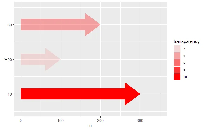
我们可以创建一个新的几何对象geom_arrowbar,像使用其他几何对象一样使用它。因此,在您的情况下,只需执行以下操作即可获得所需的图形:
tibble(y = c(10, 20, 30), n = c(300, 100, 200), transparency = c(10, 2, 4)) %>%
  ggplot() +
  geom_arrowbar(aes(x = n, y = y, alpha = transparency), fill = "red") +
  scale_y_continuous(limits = c(5, 35)) +
  scale_x_continuous(limits = c(0, 350))
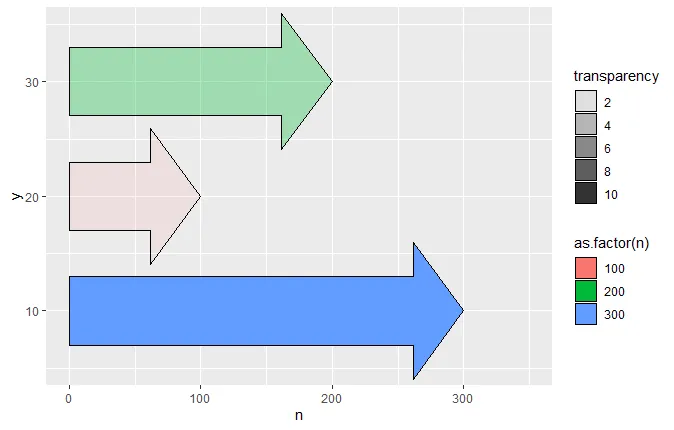
它包含3个参数,column_width、head_width和head_length,如果您不喜欢默认形状的箭头,可以通过这些参数进行更改。我们也可以根据需要指定填充颜色和其他美学效果:
tibble(y = c(10, 20, 30), n = c(300, 100, 200), transparency = c(10, 2, 4)) %>%
  ggplot() +
  geom_arrowbar(aes(x = n, y = y, alpha = transparency, fill = as.factor(n)),
                column_width = 1.8, head_width = 1.8, colour = "black") +
  scale_y_continuous(limits = c(5, 35)) +
  scale_x_continuous(limits = c(0, 350))
唯一的问题是我们得先编写它!
按照 ggplot2 扩展文档 中的示例,我们可以定义自己的 geom_arrowbar,方法就像定义其他图形一样,只不过我们希望能够传入三个控制箭头形状的参数。这些参数添加到结果 layer 对象的 params 列表中,将用于创建我们的箭头层:
library(tidyverse)

geom_arrowbar <- function(mapping = NULL, data = NULL, stat = "identity",
                          position = "identity", na.rm = FALSE, show.legend = NA,
                          inherit.aes = TRUE, head_width = 1, column_width = 1,
                          head_length = 1, ...)
{
  layer(geom = GeomArrowBar, mapping = mapping, data = data, stat = stat,
        position = position, show.legend = show.legend, inherit.aes = inherit.aes,
        params = list(na.rm = na.rm, head_width = head_width,
                      column_width = column_width, head_length = head_length, ...))
}
现在,“所有”的任务就是定义一个GeomArrowBar是什么。这实际上是一个ggproto类定义。最重要的部分是draw_panel成员函数,它会将我们数据框中的每一行转换为箭头形状。通过一些基本的数学计算,从x和y坐标以及各种形状参数中确定箭头的形状,它为我们数据的每一行生成一个grid::polygonGrob并将其存储在gTree中。这构成了该层的图形组件。
GeomArrowBar <- ggproto("GeomArrowBar", Geom,
  required_aes = c("x", "y"),
  default_aes = aes(colour = NA, fill = "grey20", size = 0.5, linetype = 1, alpha = 1),
  extra_params = c("na.rm", "head_width", "column_width", "head_length"),
  draw_key = draw_key_polygon,
  draw_panel = function(data, panel_params, coord, head_width = 1,
                        column_width = 1, head_length = 1) {
    hwidth <- head_width / 5
    wid <- column_width / 10
    len <- head_length / 10
    data2 <- data
    data2$x[1] <- data2$y[1] <- 0
    zero <- coord$transform(data2, panel_params)$x[1]
    coords <- coord$transform(data, panel_params)
    make_arrow_y <- function(y, wid, hwidth) {
      c(y - wid/2, y - wid/2, y - hwidth/2, y, y + hwidth/2, y + wid/2, y + wid/2)
    }
    make_arrow_x <- function(x, len){
      if(x < zero) len <- -len
      return(c(zero, x - len, x - len , x, x - len, x - len, zero))
    }
    my_tree <- grid::gTree()
    for(i in seq(nrow(coords))){
      my_tree <- grid::addGrob(my_tree, grid::polygonGrob(
        make_arrow_x(coords$x[i], len),
        make_arrow_y(coords$y[i], wid, hwidth),
        default.units = "native",
        gp = grid::gpar(
          col = coords$colour[i],
          fill = scales::alpha(coords$fill[i], coords$alpha[i]),
          lwd = coords$size[i] * .pt,
          lty = coords$linetype[i]))) }
    my_tree}
)
这个实现远非完美。它缺少一些重要的功能,例如明智的默认轴限制和coord_flip的能力。如果箭头长度超过整个列,它将产生不美观的结果(虽然在那种情况下可能不想使用这样的图)。但是,如果您有一个负值,它会明智地指向左边。更好的实现可能还会添加空箭头选项。
简而言之,为了消除这些(和其他)错误并使其达到生产就绪状态,需要进行大量微调,但在此期间,它已经足够好以不费太多精力生成一些漂亮的图表。
由reprex包(v0.3.0)于2020-03-08创建
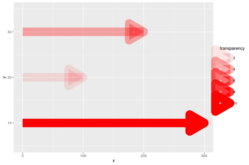
tibble(y = c(10, 20, 30), n = c(300, 100, 200), transparency = c(10, 2, 4)) %>% ggplot() + geom_segment(aes(x = 0, xend = n-10, y = y, yend = y, alpha = transparency), colour = 'red', size = 10) + geom_segment(aes(x = n-0.1, xend = n, y = y, yend = y, alpha = transparency), colour = 'red', size = 1, arrow = arrow(length = unit(1.5, 'cm'), type = 'closed')) + scale_y_continuous(limits = c(5, 35))- Wolfgang Arnold