假设我有以下使用
ggplot 生成的多个条形图:raw <- read.csv("http://pastebin.com/raw.php?i=L8cEKcxS",sep=",")
raw[,2]<-factor(raw[,2],levels=c("Very Bad","Bad","Good","Very Good"),ordered=FALSE)
raw[,3]<-factor(raw[,3],levels=c("Very Bad","Bad","Good","Very Good"),ordered=FALSE)
raw[,4]<-factor(raw[,4],levels=c("Very Bad","Bad","Good","Very Good"),ordered=FALSE)
raw=raw[,c(2,3,4)]
freq=table(col(raw), as.matrix(raw)) # get the counts of each factor level
Names=c("Food","Music","People")
data=data.frame(cbind(freq),Names)
data=data[,c(5,3,1,2,4)]
data.m <- melt(data, id.vars='Names')
ggplot(data.m, aes(Names, value)) +
geom_bar(aes(fill = variable), position = "dodge", stat="identity")
目前的图表已经很好了。但是我想在x轴上添加一些分组信息。比如说定义了两个组:Group1 : 食品和音乐 和 Group2 : 人物。我正在尝试构建一个如下所示的ggplot图表:
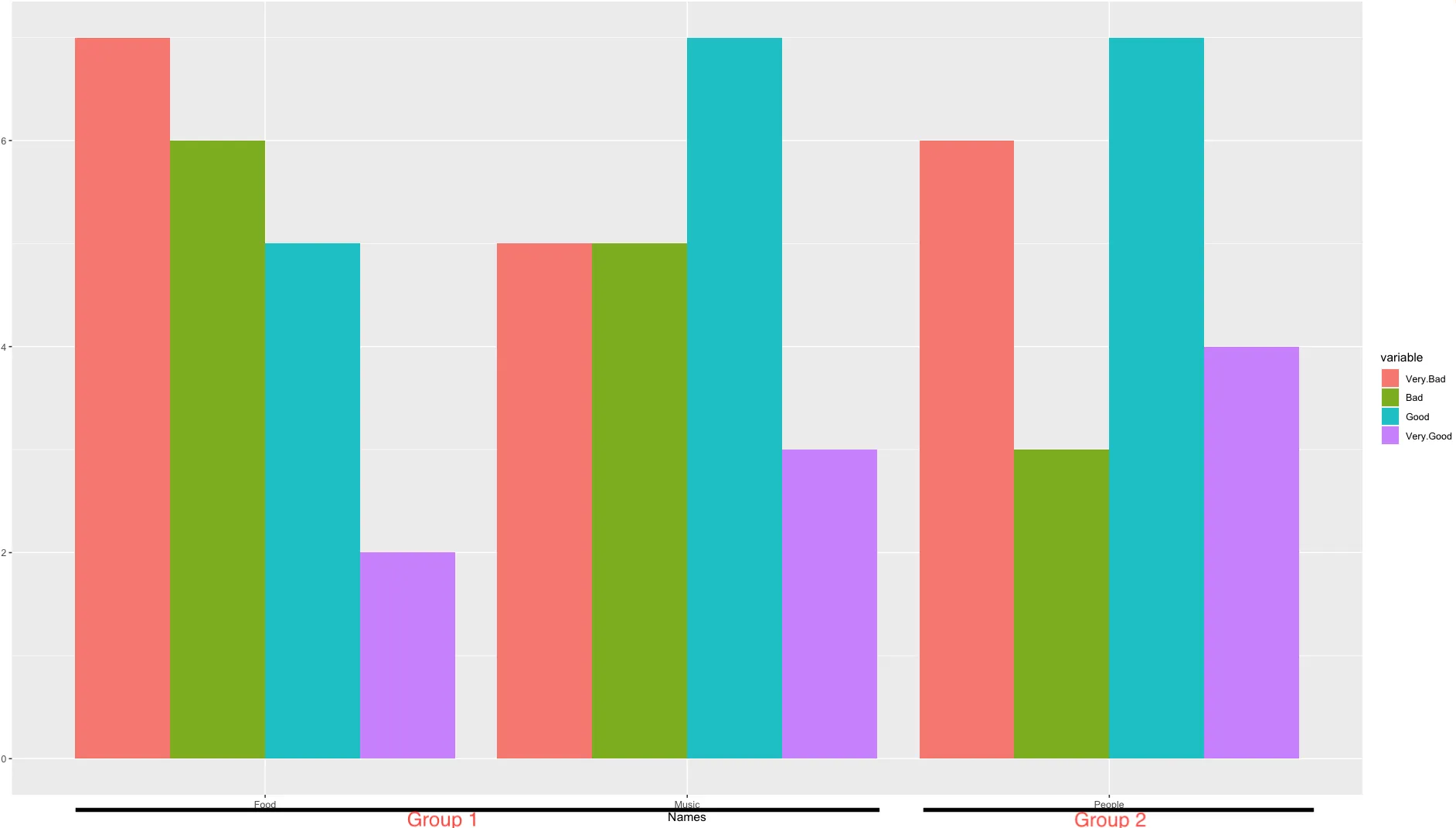
我还想减少食品与音乐之间的间隔,并增加音乐与人物之间的间隔,以便演示食品与音乐形成一个组,人物另一个组。
是否有办法使用ggplot框架实现这一点?
