我创建了一个最小化可复现的示例,我认为它符合你的描述,但如果不是你所需的,请告诉我。
import matplotlib.pyplot as plt
import numpy as np
import pandas as pd
data = pd.DataFrame()
n_rows = 100
data['group'] = np.random.choice(['1', '2', '3'], n_rows)
data['subgroup'] = np.random.choice(['A', 'B', 'C'], n_rows)
例如,我们可以获取以下子组的计数。
In [1]: data.groupby(['group'])['subgroup'].value_counts()
Out[1]: group  subgroup
    1   A      17
        C      16
        B      5
    2   A      23
        C      10
        B      7
    3   C      8
        A      7
        B      7
 Name: subgroup, dtype: int64
我创建了一个函数,根据列的顺序(例如
['group','subgroup']),计算所需的计数,并逐步绘制相应百分比的条形图。
import matplotlib.pyplot as plt
import matplotlib.cm
def plot_tree(data, ordering, axis=False):
"""
Plots a sequence of bar plots reflecting how the data
is distributed at different levels. The order of the
levels is given by the ordering parameter.
Parameters
----------
data: pandas DataFrame
ordering: list
Names of the columns to be plotted.They should be
ordered top down, from the larger to the smaller group.
axis: boolean
Whether to plot the axis.
Returns
-------
fig: matplotlib figure object.
The final tree plot.
"""
fig, ax = plt.subplots(figsize=(9.2, 3*len(ordering)))
ax.set_xticks(np.arange(-1, len(ordering)) + 0.5)
ax.set_xticklabels(['All'] + ordering, fontsize=18)
if not axis:
plt.axis('off')
counts=[data.shape[0]]
labels = ['All']
for o in reversed(ordering):
labels.extend(data[o].unique().tolist())
cmap = matplotlib.cm.get_cmap('Pastel1', len(labels))
colors = dict(zip(labels, [cmap(i) for i in range(len(labels))]))
counts = data.groupby(ordering).size().reset_index(name='c_' + ordering[-1])
for i, o in enumerate(ordering[:-1], 1):
if ordering[:i]:
counts['c_' + o]=counts.groupby(ordering[:i]).transform('sum')['c_' + ordering[-1]]
counts['p_' + ordering[0]] = counts['c_' + ordering[0]]/data.shape[0]
for i, o in enumerate(ordering[1:], 1):
counts['p_' + o] = counts['c_' + o]/counts['c_' + ordering[i-1]]
ax.bar(-1, data.shape[0], width=1, label='All', color=colors['All'], align="edge")
ax.annotate('All -- 100%', (-0.9, 0.5), fontsize=12)
comb = 1
for bar, col in enumerate(ordering):
labels = sorted(data[col].unique())*comb
comb *= len(data[col].unique())
local_counts = counts[ordering[:bar+1] +
['c_' + o for o in ordering[:bar+1]] +
['p_' + o for o in ordering[:bar+1]]].drop_duplicates()
sizes = local_counts['c_' + col]
percs = local_counts['p_' + col]
bottom = 0
for size, perc, label in zip(sizes, percs, labels):
ax.bar(bar, size, width=1, bottom=bottom, label=label, color=colors[label], align="edge")
ax.annotate('{} -- {:.0%}'.format(label, perc), (bar+0.1, bottom+0.5), fontsize=12)
bottom += size
ax.legend(colors)
return fig
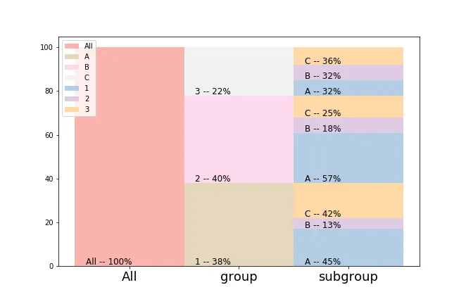
通过上述数据,我们将得到以下结果。
fig = plot_tree(data, ['group', 'subgroup'], axis=True)