使用ggplot、gtable和cowplot:固定图例框的宽度

3

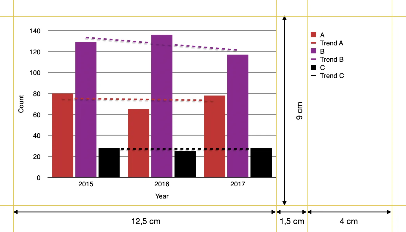
我希望用R制作一个看起来像Mac的Numbers制作的样本的图表。我在图表和图例框之间的空间上遇到了困难。这是我想要实现的样本:

enter image description here

在一些用户的帮助下(参见本文末尾的引用),我已经非常接近了。这是我的当前函数:

library(tidyverse)
library(cowplot)
library(gtable)
library(grid)
library(patchwork)


custom_barplot <- function(dataset, x_value, y_value, fill_value, nfill, xlab, ylab, y_limit, y_steps,legend_labels) {
# Example color set to choose from
colors=c("#CF232B","#942192","#000000","#f1eef6","#addd8e","#d0d1e6","#31a354","#a6bddb")

# user function for adjusting the size of key-polygons in legend
draw_key_polygon2 <- function(data, params, size) {
  lwd <- min(data$size, min(size) / 4)
  
  grid::rectGrob(
    width = grid::unit(0.8, "npc"),
    height = grid::unit(0.8, "npc"),
    gp = grid::gpar(
      col = data$colour,
      fill = alpha(data$fill, data$alpha),
      lty = data$linetype,
      lwd = lwd * .pt,
      linejoin = "mitre"
    ))
}
# user function for the plot itself
plot <- function(dataset, x_value, y_value, fill_value, nfill, xlab, ylab, y_limit, y_steps,legend,legend_labels) 
{ggplot(data=dataset, mapping=aes(x={{x_value}}, y={{y_value}}, fill={{fill_value}})) +
    geom_col(position=position_dodge(width=0.85),width=0.8,key_glyph="polygon2",show.legend=legend) + 
    geom_smooth(aes(color={{fill_value}}),method="lm",formula=y~x, se=FALSE,show.legend=legend, linetype="dashed") +
    labs(x=xlab,y=ylab) +
    theme(text=element_text(size=9,color="black"),
          panel.background = element_rect(fill="white"),
          panel.grid = element_line(color = "black",linetype="solid",size= 0.3),
          panel.grid.minor = element_blank(),
          panel.grid.major.x=element_blank(),
          axis.text=element_text(size=9),
          axis.line.x=element_line(color="black"),
          axis.ticks= element_blank(),
          legend.text=element_text(size=9),
          legend.position = "right",
          legend.justification = "top",
          legend.title = element_blank(),
          legend.key.size = unit(4,"mm"),
          legend.key = element_rect(fill="white"),
          plot.margin=unit(c(1,0.25,0.5,0.5),"cm")) +
    scale_y_continuous(breaks= seq(from=0, to=y_limit,by=y_steps),
                       limits=c(0,y_limit+1), 
                       expand=c(0,0)) +
    scale_x_continuous(breaks=min(data[,deparse(ensym(x_value))],na.rm=TRUE):max(data[,deparse(ensym(x_value))],na.rm=TRUE)) +
    scale_fill_manual(values = colors[1:nfill],labels={{legend_labels}})+
    scale_color_manual(values= colors[1:nfill],labels=paste("Trend ",{{legend_labels}},sep=""))+
    guides(color=guide_legend(override.aes=list(fill=NA),order=2),fill=guide_legend(override.aes = list(linetype=0),order=1))}

# taking the legend of the plot and removing the first column of the gtable within the legend
p_legend <- #cowplot::get_legend(plot(dataset, {{x_value}}, {{y_value}}, {{fill_value}}, nfill, xlab, ylab, y_limit, y_steps,legend=TRUE))
  gtable_squash_cols(cowplot::get_legend(plot(dataset, {{x_value}}, {{y_value}}, {{fill_value}},nfill, xlab, ylab, y_limit, y_steps,legend=TRUE,legend_labels)),1)

# printing the plot without legend
p_main <- plot(dataset, {{x_value}}, {{y_value}}, {{fill_value}}, nfill, xlab, ylab, y_limit, y_steps,legend=FALSE,legend_labels = NULL)

#joining it all together
Obj<- p_main+plot_spacer() + p_legend +
  plot_layout(widths=c(12.5,1.5,4))

return(Obj)

}

我的问题是,图例框的宽度似乎会根据标签的大小进行调整,因此绘图和图例之间的距离不会保持不变。
示例数据:
set.seed(9)
data <- data.frame(Cat=c(rep("A",times=5),rep("B",times=5),rep("C", times=5)),
                   year=rep(c(2015,2016,2017,2018,2019),times=3),
                   count=c(sample(seq(60,80),replace=TRUE,size=5),sample(seq(100,140),replace=TRUE,size=5),sample(seq(20,30),replace=TRUE,size=5)))
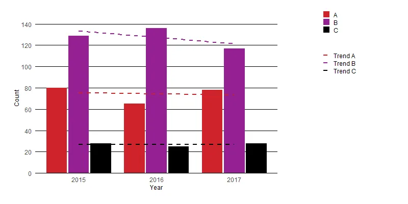
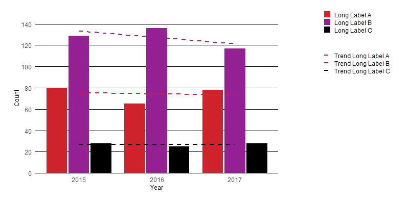
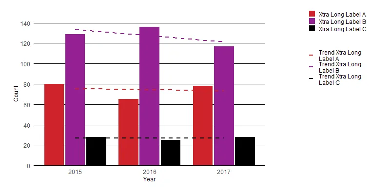
我制作了四个图表,只有标签不同:
plt <- custom_barplot(dataset=data %>% filter(year %in% c(2015,2016,2017)), 
     x_value=year,
     y_value=count, 
     fill_value=Cat, 
     nfill=3, 
     xlab="Year",
     ylab="Count",
     y_limit=140, 
     y_steps=20,
     legend_labels=c("A","B","C"))


plt_2 <- custom_barplot(dataset=data %>% filter(year %in% c(2015,2016,2017)), 
                        x_value=year,
                        y_value=count, 
                        fill_value=Cat, 
                        nfill=3, 
                        xlab="Year",
                        ylab="Count",
                        y_limit=140, 
                        y_steps=20,
                        legend_labels=c("Long Label A","Long Label B","Long Label C"))

plt_3 <- custom_barplot(dataset=data %>% filter(year %in% c(2015,2016,2017)), 
                        x_value=year,
                        y_value=count, 
                        fill_value=Cat, 
                        nfill=3, 
                        xlab="Year",
                        ylab="Count",
                        y_limit=140, 
                        y_steps=20,
                        legend_labels=c("Xtra Long Label A","Xtra Long Label B","Xtra Long Label C"))

plt_4 <- custom_barplot(dataset=data %>% filter(year %in% c(2015,2016,2017)), 
                        x_value=year,
                        y_value=count, 
                        fill_value=Cat, 
                        nfill=3, 
                        xlab="Year",
                        ylab="Count",
                        y_limit=140, 
                        y_steps=20,
                        legend_labels=c("Super Xtra Long Label A","Super Xtra Long Label B","Super Xtra Long Label C"))
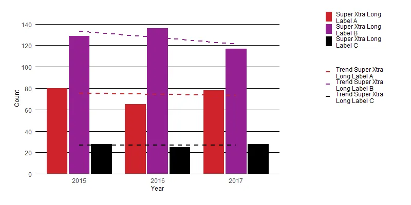
生成的图表如下所示: 输入图像描述 输入图像描述 输入图像描述 输入图像描述 
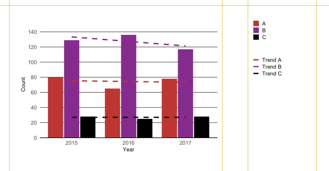
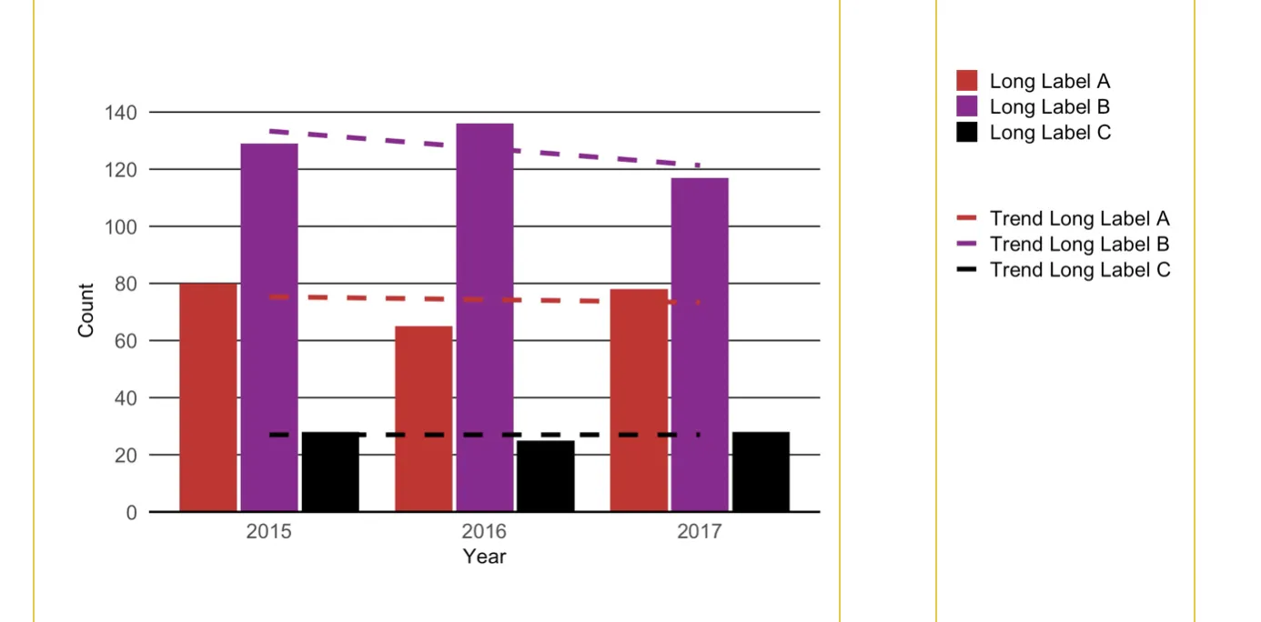
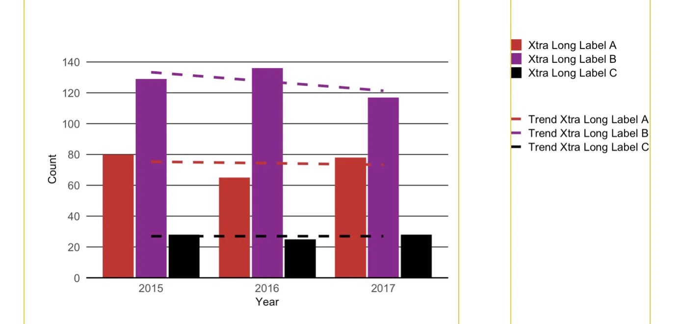
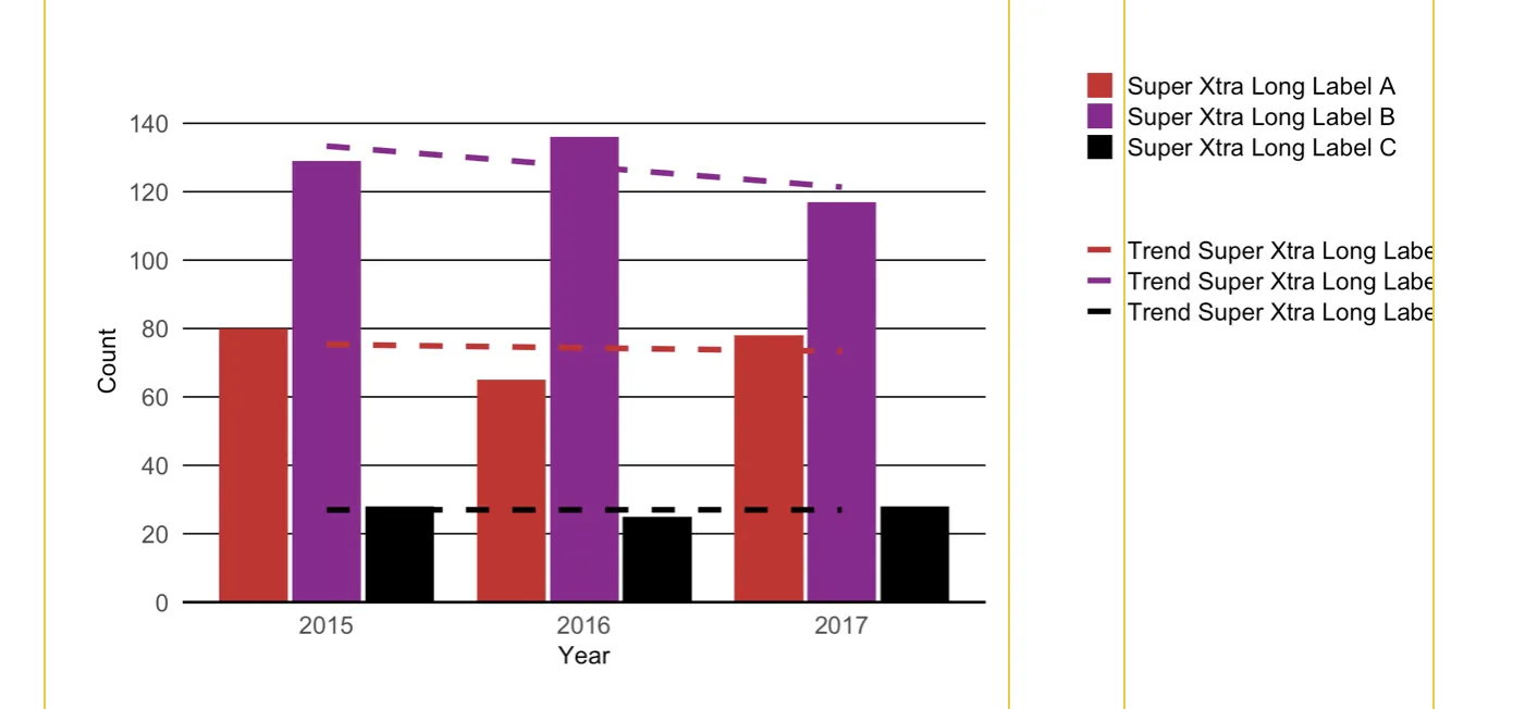
我需要图表和图例之间的间距保持不变,无论图例中标签的长度如何。我宁愿缩短标签并使其未完全显示。这些图表用于具有的文档,并且图例应该在注释所在的相同区域。
你有任何想法如何保持间距恒定吗?
参考:
  • 这篇文章介绍了tjebo提出的基本方法。
  • 这篇文章介绍了stefan对图表和图例之间空间的一般调整方法。

你尝试过为图例中的不同项换行(即添加换行符)吗?通过强制文本宽度小于某个字符数,您可能会消除一些摩擦。您可以尝试使用 stringr::str_wrap() 或基本函数 strwrap() 来实现此目的。 - wurli
1个回答

2
我认为最简单的解决方案是在图例中应用文本换行。您可以使用stringr::str_wrap()来实现以下结果:

plot 1 plot 2 plot 3 plot 4

这是对您的函数进行非常简单的编辑,允许用户控制文本换行:

custom_barplot <- function(dataset, x_value, y_value, fill_value, nfill, xlab, ylab, y_limit, y_steps, legend_labels, wrap_labels = 20) {
  # Example color set to choose from
  colors <- c("#CF232B", "#942192", "#000000", "#f1eef6", "#addd8e", "#d0d1e6", "#31a354", "#a6bddb")

  # user function for adjusting the size of key-polygons in legend
  draw_key_polygon2 <- function(data, params, size) {
    lwd <- min(data$size, min(size) / 4)

    grid::rectGrob(
      width = grid::unit(0.8, "npc"),
      height = grid::unit(0.8, "npc"),
      gp = grid::gpar(
        col = data$colour,
        fill = alpha(data$fill, data$alpha),
        lty = data$linetype,
        lwd = lwd * .pt,
        linejoin = "mitre"
      )
    )
  }
  # user function for the plot itself
  plot <- function(dataset, x_value, y_value, fill_value, nfill, xlab, ylab, y_limit, y_steps, legend, legend_labels) {
    ggplot(data = dataset, mapping = aes(x = {{ x_value }}, y = {{ y_value }}, fill = {{ fill_value }})) +
      geom_col(position = position_dodge(width = 0.85), width = 0.8, key_glyph = "polygon2", show.legend = legend) +
      geom_smooth(aes(color = {{ fill_value }}), method = "lm", formula = y ~ x, se = FALSE, show.legend = legend, linetype = "dashed") +
      labs(x = xlab, y = ylab) +
      theme(
        text = element_text(size = 9, color = "black"),
        panel.background = element_rect(fill = "white"),
        panel.grid = element_line(color = "black", linetype = "solid", size = 0.3),
        panel.grid.minor = element_blank(),
        panel.grid.major.x = element_blank(),
        axis.text = element_text(size = 9),
        axis.line.x = element_line(color = "black"),
        axis.ticks = element_blank(),
        legend.text = element_text(size = 9),
        legend.position = "right",
        legend.justification = "top",
        legend.title = element_blank(),
        legend.key.size = unit(4, "mm"),
        legend.key = element_rect(fill = "white"),
        plot.margin = unit(c(1, 0.25, 0.5, 0.5), "cm")
      ) +
      scale_y_continuous(
        breaks = seq(from = 0, to = y_limit, by = y_steps),
        limits = c(0, y_limit + 1),
        expand = c(0, 0)
      ) +
      scale_x_continuous(breaks = min(data[, deparse(ensym(x_value))], na.rm = TRUE):max(data[, deparse(ensym(x_value))], na.rm = TRUE)) +
      scale_fill_manual(values = colors[1:nfill], labels = stringr::str_wrap({{ legend_labels }}, wrap_labels)) +
      scale_color_manual(values = colors[1:nfill], labels = stringr::str_wrap(paste("Trend ", {{ legend_labels }}, sep = ""), wrap_labels)) +
      guides(color = guide_legend(override.aes = list(fill = NA), order = 2), fill = guide_legend(override.aes = list(linetype = 0), order = 1))
  }

  # taking the legend of the plot and removing the first column of the gtable within the legend
  p_legend <- # cowplot::get_legend(plot(dataset, {{x_value}}, {{y_value}}, {{fill_value}}, nfill, xlab, ylab, y_limit, y_steps,legend=TRUE))
    gtable_squash_cols(cowplot::get_legend(plot(dataset, {{ x_value }}, {{ y_value }}, {{ fill_value }}, nfill, xlab, ylab, y_limit, y_steps, legend = TRUE, legend_labels)), 1)

  # printing the plot without legend
  p_main <- plot(dataset, {{ x_value }}, {{ y_value }}, {{ fill_value }}, nfill, xlab, ylab, y_limit, y_steps, legend = FALSE, legend_labels = NULL)

  # joining it all together
  Obj <- p_main + plot_spacer() + p_legend +
    plot_layout(widths = c(12.5, 1.5, 4))

  return(Obj)
}

谢谢您的帖子。我刚刚尝试了您在评论中提供的信息,但没有成功。不过,在调用绘图函数时,我确实在参数中使用了word_wrap()。例如:legend_labels=c(str_wrap("Long Label A",width=18),str_wrap("Long Label B",width=18),str_wrap("Long Label C",width=18)) 我将进一步研究您的解决方案,特别是当标签文本需要两行时,如何保留条形图的图例键为正方形而不是矩形。 - thuettel
1
我另外开了一个帖子,讨论如何调整图例键的换行文本,如果你感兴趣的话。 - thuettel

网页内容由stack overflow 提供, 点击上面的
可以查看英文原文,
原文链接