在ggplot2中居中绘图标题

390

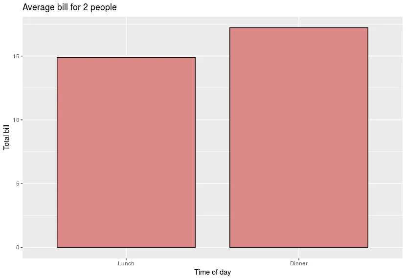
这段简单的代码(以及我今天早上所有的脚本)在使用ggplot2时开始给我一个偏离中心的标题:

Ubuntu version: 16.04

R studio version: Version 0.99.896

R version: 3.3.2

GGPLOT2 version: 2.2.0

今天早上我刚刚安装了以上内容,以尝试解决这个问题...
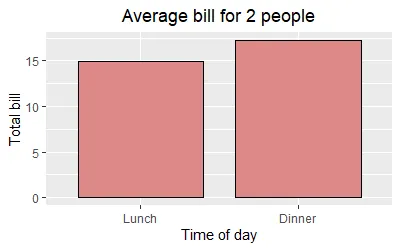
dat <- data.frame(
time = factor(c("Lunch","Dinner"), levels=c("Lunch","Dinner")),
total_bill = c(14.89, 17.23)
)

# Add title, narrower bars, fill color, and change axis labels
ggplot(data=dat, aes(x=time, y=total_bill, fill=time)) + 
  geom_bar(colour="black", fill="#DD8888", width=.8, stat="identity") + 
  guides(fill=FALSE) +
  xlab("Time of day") + ylab("Total bill") +
  ggtitle("Average bill for 2 people")

输入图像描述

5个回答

509

根据 ggplot 2.2.0 的发布消息:"主图标题现在左对齐,以更好地与副标题协调"。请参见?theme中的 plot.title 参数:"默认左对齐"。

如 @J_F 所指出的,您可以添加 theme(plot.title = element_text(hjust = 0.5)) 以将标题居中。

ggplot() +
  ggtitle("Default in 2.2.0 is left-aligned")

输入图像描述

ggplot() +
  ggtitle("Use theme(plot.title = element_text(hjust = 0.5)) to center") +
  theme(plot.title = element_text(hjust = 0.5))

输入图像描述


171

正如Henrik的答案所述,从ggplot 2.2.0开始,标题默认左对齐。要使标题居中,请在绘图时添加以下内容:

theme(plot.title = element_text(hjust = 0.5))

然而,如果您创建了许多图表,则在每个地方都添加此行可能会很繁琐。那么也可以使用以下方法更改ggplot的默认行为:

theme_update(plot.title = element_text(hjust = 0.5))

运行以上代码后,所有后续创建的图形都将使用主题设置plot.title = element_text(hjust = 0.5)作为它们的默认值:

theme_update(plot.title = element_text(hjust = 0.5))
ggplot() + ggtitle("Default is now set to centered")

输入图像描述

要恢复到原始的ggplot2默认设置,您可以重新启动R会话或选择默认主题。

theme_set(theme_gray())

16

ggeasy包中,有一个名为easy_center_title()的函数可以实现这一点。我发现这比theme(plot.title = element_text(hjust = 0.5))更具吸引力,而且更容易记忆。

ggplot(data = dat, aes(time, total_bill, fill = time)) + 
  geom_bar(colour = "black", fill = "#DD8888", width = .8, stat = "identity") + 
  guides(fill = FALSE) +
  xlab("Time of day") +
  ylab("Total bill") +
  ggtitle("Average bill for 2 people") +
  ggeasy::easy_center_title()

输入图片描述

请注意,截至撰写本答案时,您需要从GitHub安装ggeasy的开发版本才能使用easy_center_title()。 您可以通过运行remotes::install_github("jonocarroll/ggeasy")来实现。


8

如果你经常使用图形和ggplot,可能会厌烦每次都要添加theme()。如果您不想像之前建议的那样更改默认主题,那么创建自己的个人主题可能会更容易。

personal_theme = theme(plot.title = 
element_text(hjust = 0.5))

假设你有多个图表,p1、p2和p3,只需为它们添加 personal_theme 即可。

p1 + personal_theme
p2 + personal_theme
p3 + personal_theme

dat <- data.frame(
  time = factor(c("Lunch","Dinner"), 
levels=c("Lunch","Dinner")),
  total_bill = c(14.89, 17.23)
)
p1 = ggplot(data=dat, aes(x=time, y=total_bill, 
fill=time)) + 
  geom_bar(colour="black", fill="#DD8888", 
width=.8, stat="identity") + 
  guides(fill=FALSE) +
  xlab("Time of day") + ylab("Total bill") +
  ggtitle("Average bill for 2 people")

p1 + personal_theme

0

对于我来说,ggeasy包做得很好,只要使用Packman::p_load包运行它就非常容易。

这是一个帮助函数,使得使用ggplot2更加容易的包。[ggeasy版本0.1.4索引]


请提供用于此问题的代码。 - Wael

网页内容由stack overflow 提供, 点击上面的
可以查看英文原文,
原文链接