我正在尝试使用Pandas在Jupyter Notebook中绘制一条折线图,比较特定州在1960-1962年间的谋杀率。
以下是我的现状和到达此处的方法的简要说明:
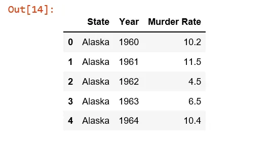
我正在使用一个犯罪csv文件,它看起来像这样: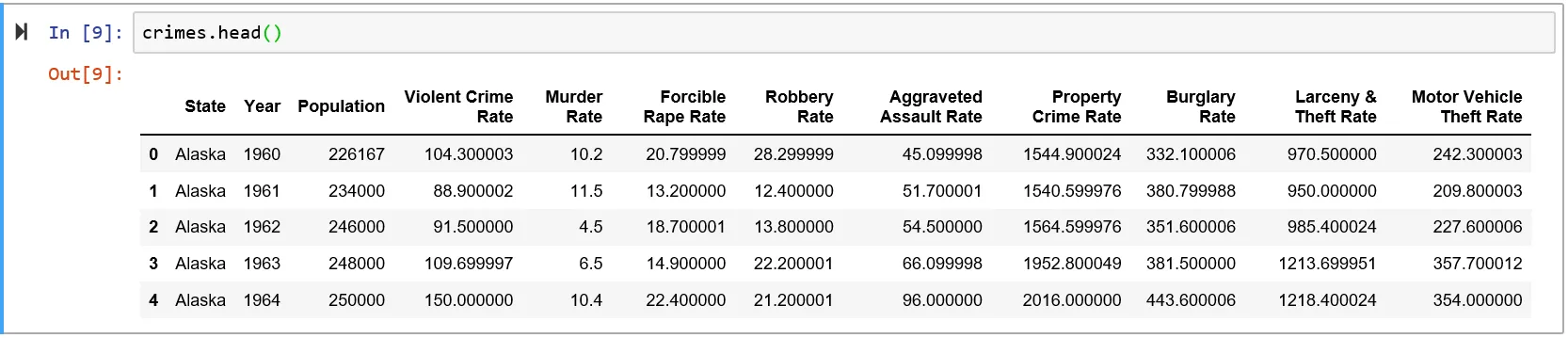 目前我只对三列感兴趣:州、年份和谋杀率。具体而言,我只对五个州感兴趣——阿拉斯加州、密歇根州、明尼苏达州、缅因州和威斯康星州。
因此,为了生成所需的表格,我执行了以下操作(仅显示前5行条目):
以下是我的现状和到达此处的方法的简要说明:
我正在使用一个犯罪csv文件,它看起来像这样:
目前我只对三列感兴趣:州、年份和谋杀率。具体而言,我只对五个州感兴趣——阿拉斯加州、密歇根州、明尼苏达州、缅因州和威斯康星州。因此,为了生成所需的表格,我执行了以下操作(仅显示前5行条目):
al_mi_mn_me_wi = crimes[(crimes['State'] == 'Alaska') | (crimes['State'] =='Michigan') | (crimes['State'] =='Minnesota') | (crimes['State'] =='Maine') | (crimes['State'] =='Wisconsin')]
control_df = al_mi_mn_me_wi[['State', 'Year', 'Murder Rate']]
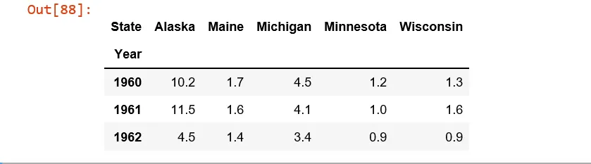
从这里开始我使用了pivot函数
df = control_1960_to_1962.pivot(index = 'Year', columns = 'State',values= 'Murder Rate' )
我被卡在这里了。 在执行操作时出现了KeyError错误(错误为Year):
df.plot(x='Year', y='Murder Rate', kind='line')
尝试时只需
df.plot()
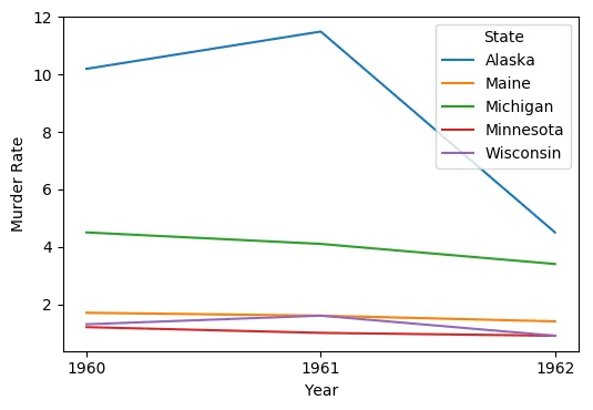
我得到了这个不稳定的图表。
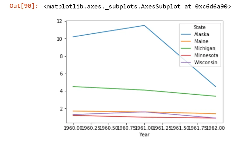
我如何获得我想要的图表?