如何在Python的Matplotlib中绘制一个叠加的柱状图?

10
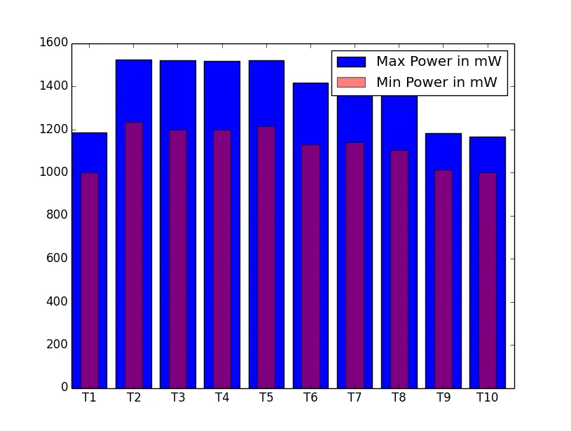
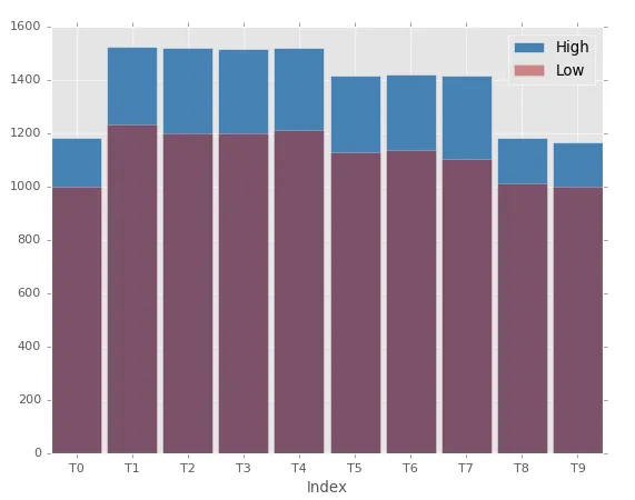
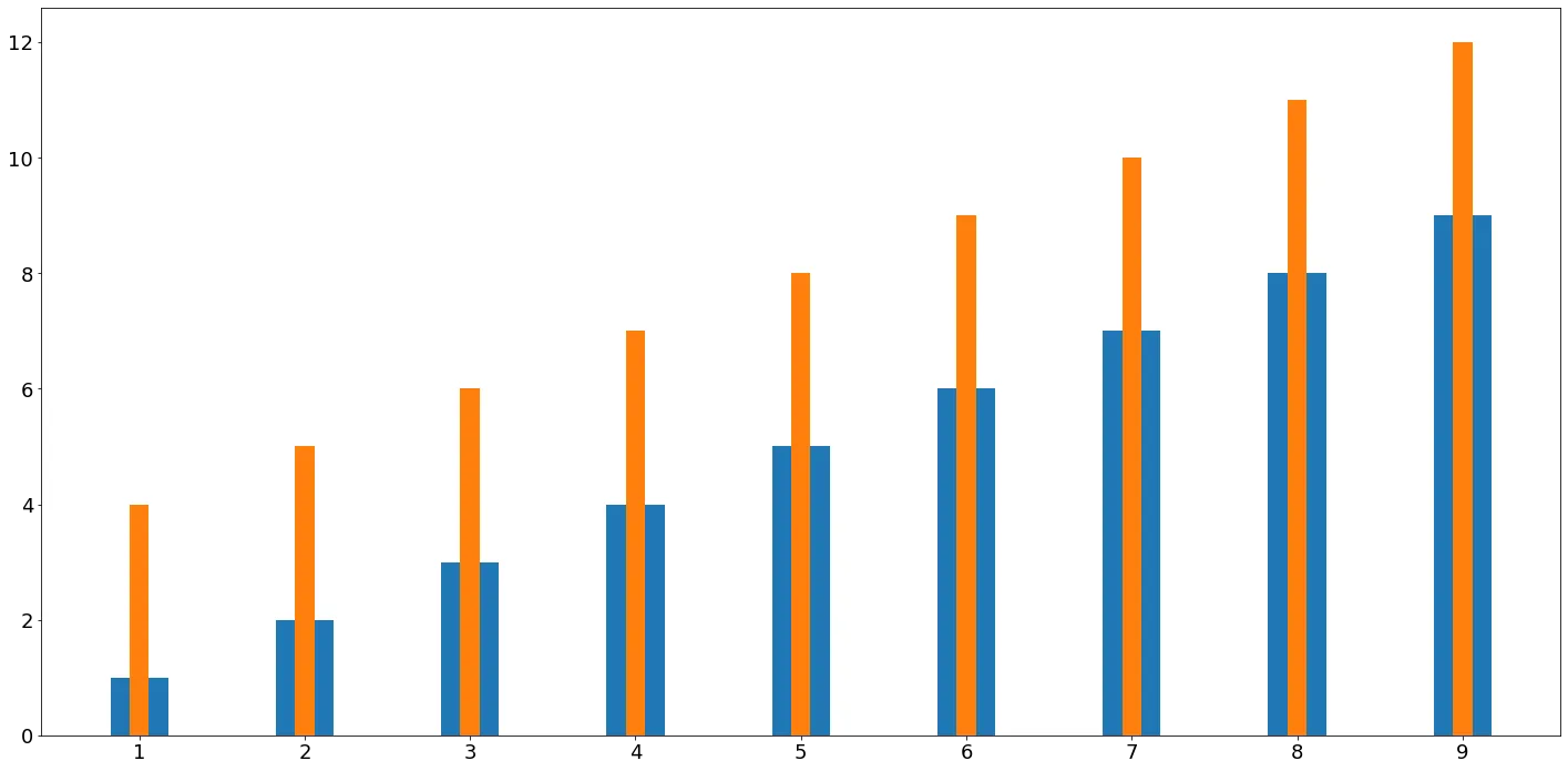
我希望使用matplotlib绘制条形图或直方图。我不想要一个堆积的条形图,而是两个数据列表的叠加条形图。例如,我有以下两个数据列表:

以下是一些开始的代码:

import matplotlib.pyplot as plt
from numpy.random import normal, uniform

highPower   = [1184.53,1523.48,1521.05,1517.88,1519.88,1414.98,1419.34,
              1415.13,1182.70,1165.17]
lowPower    = [1000.95,1233.37, 1198.97,1198.01,1214.29,1130.86,1138.70,
               1104.12,1012.95,1000.36]

plt.hist(highPower, bins=10, histtype='stepfilled', normed=True,
         color='b', label='Max Power in mW')
plt.hist(lowPower, bins=10, histtype='stepfilled', normed=True,
         color='r', alpha=0.5, label='Min Power in mW')

我希望能将这两个列表按照它们各自的值数量绘制出来,以便我能够看到每个读数的变化情况。此处涉及的是 IT 技术相关内容。


是的,我将其发布在问题的编辑中。 - AnkitSablok
请查看 numpy.cumsum()pyplot.hist()... - Saullo G. P. Castro
pyplot.hist() 我该怎么使用? - AnkitSablok
@Ffisegydd,您可以提供任何帮助吗? - AnkitSablok
3个回答

19
您可以使用 plt.bar() 并使用下面所示的alpha关键字来生成一个叠加的条形图。

alpha控制条形图的透明度。

注意:当您有两个重叠的条形图,其中一个的 alpha 值小于 1 时,您将会得到一种颜色混合的效果。因此,即使传统的标识显示为浅红色,该条形图看起来仍会是紫色的。为了解决这个问题,我修改了一个条形图的宽度,这样即使你的能力值发生变化,两个条形图都能清晰可见。

plt.xticks 可以用来设置您的图表中 x 轴刻度的位置和格式。

import matplotlib.pyplot as plt
import numpy as np

width = 0.8

highPower   = [1184.53,1523.48,1521.05,1517.88,1519.88,1414.98,
               1419.34,1415.13,1182.70,1165.17]
lowPower    = [1000.95,1233.37, 1198.97,1198.01,1214.29,1130.86,
               1138.70,1104.12,1012.95,1000.36]

indices = np.arange(len(highPower))

plt.bar(indices, highPower, width=width, 
        color='b', label='Max Power in mW')
plt.bar([i+0.25*width for i in indices], lowPower, 
        width=0.5*width, color='r', alpha=0.5, label='Min Power in mW')

plt.xticks(indices+width/2., 
           ['T{}'.format(i) for i in range(len(highPower))] )

plt.legend()

plt.show()

Plot


列表中没有超过2000的值,那么这个条形图如何显示一个大于2000的值,并且x轴上的标签必须是[1,2,3,4,.....,10],但它显示的增量为2。 - AnkitSablok
我不希望它们堆叠在一起,而是应该相互叠加,即较低的值应该占据较高值的某个区域。 - AnkitSablok
太好了,这个可行,谢谢你的解释 :) 但是我该如何修改x轴上的刻度为T1、T2、T3等等? - AnkitSablok
我已经添加了一个示例,演示如何将 x 轴刻度设置为"T1"、"T2"等。然而,将来我建议您要么在开始时充分解释您的问题(不要边进行提问边添加更多的子问题),要么对于您的扩展问题直接提出一个新的问题。 - Ffisegydd
当我运行这段代码时,红色条显示在蓝色条的右侧,而不是中间。你能更新一下代码吗? - Snow
如何使图例颜色与实际颜色匹配? - tejasvi88

6

在 @Ffisegydd 的 回答 的基础上,如果您的数据在 Pandas DataFrame 中,这应该很好地工作:

def overlapped_bar(df, show=False, width=0.9, alpha=.5,
                   title='', xlabel='', ylabel='', **plot_kwargs):
    """Like a stacked bar chart except bars on top of each other with transparency"""
    xlabel = xlabel or df.index.name
    N = len(df)
    M = len(df.columns)
    indices = np.arange(N)
    colors = ['steelblue', 'firebrick', 'darksage', 'goldenrod', 'gray'] * int(M / 5. + 1)
    for i, label, color in zip(range(M), df.columns, colors):
        kwargs = plot_kwargs
        kwargs.update({'color': color, 'label': label})
        plt.bar(indices, df[label], width=width, alpha=alpha if i else 1, **kwargs)
        plt.xticks(indices + .5 * width,
                   ['{}'.format(idx) for idx in df.index.values])
    plt.legend()
    plt.title(title)
    plt.xlabel(xlabel)
    plt.ylabel(ylabel)
    if show:
        plt.show()
    return plt.gcf()

然后在Python命令行中:

low = [1000.95, 1233.37, 1198.97, 1198.01, 1214.29, 1130.86, 1138.70, 1104.12, 1012.95, 1000.36]
high = [1184.53, 1523.48, 1521.05, 1517.88, 1519.88, 1414.98, 1419.34, 1415.13, 1182.70, 1165.17]
df = pd.DataFrame(np.matrix([high, low]).T, columns=['High', 'Low'],
                  index=pd.Index(['T%s' %i for i in range(len(high))],
                  name='Index'))
overlapped_bar(df, show=False)

overlapped bar chart in matplotlib


尝试运行这段代码后,它会显示两次条形图,能否编辑代码使其只显示一次图表? - Cathal Brady
你如何改变这个图形的大小?我似乎无法按照标准方式更改它。 - Cathal Brady
@CathalBrady 你在使用Spider吗?你的Python环境是什么?这段代码只能在完整的Python环境中运行,并且必须正确配置Matplotlib及其后端以适应你的操作系统或环境。如果你在Jupyter Notebook中使用,需要稍微做一些不同的事情。 - hobs
我的环境中某种原因缺少了darksage。 我还试图将它修改为barh,因为我认为垂直条更适合我的数据,但是我的尝试打破了索引。 - jmd

6

实际上,它比互联网上的所有答案都要简单。

a = range(1,10)
b = range(4,13)
ind = np.arange(len(a))

fig = plt.figure()
ax = fig.add_subplot(111)
ax.bar(x=ind, height=a, width=0.35,align='center')
ax.bar(x=ind, height=b, width=0.35/3,  align='center')

plt.xticks(ind, a)

plt.tight_layout()
plt.show()

enter image description here


网页内容由stack overflow 提供, 点击上面的
可以查看英文原文,
原文链接