如何在使用matplotlib绘制python柱状图时防止字母排序?

16

我正在使用条形图绘制一些分类数据。即使我对数据框进行了排序,Matplotlib仍会按字母顺序对我的 x 轴进行排序。

这是我的代码:

fig3, new_ax = plt.subplots(1,1, figsize=(25/3,5))
summary = tsa.source.sum().sort_values(ascending=False)
new_ax.bar(summary.index, summary.values, color=my_colors)
new_ax.legend()
bar_heights(new_ax) # custom function to get the values on top of bars
simpleaxis(new_ax) # custom function to define an axis to please my boss...
new_ax.set_ylabel('Effectifs')
new_ax.set_xlabel("Type d'arme")
new_ax.grid(False)

输出: 在此输入图像描述

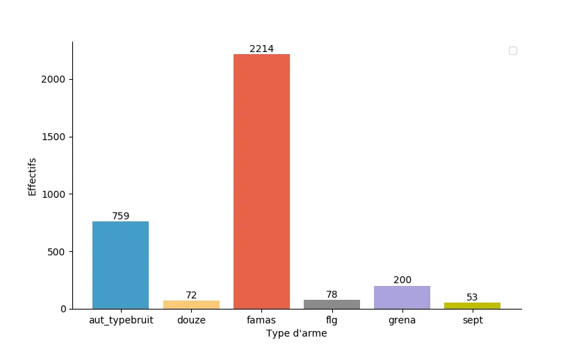
但这是摘要的样子,我希望在我的图表上看到这个顺序:

famas            2214.0
aut_typebruit     759.0
grena             200.0
flg                78.0
douze              72.0
sept               53.0
dtype: float64

这是我数据样本的链接:

https://files.fm/u/wumscb4q

使用以下命令将其导入:

tsa.source = pd.read_csv('sample.csv', sep=';', index_col=0)

这是我的函数:

def simpleaxis(ax):
    ax.spines['top'].set_visible(False)
    ax.spines['right'].set_visible(False)
    ax.get_xaxis().tick_bottom()
    ax.get_yaxis().tick_left()

def bar_heights(axes):
    for rect in axes.containers[0]:
        height = rect.get_height()
        rect.axes.text(rect.get_x() + rect.get_width()/2., height+3,
            '%d' % int(height),
            ha='center', va='bottom')
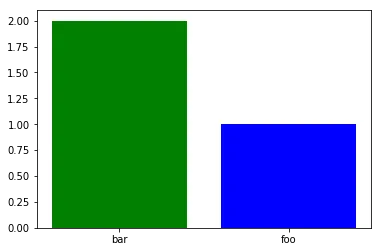
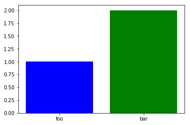
1
我无法复制您的问题。能否发布一个 [mcve]? - Stop harming Monica
完成了,我想... - Martin B
不完全是“最小化”的。plt.bar(['foo', 'bar'], [1, 2]) 呢?它会按字母顺序排序吗? - Stop harming Monica
是的,它确实可以...! - Martin B
不确定为什么这个问题被投票下降了——这是一个完全合理的问题,我也遇到过这个问题。我把它投票回中立了。 - T3am5hark
我最近发现了使用matplotlib 2.2.3的数据框架出现了同样的问题。因此,我对版本升级的答案持怀疑态度。 - zerocog
2个回答

16

问题

这是 matplotlib < 2.2.0 中的一个错误,即使值为字符串,X 轴也总是排序的。这就是为什么下图中柱形的顺序被颠倒的原因。

x = ['foo', 'bar']
y = [1, 2]
plt.bar(x, y, color=['b', 'g'])

输入图像描述

修复方法

将 matplotlib 升级到 2.2.0 或更高版本。使用这些版本时,相同的代码会产生预期结果。

输入图像描述

解决方法

如果您无法或不想升级 matplotlib,则可以使用数字代替字符串,然后将刻度和标签设置为正确的值:

index = range(len(x))
plt.bar(x, y, color=['b', 'g'])  # use numbers in the X axis.
plt.xticks(index, x)  # set the X ticks and labels

在这里输入图片描述

Pandas的方法

您可以使用Series.plot,因为您的数据已经以Series的形式存在,这可能很方便。但要注意,Pandas以不同的方式绘制图形。使用关键字参数rot来控制标签的旋转。

s = pd.Series(y, index=x)
s.plot(kind='bar',rot=0, color=['b', 'g'])

在此输入图像描述


我有matplotlib 3.6.0版本,问题仍然存在。 - ibilgen
@ibilgen 对我来说,使用matplotlib 3.6.3的效果符合预期。 - Stop harming Monica

0
我回答自己的问题,因为我找到了一个解决方法,但需要再加一行代码才能得到相同的结果,我不喜欢这样。
summary.plot(kind='bar', ax=new_ax, color=my_colors, width=0.8)
fig3.autofmt_xdate(bottom=0.2, rotation=0, ha='center')

需要第二行是因为summary.plot()会将xticklabels的方向更改为垂直...


网页内容由stack overflow 提供, 点击上面的
可以查看英文原文,
原文链接