使用pandas/matplotlib或seaborn制作排序柱状图

12

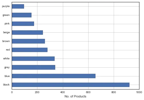
我有一个包含50个特征的5000个产品数据集。其中一列是“颜色”,这一列中有100多种颜色。我试图绘制一个柱状图,仅显示前10种最常见的颜色和每种颜色中有多少产品。

top_colors = df.colors.value_counts()
top_colors[:10].plot(kind='barh')
plt.xlabel('No. of Products');

Pandas Plot

使用Seaborn:

sns.factorplot("colors", data=df , palette="PuBu_d");

Seaborn

1)有更好的方法吗?

2)如何使用Seaborn复制此操作?

3)如何绘制使得最高计数在顶部(即黑色在条形图的最上方)?


来自 seaborn 文档的示例:https://seaborn.pydata.org/examples/horizontal_barplot.html - Anton Tarasenko
2个回答

18

一个简单的技巧可能是反转您绘图的y轴,而不是修改数据:

s = pd.Series(np.random.choice(list(string.uppercase), 1000))
counts = s.value_counts()
ax = counts.iloc[:10].plot(kind="barh")
ax.invert_yaxis()

在此输入图片描述

目前 Seaborn 的 barplot 不支持水平显示的条形图,但是如果你想控制条形图的顺序,可以将值列表传递给 x_order 参数。但我认为在这种情况下使用 Pandas 绘图方法更容易。


3

如果您想使用pandas,则可以先进行排序:

top_colors[:10].sort(ascending=0).plot(kind='barh')

Seaborn已经为您的pandas图表设置了样式,但您也可以使用以下方法:

sns.barplot(top_colors.index, top_colors.values)

谢谢。为了澄清,颜色是其中一列。因此,您的答案将绘制整个数据集,而不仅仅是颜色列。尝试过df.colors[:10].sort(ascending=0).plot(kind='barh'),但没有成功。Seaborn也是如此。有什么想法吗? - ananuc
出现错误:"AttributeError: 'NoneType' object has no attribute 'plot'"。在这种情况下,Seaborn似乎无法正常工作。 - ananuc
谢谢,我解决了。top_colors.sort() top_colors[-10:].plot(kind='barh') - ananuc

网页内容由stack overflow 提供, 点击上面的
可以查看英文原文,
原文链接