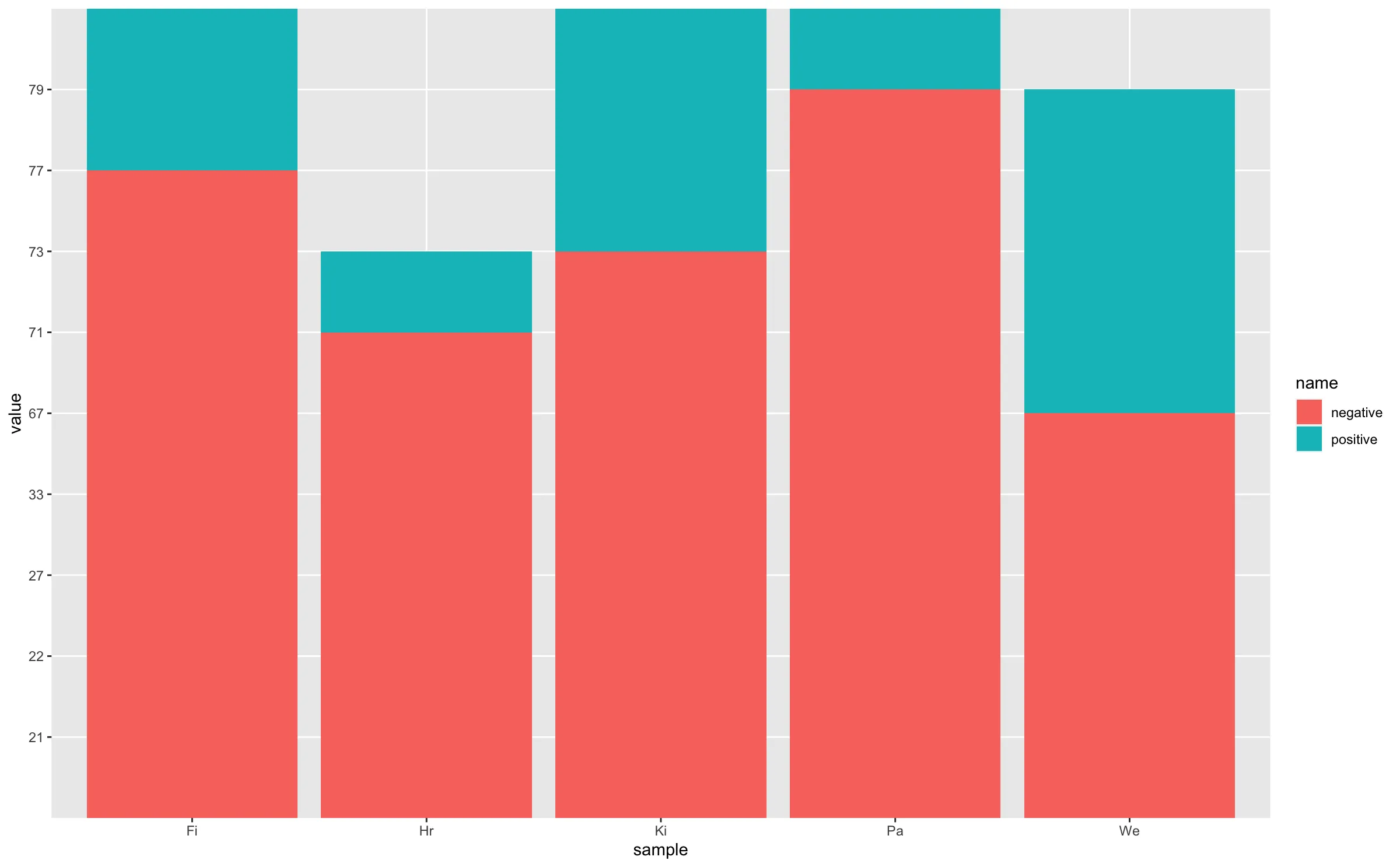
另一个解决方案是使用并排的条形图。
样例数据:
values <- c(21, 22, 33, 21, 27, -71, -77, -67, -79, -73)
sample <- factor(c("Hr", "Fi", "We", "Pa", "Ki"))
mydata <- data.frame(values, sample)
示例代码:
(ggplot(mydata, aes(x = sample, y = values)) +
  geom_bar(
    stat = "identity", position = position_stack(),
    color = "white", fill = "lightblue") +
  coord_flip())+
  labs(x="Sample",y="Percentage")+
  theme_bw()
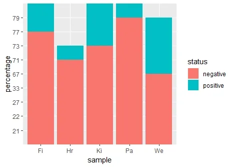
情节: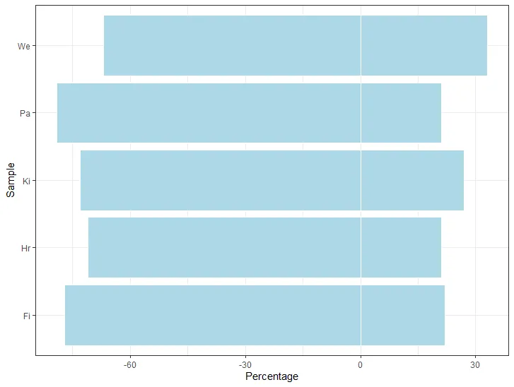
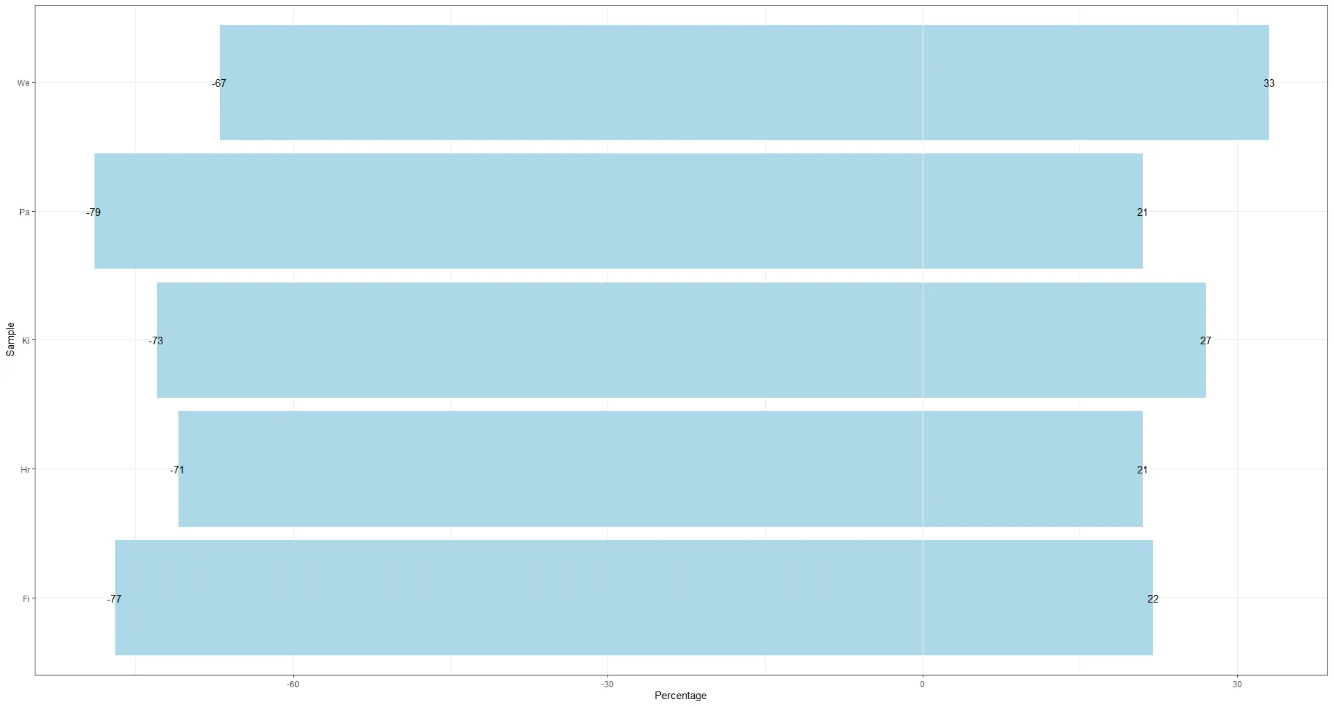
样例代码以显示值:
(ggplot(mydata, aes(x = sample, y = values)) +
  geom_bar(
    stat = "identity", position = position_stack(),
    color = "white", fill = "lightblue"
  ) +
    geom_text(aes(label = values))+
  coord_flip())+
  labs(x="Sample",y="Percentage")+
  theme_bw()
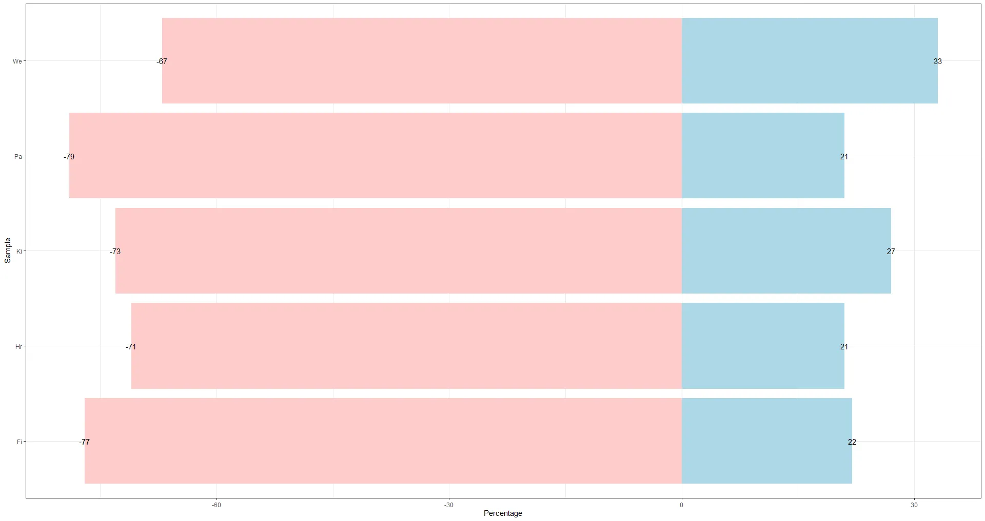
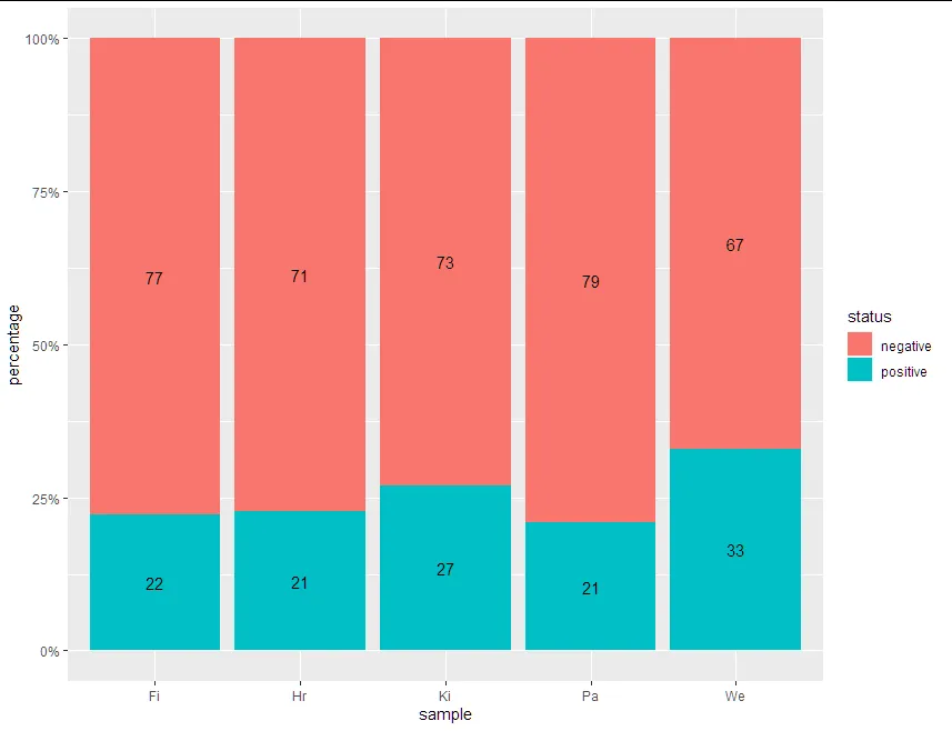
如果您希望用不同的颜色标记正负条
(ggplot(mydata, aes(x = sample, y = values)) +
  geom_bar(
    stat = "identity", position = position_stack(),
    fill= ifelse(mydata$values < 0,"#ffcccb","lightblue")
  ) +
    geom_text(aes(label = values))+
  coord_flip())+
  labs(x="Sample",y="Percentage")+
  theme_bw()