我试图按“好”的百分比对ggplot进行排序。以下是我正在使用的数据框。我现在得到了什么以及我理想情况下想要的是什么。
library(ggplot2)

a <- c("Nevada", "Maine", "North Carolina", "South Carolina", "Texas", "Rhode Island",
       "Nevada", "Maine", "North Carolina", "South Carolina", "Texas", "Rhode Island")
b <- c(0.81, 0.72, 0.65, 0.55, 0.45, 0.35, 0.19, 0.28, 0.35, 0.45, 0.55, 0.65)
d <- c("Good", "Good", "Good", "Good", "Good", "Good", "Bad", "Bad", "Bad", "Bad", "Bad", "Bad")

df <- data.frame(a,b,d)
names(df) <- c("State", "Percentage", "Condition")

ggplot(df, aes(x=State, y=Percentage, fill=Condition))+
  geom_bar (position = "fill", stat="identity")+
  coord_flip()
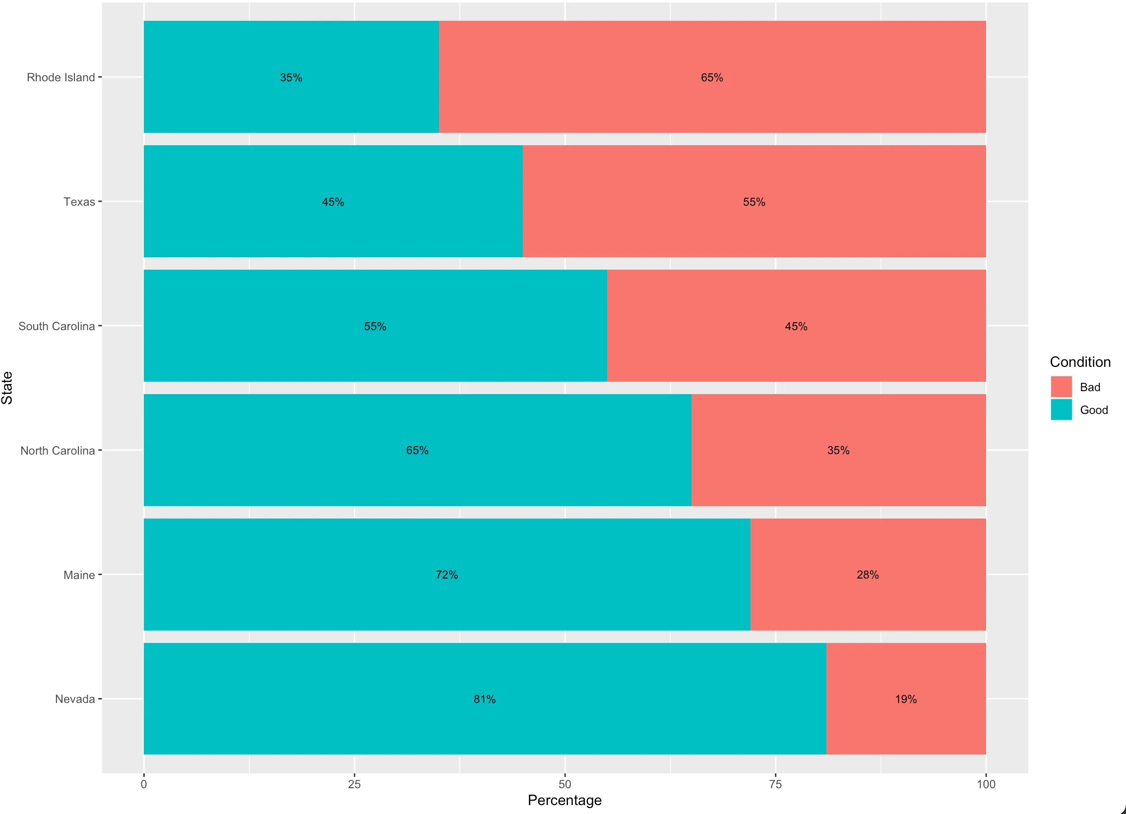
我当前的结果是:
当前堆栈条形图
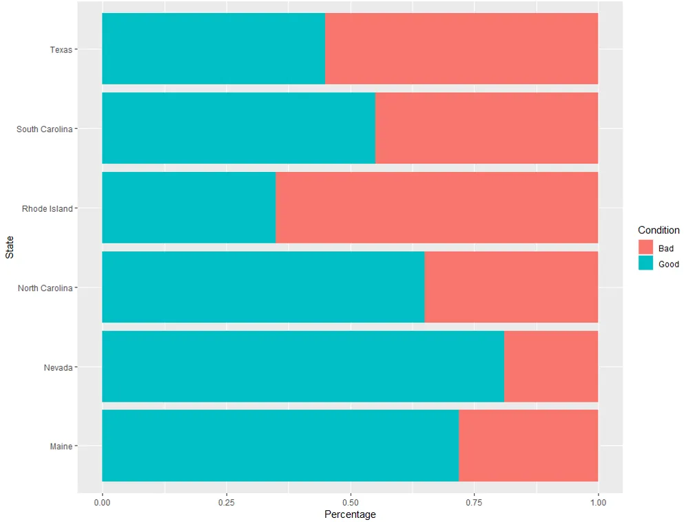
理想情况下,我的结果应该像这样:
期望输出
我已经阅读了多个答案,但是似乎都无法解决问题。我觉得我的数据表格格式可能是问题的一部分,但我尝试过多种方法。欢迎任何指导。