如何创建堆叠条形图集群

87

这是我的数据集的样子:

In [1]: df1=pd.DataFrame(np.random.rand(4,2),index=["A","B","C","D"],columns=["I","J"])

In [2]: df2=pd.DataFrame(np.random.rand(4,2),index=["A","B","C","D"],columns=["I","J"])

In [3]: df1
Out[3]: 
          I         J
A  0.675616  0.177597
B  0.675693  0.598682
C  0.631376  0.598966
D  0.229858  0.378817

In [4]: df2
Out[4]: 
          I         J
A  0.939620  0.984616
B  0.314818  0.456252
C  0.630907  0.656341
D  0.020994  0.538303

我想为每个数据框绘制堆叠条形图,但由于它们具有相同的索引,我希望每个索引有2个堆叠条。

我尝试在同一坐标轴上绘制两者:

In [5]: ax = df1.plot(kind="bar", stacked=True)

In [5]: ax2 = df2.plot(kind="bar", stacked=True, ax = ax)

但它们重叠了。

然后我尝试先连接这两个数据集:

pd.concat(dict(df1 = df1, df2 = df2),axis = 1).plot(kind="bar", stacked=True)

但是这里的一切都被堆积在一起。

我最好的尝试是:

 pd.concat(dict(df1 = df1, df2 = df2),axis = 0).plot(kind="bar", stacked=True)

这将会得到:

enter image description here

这基本上是我想要的,只是我希望按以下顺序排序:

(df1,A) (df2,A) (df1,B) (df2,B) 等等...

我猜有一个技巧,但我找不到它!


在@bgschiller的回答之后,我得到了这个:

enter image description here

这几乎是我想要的。我希望将条形图按索引分组,以便有一些视觉上清晰的东西。

额外奖励:使x轴标签不冗余,例如:

df1 df2    df1 df2
_______    _______ ...
   A          B
10个回答

110

最终我找到了一个技巧(编辑:请查看下文以使用 seaborn 和长格式数据框):

使用 pandas 和 matplotlib 的解决方案

以下是一个更完整的示例:

import pandas as pd
import matplotlib.cm as cm
import numpy as np
import matplotlib.pyplot as plt

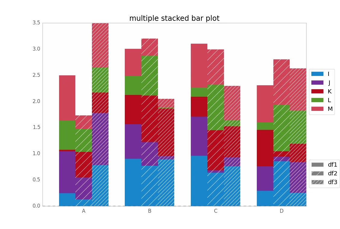
def plot_clustered_stacked(dfall, labels=None, title="multiple stacked bar plot",  H="/", **kwargs):
    """Given a list of dataframes, with identical columns and index, create a clustered stacked bar plot. 
labels is a list of the names of the dataframe, used for the legend
title is a string for the title of the plot
H is the hatch used for identification of the different dataframe"""

    n_df = len(dfall)
    n_col = len(dfall[0].columns) 
    n_ind = len(dfall[0].index)
    axe = plt.subplot(111)

    for df in dfall : # for each data frame
        axe = df.plot(kind="bar",
                      linewidth=0,
                      stacked=True,
                      ax=axe,
                      legend=False,
                      grid=False,
                      **kwargs)  # make bar plots

    h,l = axe.get_legend_handles_labels() # get the handles we want to modify
    for i in range(0, n_df * n_col, n_col): # len(h) = n_col * n_df
        for j, pa in enumerate(h[i:i+n_col]):
            for rect in pa.patches: # for each index
                rect.set_x(rect.get_x() + 1 / float(n_df + 1) * i / float(n_col))
                rect.set_hatch(H * int(i / n_col)) #edited part     
                rect.set_width(1 / float(n_df + 1))

    axe.set_xticks((np.arange(0, 2 * n_ind, 2) + 1 / float(n_df + 1)) / 2.)
    axe.set_xticklabels(df.index, rotation = 0)
    axe.set_title(title)

    # Add invisible data to add another legend
    n=[]        
    for i in range(n_df):
        n.append(axe.bar(0, 0, color="gray", hatch=H * i))

    l1 = axe.legend(h[:n_col], l[:n_col], loc=[1.01, 0.5])
    if labels is not None:
        l2 = plt.legend(n, labels, loc=[1.01, 0.1]) 
    axe.add_artist(l1)
    return axe

# create fake dataframes
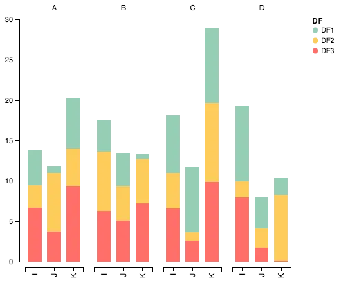
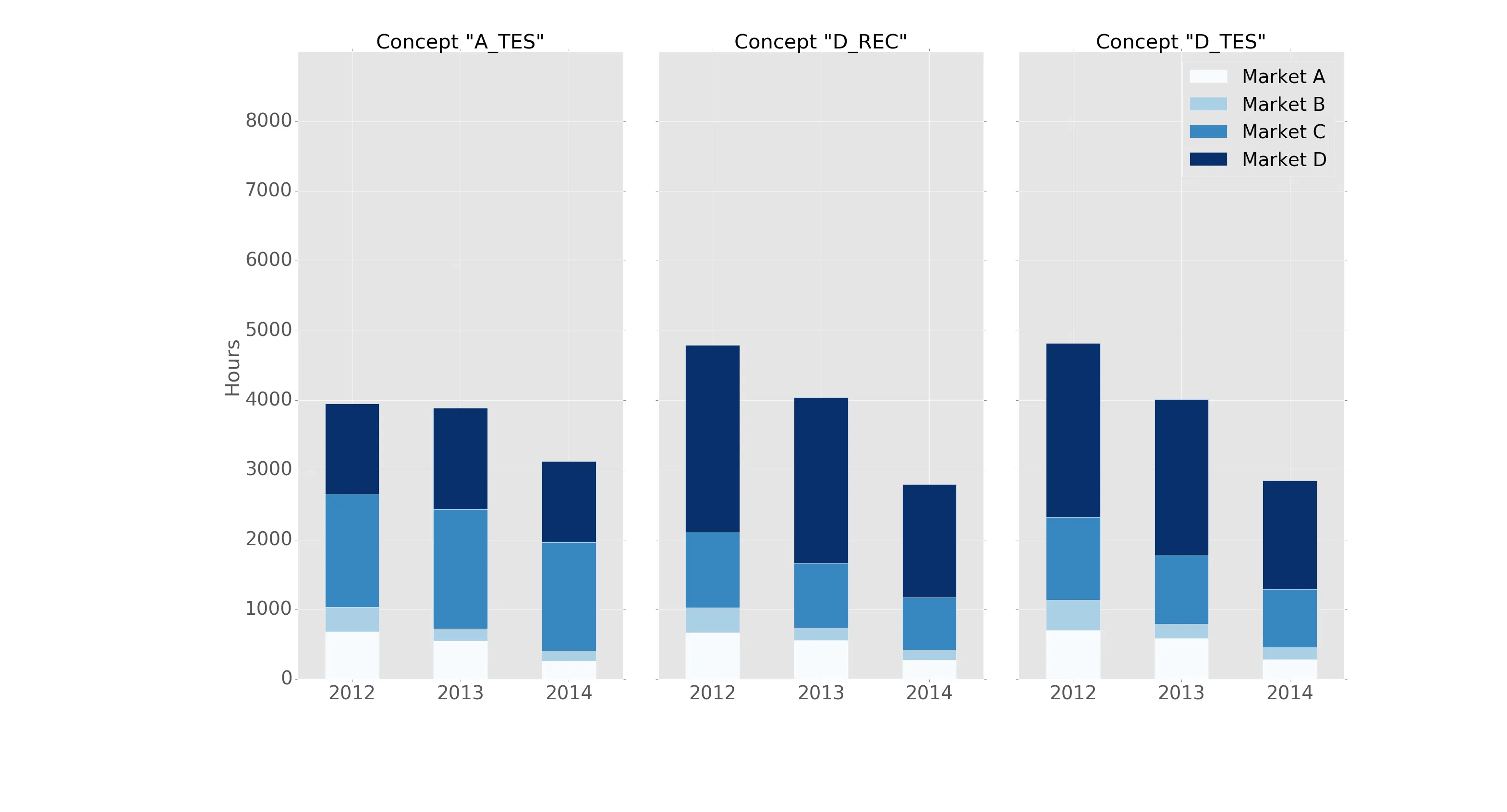
df1 = pd.DataFrame(np.random.rand(4, 5),
                   index=["A", "B", "C", "D"],
                   columns=["I", "J", "K", "L", "M"])
df2 = pd.DataFrame(np.random.rand(4, 5),
                   index=["A", "B", "C", "D"],
                   columns=["I", "J", "K", "L", "M"])
df3 = pd.DataFrame(np.random.rand(4, 5),
                   index=["A", "B", "C", "D"], 
                   columns=["I", "J", "K", "L", "M"])

# Then, just call :
plot_clustered_stacked([df1, df2, df3],["df1", "df2", "df3"])
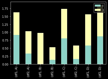
    

它会得到这样的结果:

多个堆叠条形图

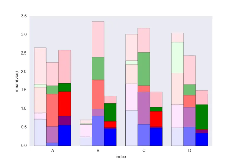
您可以通过传递cmap参数来更改条形的颜色:

plot_clustered_stacked([df1, df2, df3],
                       ["df1", "df2", "df3"],
                       cmap=plt.cm.viridis)
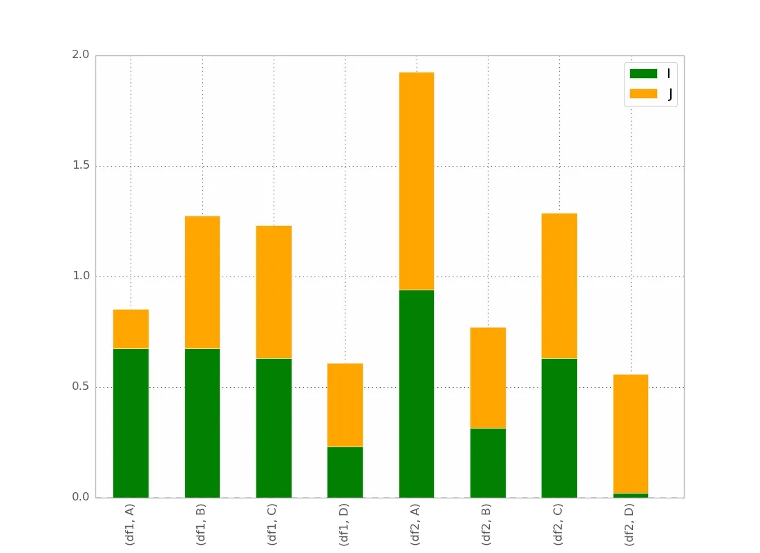
使用 seaborn 的解决方案:

对于给定的 df1、df2、df3 数据框,我将它们转换为长格式:

df1["Name"] = "df1"
df2["Name"] = "df2"
df3["Name"] = "df3"
dfall = pd.concat([pd.melt(i.reset_index(),
                           id_vars=["Name", "index"]) # transform in tidy format each df
                   for i in [df1, df2, df3]],
                   ignore_index=True)

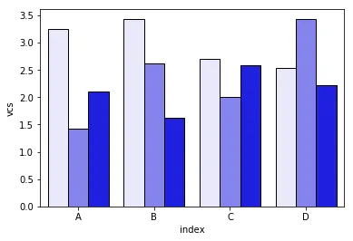
Seaborn的问题在于它本身不支持堆叠条形图,因此诀窍是在彼此之上绘制每个条的累计总和:

dfall.set_index(["Name", "index", "variable"], inplace=1)
dfall["vcs"] = dfall.groupby(level=["Name", "index"]).cumsum()
dfall.reset_index(inplace=True) 

>>> dfall.head(6)
  Name index variable     value       vcs
0  df1     A        I  0.717286  0.717286
1  df1     B        I  0.236867  0.236867
2  df1     C        I  0.952557  0.952557
3  df1     D        I  0.487995  0.487995
4  df1     A        J  0.174489  0.891775
5  df1     B        J  0.332001  0.568868

然后循环遍历每组 variable 并绘制累计和:

c = ["blue", "purple", "red", "green", "pink"]
for i, g in enumerate(dfall.groupby("variable")):
    ax = sns.barplot(data=g[1],
                     x="index",
                     y="vcs",
                     hue="Name",
                     color=c[i],
                     zorder=-i, # so first bars stay on top
                     edgecolor="k")
ax.legend_.remove() # remove the redundant legends 

多个堆叠柱状图seaborn

我认为它缺少可以轻松添加的图例。问题在于,我们有一个亮度梯度来区分数据帧,而不是方格线(可以很容易地添加),对于第一个数据帧来说有点太浅了,我不知道如何在不逐个更改每个矩形的情况下更改它(就像第一种解决方案一样)。

如果您不理解代码中的某些内容,请告诉我。

随意重复使用此处在CC0下开源的代码。


1
我不了解mpdld3,但从文档中所理解的来看,你只需要使用mpld3.display(plt.gcf())或类似的方法来显示它。 - jrjc
2
你能帮我一个大忙,把这个片段放在BSD / MIT / CC-0下吗?谢谢 :) - Andreas Mueller
谢谢你的解决方案!我正在尝试添加误差线,但它们被移位了。你能演示一下如何包含它们吗? - ta8
@AndreasMueller 所有发布在本网站上的代码均属于 CC BY-SA 3.0 许可,您可以自由地重复使用这些代码。 - cjnash
@cjnash,这与我提到的任何许可证都不同,如果包含在开源库中将会很麻烦。我可能已经在某个时候重写了这个,但是这个评论已经有7年了 ;) - Andreas Mueller
显示剩余7条评论

23

这是一个很好的开始,但我认为颜色可以稍微修改一下以增加清晰度。此外,在导入Altair的每个参数时要小心,因为这可能会导致与命名空间中现有对象发生冲突。这里是一些重新配置的代码,以显示正确的颜色显示当堆叠值时:

Altair簇列图

导入包

import pandas as pd
import numpy as np
import altair as alt

生成一些随机数据

df1=pd.DataFrame(10*np.random.rand(4,3),index=["A","B","C","D"],columns=["I","J","K"])
df2=pd.DataFrame(10*np.random.rand(4,3),index=["A","B","C","D"],columns=["I","J","K"])
df3=pd.DataFrame(10*np.random.rand(4,3),index=["A","B","C","D"],columns=["I","J","K"])

def prep_df(df, name):
    df = df.stack().reset_index()
    df.columns = ['c1', 'c2', 'values']
    df['DF'] = name
    return df

df1 = prep_df(df1, 'DF1')
df2 = prep_df(df2, 'DF2')
df3 = prep_df(df3, 'DF3')

df = pd.concat([df1, df2, df3])

使用Altair绘制数据

alt.Chart(df).mark_bar().encode(

    # tell Altair which field to group columns on
    x=alt.X('c2:N', title=None),

    # tell Altair which field to use as Y values and how to calculate
    y=alt.Y('sum(values):Q',
        axis=alt.Axis(
            grid=False,
            title=None)),

    # tell Altair which field to use to use as the set of columns to be  represented in each group
    column=alt.Column('c1:N', title=None),

    # tell Altair which field to use for color segmentation 
    color=alt.Color('DF:N',
            scale=alt.Scale(
                # make it look pretty with an enjoyable color pallet
                range=['#96ceb4', '#ffcc5c','#ff6f69'],
            ),
        ))\
    .configure_view(
        # remove grid lines around column clusters
        strokeOpacity=0    
    )

1
可以为不同的列I、J和K设置不同的颜色集吗? - toryan
1
@toryan,你可以使用我的解决方案这里,它为每个I、J、K提供了选择不同颜色方案的选项。我相信在altair中也可以做到,但是由于我对altair的知识有限,所以无法做到 :P - lifezbeautiful
@grant-langseth,如果我想添加误差条,您能指出应该修改哪里吗? - tigercosmos
@Grant Langseth,有没有一种简单的方法可以展示每个堆叠条形图每个部分的数值? - Nadros
@Grant Langseth,你的图表水平轴上的 I J K 指示标记看起来非常漂亮。你能提供一些关于如何在自己的图表中实现类似外观的指导吗? - swamp

9
@jrjc提供的使用seaborn的答案非常聪明,但是它有一些问题,正如作者所指出的那样:
  1. 当只需要两个或三个类别时,“浅色”阴影太淡了。这使得颜色系列(淡蓝色、蓝色、深蓝色等)难以区分。
  2. 没有产生图例来区分阴影的含义(“浅色”意味着什么?)
然而更重要的是,我发现,由于代码中的groupby语句:
  1. 此解决方案仅在按字母顺序排序的列的情况下有效。如果我通过反字母表方式重命名列["I","J","K","L","M"]["zI","yJ","xK","wL","vM"],则会得到此图形
如果列不按字母顺序排列,则堆叠条形构造失败
我努力解决这些问题,使用这个开源的Python模块中的plot_grouped_stackedbars()函数
  1. 它保持了合理范围内的阴影
  2. 它自动生成一个解释阴影的图例
  3. 它不依赖于groupby
具有图例和窄阴影范围的适当分组堆叠条形图 它还允许
  1. 各种标准化选项(见下面的最大值标准化为100%)
  2. 添加误差栏
标准化和误差栏的示例此处查看完整演示。我希望这对回答原始问题有所帮助。

9

我已经使用pandas和matplotlib子图基本命令达到了相同的效果。

以下是一个示例:

fig, axes = plt.subplots(nrows=1, ncols=3)

ax_position = 0
for concept in df.index.get_level_values('concept').unique():
    idx = pd.IndexSlice
    subset = df.loc[idx[[concept], :],
                    ['cmp_tr_neg_p_wrk', 'exp_tr_pos_p_wrk',
                     'cmp_p_spot', 'exp_p_spot']]     
    print(subset.info())
    subset = subset.groupby(
        subset.index.get_level_values('datetime').year).sum()
    subset = subset / 4  # quarter hours
    subset = subset / 100  # installed capacity
    ax = subset.plot(kind="bar", stacked=True, colormap="Blues",
                     ax=axes[ax_position])
    ax.set_title("Concept \"" + concept + "\"", fontsize=30, alpha=1.0)
    ax.set_ylabel("Hours", fontsize=30),
    ax.set_xlabel("Concept \"" + concept + "\"", fontsize=30, alpha=0.0),
    ax.set_ylim(0, 9000)
    ax.set_yticks(range(0, 9000, 1000))
    ax.set_yticklabels(labels=range(0, 9000, 1000), rotation=0,
                       minor=False, fontsize=28)
    ax.set_xticklabels(labels=['2012', '2013', '2014'], rotation=0,
                       minor=False, fontsize=28)
    handles, labels = ax.get_legend_handles_labels()
    ax.legend(['Market A', 'Market B',
               'Market C', 'Market D'],
              loc='upper right', fontsize=28)
    ax_position += 1

# look "three subplots"
#plt.tight_layout(pad=0.0, w_pad=-8.0, h_pad=0.0)

# look "one plot"
plt.tight_layout(pad=0., w_pad=-16.5, h_pad=0.0)
axes[1].set_ylabel("")
axes[2].set_ylabel("")
axes[1].set_yticklabels("")
axes[2].set_yticklabels("")
axes[0].legend().set_visible(False)
axes[1].legend().set_visible(False)
axes[2].legend(['Market A', 'Market B',
                'Market C', 'Market D'],
               loc='upper right', fontsize=28)

"subset" 在分组之前的数据框结构如下:
<class 'pandas.core.frame.DataFrame'>
MultiIndex: 105216 entries, (D_REC, 2012-01-01 00:00:00) to (D_REC, 2014-12-31 23:45:00)
Data columns (total 4 columns):
cmp_tr_neg_p_wrk    105216 non-null float64
exp_tr_pos_p_wrk    105216 non-null float64
cmp_p_spot          105216 non-null float64
exp_p_spot          105216 non-null float64
dtypes: float64(4)
memory usage: 4.0+ MB

以下是故事情节:

enter image description here

它采用“ggplot”风格格式化,头部如下:

import pandas as pd
import matplotlib.pyplot as plt
import matplotlib
matplotlib.style.use('ggplot')

2
很棒的答案,但如果没有可复制的数据,就更难理解了。有没有可能在某个地方下载数据? - lincolnfrias
3
请添加样本数据以便能够复现此问题。 - baxx

6
这里是Cord Kaldemeyer回答的更简洁的实现答案。其思路是为绘图保留必要的宽度,然后每个聚类都会得到所需长度的子图。
# Data and imports

import pandas as pd
import matplotlib.pyplot as plt
import numpy as np
from matplotlib.ticker import MaxNLocator
import matplotlib.gridspec as gridspec
import matplotlib

matplotlib.style.use('ggplot')

np.random.seed(0)

df = pd.DataFrame(np.asarray(1+5*np.random.random((10,4)), dtype=int),columns=["Cluster", "Bar", "Bar_part", "Count"])
df = df.groupby(["Cluster", "Bar", "Bar_part"])["Count"].sum().unstack(fill_value=0)
display(df)

# plotting

clusters = df.index.levels[0]
inter_graph = 0
maxi = np.max(np.sum(df, axis=1))
total_width = len(df)+inter_graph*(len(clusters)-1)

fig = plt.figure(figsize=(total_width,10))
gridspec.GridSpec(1, total_width)
axes=[]

ax_position = 0
for cluster in clusters:
    subset = df.loc[cluster]
    ax = subset.plot(kind="bar", stacked=True, width=0.8, ax=plt.subplot2grid((1,total_width), (0,ax_position), colspan=len(subset.index)))
    axes.append(ax)
    ax.set_title(cluster)
    ax.set_xlabel("")
    ax.set_ylim(0,maxi+1)
    ax.yaxis.set_major_locator(MaxNLocator(integer=True))
    ax_position += len(subset.index)+inter_graph

for i in range(1,len(clusters)):
    axes[i].set_yticklabels("")
    axes[i-1].legend().set_visible(False)
axes[0].set_ylabel("y_label")

fig.suptitle('Big Title', fontsize="x-large")
legend = axes[-1].legend(loc='upper right', fontsize=16, framealpha=1).get_frame()
legend.set_linewidth(3)
legend.set_edgecolor("black")

plt.show()

结果如下:

(目前还不能在网站上直接发布图片)


有没有办法重新排列组的顺序?以及每个组内的列?例如,在第一组中,5、4,在第二组中:4、3、5? - josepmaria
1
你需要重新排列数据本身,并稍微更改代码。在显示之前,执行 df = df.loc[[(3, 4), (3, 3), (3, 5), (1, 5), (1, 4), (4, 4), (5, 4), (5, 2)]],并在初始化 clusters 时,写入 clusters = df.index.get_level_values("Cluster").drop_duplicates()。这应该能解决问题。 - Simoons
你如何增加群组集群的字体大小(在“大标题”下面的数字)? - josepmaria
1
ax.set_title(cluster, fontsize=32) instead of ax.set_title(cluster) - Simoons
你如何在柱子上添加图案(同时保留现有的颜色)? - josepmaria
1
在第一个循环内添加类似于 for container in ax.containers: for patch in container.patches: patch.set_hatch(r"/") 的内容。 - Simoons

3
我们尝试使用matplotlib来完成这个任务。我们将数值转换为累积值,如下所示:
# get cumulative values
cum_val = [a[0]]
for j in range(1,len(a)):
    cum_val.append( cum_val[j-1] + a[j] )

我们按高度降序绘制条形图,以便它们都可见。我们添加了一些硬编码的颜色方案,也可以从RGB立方体中按顺序生成。该软件包可通过以下方式安装:
pip install groupstackbar

然后,它可以按如下所示导入并使用。此外,有一个函数(generate_dummy_data)可生成一个dummy.csv样本数据以测试功能。

import matplotlib.pyplot as plt
import csv
import random
import groupstackbar

def generate_dummy_data():
    with open('dummy_data.csv','w') as f:
        csvwriter = csv.writer(f)
        csvwriter.writerow(['Week','State_SEIR','Age_Cat','Value'])
        for i in ['Week 1', 'Week 2', 'Week 3']: # 3 weeks
            for j in ['S','E','I','R']:
                for k in ['Age Cat 1', 'Age Cat 2', 'Age Cat 3', 'Age Cat 4', 'Age Cat 5']:
                    csvwriter.writerow([i,j,k, int(random.random()*100)])

generate_dummy_data()


f = groupstackbar.plot_grouped_stacks('dummy_data.csv', BGV=['State_SEIR','Week','Age_Cat'], extra_space_on_top = 30)

plt.savefig("output.png",dpi=500)

下面是groupstackbarplot_grouped_stacks()函数的复制版本:
"""
Arguments: 
filename: 
  a csv filename with 4 headers, H1, H2, H3 and H4. Each one of H1/H2/H3/H4 are strings.
  the first three headers(H1/H2/H3) should identify a row uniquely 
  the fourth header H4 contains the value (H4 must be integer or floating; cannot be a string)
  .csv files without headers will result in the first row being read as headers. 
duplicates (relevant for csv inputs):
  duplicate entries imply two rows with same <H1/H2/H3> identifier. 
  In case of duplicates aggregation is performed before proceeding, both the duplicates are binned together to increase the target value 
BGV:a python list of three headers in order for stacking (Bars, Groups and Vertical Stacking)
  for example, if BGV=[H2, H1, H3], the group stack plot will be such that:
    maximum number of bars = number of unique values under column H2
    maximum number of bars grouped together horizontally(side-by-side) = number of 
                                                unique values under column H1
    maximum number of vertical stacks in any bar = number of unique values under column H2
"""
def plot_grouped_stacks(filename, BGV, fig_size=(10, 8), 
                        intra_group_spacing=0.1,
                        inter_group_spacing=10, 
                        y_loc_for_group_name=-5,
                        y_loc_for_hstack_name=5,
                        fontcolor_hstacks='blue',
                        fontcolor_groups='black',
                        fontsize_hstacks=20,
                        fontsize_groups=30,
                        x_trim_hstack_label=0,
                        x_trim_group_label=0,
                        extra_space_on_top=20 
                        ):
    

    figure_ = plt.figure(figsize=fig_size)
    size = figure_.get_size_inches()
    figure_.add_subplot(1,1,1)

    # sanity check for inputs; some trivial exception handlings 
    if intra_group_spacing >= 100: 
        print ("Percentage for than 100 for variables intra_group_spacing, Aborting! ")
        return 
    else:
        intra_group_spacing = intra_group_spacing*size[0]/100  # converting percentanges to inches

    if inter_group_spacing >= 100: 
        print ("Percentage for than 100 for variables inter_group_spacing, Aborting! ")        
        return 
    else:
        inter_group_spacing = inter_group_spacing*size[0]/100  # converting percentanges to inches

    
    if y_loc_for_group_name >= 100: 
        print ("Percentage for than 100 for variables inter_group_spacing, Aborting! ")        
        return 
    else:
        # the multiplier 90 is set empirically to roughly align the percentage value 
        # <this is a quick fix solution, which needs to be improved later>
        y_loc_for_group_name = 90*y_loc_for_group_name*size[1]/100  # converting percentanges to inches


    if y_loc_for_hstack_name >= 100: 
        print ("Percentage for than 100 for variables inter_group_spacing, Aborting! ")        
        return 
    else:
        y_loc_for_hstack_name = 70*y_loc_for_hstack_name*size[1]/100  # converting percentanges to inches

    if x_trim_hstack_label >= 100: 
        print ("Percentage for than 100 for variables inter_group_spacing, Aborting! ")        
        return 
    else:
        x_trim_hstack_label = x_trim_hstack_label*size[0]/100  # converting percentanges to inches

    if x_trim_group_label >= 100: 
        print ("Percentage for than 100 for variables inter_group_spacing, Aborting! ")        
        return 
    else:
        x_trim_group_label = x_trim_group_label*size[0]/100  # converting percentanges to inches


    fileread_list = []

   
    with open(filename) as f:
        for row in f:
            r = row.strip().split(',')    
            if len(r) != 4:
                print ('4 items not found @ line ', c, ' of ', filename)
                return
            else:
                fileread_list.append(r)

        
    # inputs: 
    bar_variable = BGV[0]
    group_variable = BGV[1]
    vertical_stacking_variable = BGV[2]

    first_line = fileread_list[0]
    for i in range(4):
        if first_line[i] == vertical_stacking_variable:
            header_num_Of_vertical_stacking = i
            break
    
    sorted_order_for_stacking = []
    for listed in fileread_list[1:]:  # skipping the first line
        sorted_order_for_stacking.append(listed[header_num_Of_vertical_stacking])
    sorted_order_for_stacking = list(set(sorted_order_for_stacking))
    list.sort(sorted_order_for_stacking)
    sorted_order_for_stacking_V = list(sorted_order_for_stacking)
    #####################

    first_line = fileread_list[0]
    for i in range(4):
        if first_line[i] == bar_variable:
            header_num_Of_bar_Variable = i
            break

    sorted_order_for_stacking = []
    for listed in fileread_list[1:]:  # skipping the first line
        sorted_order_for_stacking.append(listed[header_num_Of_bar_Variable])
    sorted_order_for_stacking = list(set(sorted_order_for_stacking))
    list.sort(sorted_order_for_stacking)
    sorted_order_for_stacking_H = list(sorted_order_for_stacking)
    ######################

    first_line = fileread_list[0]
    for i in range(4):
        if first_line[i] == group_variable:
            header_num_Of_bar_Variable = i
            break

    sorted_order_for_stacking = []
    for listed in fileread_list[1:]:  # skipping the first line
        sorted_order_for_stacking.append(listed[header_num_Of_bar_Variable])
    sorted_order_for_stacking = list(set(sorted_order_for_stacking))
    list.sort(sorted_order_for_stacking)
    sorted_order_for_stacking_G = list(sorted_order_for_stacking)
    #########################   

    print (" Vertical/Horizontal/Groups  ")
    print (sorted_order_for_stacking_V, " : Vertical stacking labels")
    print (sorted_order_for_stacking_H, " : Horizontal stacking labels")
    print (sorted_order_for_stacking_G, " : Group names")


    # +1 because we need one space before and after as well
    each_group_width = (size[0] - (len(sorted_order_for_stacking_G) + 1) *
                        inter_group_spacing)/len(sorted_order_for_stacking_G)
    
    # -1 because we need n-1 spaces between bars if there are n bars in each group
    each_bar_width = (each_group_width - (len(sorted_order_for_stacking_H) - 1) *
                      intra_group_spacing)/len(sorted_order_for_stacking_H)

    
    # colormaps 
    number_of_color_maps_needed = len(sorted_order_for_stacking_H)
    number_of_levels_in_each_map = len(sorted_order_for_stacking_V)
    c_map_vertical = {}
    
    for i in range(number_of_color_maps_needed):
        try:
            c_map_vertical[sorted_order_for_stacking_H[i]] = sequential_colors[i]
        except:
            print ("Something went wrong with hardcoded colors!\n reverting to custom colors (linear in RGB) ") 
            c_map_vertical[sorted_order_for_stacking_H[i]] = getColorMaps(N = number_of_levels_in_each_map, type = 'S')

    ## 

    state_num = -1
    max_bar_height = 0
    for state in sorted_order_for_stacking_H:
        state_num += 1
        week_num = -1
        for week in ['Week 1', 'Week 2','Week 3']:
            week_num += 1

            a = [0] * len(sorted_order_for_stacking_V)
            for i in range(len(sorted_order_for_stacking_V)):

                for line_num in range(1,len(fileread_list)):  # skipping the first line
                    listed = fileread_list[line_num]

                    if listed[1] == state and listed[0] == week and listed[2] == sorted_order_for_stacking_V[i]:
                        a[i] = (float(listed[3]))

            
            # get cumulative values
            cum_val = [a[0]]
            for j in range(1,len(a)):
                cum_val.append( cum_val[j-1] + a[j] )
            max_bar_height = max([max_bar_height, max(cum_val)])        
    

            plt.text(x=  (week_num)*(each_group_width+inter_group_spacing) - x_trim_group_label
            , y=y_loc_for_group_name, s=sorted_order_for_stacking_G[week_num], fontsize=fontsize_groups, color=fontcolor_groups)


            # state labels need to be printed just once for each week, hence putting them outside the loop
            plt.text(x=  week_num*(each_group_width+inter_group_spacing) + (state_num)*(each_bar_width+intra_group_spacing) - x_trim_hstack_label
             , y=y_loc_for_hstack_name, s=sorted_order_for_stacking_H[state_num], fontsize=fontsize_hstacks, color = fontcolor_hstacks)


            if week_num == 1:
                # label only in the first week

                for i in range(len(sorted_order_for_stacking_V)-1,-1,-1): 
                    # trick to make them all visible: Plot in descending order of their height!! :)
                    plt.bar(  week_num*(each_group_width+inter_group_spacing) +
                            state_num*(each_bar_width+intra_group_spacing), 
                            height=cum_val[i] ,
                            width=each_bar_width, 
                            color=c_map_vertical[state][i], 
                            label= state + "_" + sorted_order_for_stacking_V[i] )
            else:
                    # no label after the first week, (as it is just repetition)
                    for i in range(len(sorted_order_for_stacking_V)-1,-1,-1): 
                        plt.bar(  week_num*(each_group_width+inter_group_spacing) +
                            state_num*(each_bar_width+intra_group_spacing), 
                            height=cum_val[i] ,
                            width=each_bar_width, 
                            color=c_map_vertical[state][i])
                        
    plt.ylim(0,max_bar_height*(1+extra_space_on_top/100))
    plt.tight_layout()
    plt.xticks([], [])
    plt.legend(ncol=len(sorted_order_for_stacking_H))
    return figure_

附有图示的readMe,可帮助用户快速了解函数参数。如有问题或需求,请随时提出issue或发起pull request。目前输入格式为4列的csv文件,但如有必要,可以添加pandas数据框作为输入。

https://github.com/jimioke/groupstackbar

Image


2

你已经朝着正确的方向前进了!要改变条形图的顺序,你需要更改索引的顺序。

In [5]: df_both = pd.concat(dict(df1 = df1, df2 = df2),axis = 0)

In [6]: df_both
Out[6]:
              I         J
df1 A  0.423816  0.094405
    B  0.825094  0.759266
    C  0.654216  0.250606
    D  0.676110  0.495251
df2 A  0.607304  0.336233
    B  0.581771  0.436421
    C  0.233125  0.360291
    D  0.519266  0.199637

[8 rows x 2 columns]

所以我们想要交换轴,然后重新排序。以下是一种简单的方法

In [7]: df_both.swaplevel(0,1)
Out[7]:
              I         J
A df1  0.423816  0.094405
B df1  0.825094  0.759266
C df1  0.654216  0.250606
D df1  0.676110  0.495251
A df2  0.607304  0.336233
B df2  0.581771  0.436421
C df2  0.233125  0.360291
D df2  0.519266  0.199637

[8 rows x 2 columns]

In [8]: df_both.swaplevel(0,1).sort_index()
Out[8]:
              I         J
A df1  0.423816  0.094405
  df2  0.607304  0.336233
B df1  0.825094  0.759266
  df2  0.581771  0.436421
C df1  0.654216  0.250606
  df2  0.233125  0.360291
D df1  0.676110  0.495251
  df2  0.519266  0.199637

[8 rows x 2 columns]

如果水平标签以旧顺序(df1,A)而不是(A,df1)显示很重要,我们可以再次交换级别而不是排序索引:

In [9]: df_both.swaplevel(0,1).sort_index().swaplevel(0,1)
Out[9]:
              I         J
df1 A  0.423816  0.094405
df2 A  0.607304  0.336233
df1 B  0.825094  0.759266
df2 B  0.581771  0.436421
df1 C  0.654216  0.250606
df2 C  0.233125  0.360291
df1 D  0.676110  0.495251
df2 D  0.519266  0.199637

[8 rows x 2 columns]

谢谢,它几乎按预期工作。我想要一些视觉上清晰的东西,在这里所有的条形图都沿着x轴均匀分布,我想要2对2聚类。抱歉我在问题中没有提到。(我会编辑) - jrjc

1

Altair在这里可能会很有帮助。这是生成的图表。

enter image description here

导入

import pandas as pd
import numpy as np
from altair import *

数据集创建
df1=pd.DataFrame(10*np.random.rand(4,2),index=["A","B","C","D"],columns=["I","J"])
df2=pd.DataFrame(10*np.random.rand(4,2),index=["A","B","C","D"],columns=["I","J"])

准备数据集。
def prep_df(df, name):
    df = df.stack().reset_index()
    df.columns = ['c1', 'c2', 'values']
    df['DF'] = name
    return df

df1 = prep_df(df1, 'DF1')
df2 = prep_df(df2, 'DF2')

df = pd.concat([df1, df2])

Altair 绘图

Chart(df).mark_bar().encode(y=Y('values', axis=Axis(grid=False)),
                            x='c2:N', 
                            column=Column('c1:N') ,
                            color='DF:N').configure_facet_cell( strokeWidth=0.0).configure_cell(width=200, height=200)

0

这是我使用两个图表进行数据复制的方法。

初始数据:

      A     B    C   D
0   level1  B1  456 326
1   level1  B3  694 1345
2   level1  B2  546 1471
3   level2  B1  687 806
4   level2  B3  877 1003
5   level2  B2  790 1004

设置多重索引

data = data.set_index(["A", "B"])

这里是代码:

import matplotlib
import matplotlib.pyplot as plt

import pandas as pd
import os
import seaborn as sns    
matplotlib.style.use("seaborn-white")

ig, axes = plt.subplots(nrows=1, ncols=2, figsize=(10,6))
ax_position = 0
y_offset = -120 # decrease value if you want to decrease the position of data labels
for metric in data.index.get_level_values('A').unique():
    idx = pd.IndexSlice
    subset = data.loc[idx[[metric], :],
                    ['C', 'D']]   
    subset = subset.groupby(
        subset.index.get_level_values('B')).sum()
    ax = subset.plot(kind="bar", stacked=True, colormap="Pastel1",
                     ax=axes[ax_position])
    ax.set_title(metric, fontsize=15, alpha=1.0)
    ax.set_xlabel(metric, fontsize=15, alpha=0.0)
    ax.set_ylabel("Values", fontsize=15)
    ax.set_xticklabels(labels=['B1', "B2", "B3"], rotation=0,
                       minor=False, fontsize=15)
    ax.set_ylim(0, 3000)
    ax.set_yticks(range(0, 3000, 500), fontsize=15)
    handles, labels = ax.get_legend_handles_labels()
    ax_position += 1
    
    for bar in ax.patches:
        ax.text(
          # Put the text in the middle of each bar. get_x returns the start
          # so we add half the width to get to the middle.
          bar.get_x() + bar.get_width() / 2,
          # Vertically, add the height of the bar to the start of the bar,
          # along with the offset.
          bar.get_height() + bar.get_y() + y_offset,
          # This is actual value we'll show.
          round(bar.get_height()),
          # Center the labels and style them a bit.
          ha='center',
          color='w',
          weight='bold',
          size=12
      )

ax.legend(bbox_to_anchor=(1.04, 1), loc="upper left")
plt.tight_layout(pad=0.0, w_pad=-1.0, h_pad=0.0) # increase w_pad if you'd like to separate charts
axes[1].set_yticklabels("")
axes[1].set_ylabel("")
axes[0].legend().set_visible(False)

result chart


0

您可以通过更改索引顺序(在这种情况下使用排序)来更改条形顺序:

pd.concat([df1, df2], keys=['df1', 'df2']).sort_index(level=1).plot.bar(stacked=True)

enter image description here


网页内容由stack overflow 提供, 点击上面的
可以查看英文原文,
原文链接