问题在于您在绘制数据后才绘制白色矩形,从而覆盖了它们。由于
plot.xts没有一个
add参数,允许您在绘制矩形后调用它,我唯一看到的解决方案是修改
plot.xts函数。
plot.xtsMODIFIED<-function (x, y = NULL, type = "l", auto.grid = TRUE, major.ticks = "auto",
minor.ticks = TRUE, major.format = TRUE, bar.col = "grey",
candle.col = "white", ann = TRUE, axes = TRUE, ...)
{
series.title <- deparse(substitute(x))
ep <- axTicksByTime(x, major.ticks, format.labels = major.format)
otype <- type
if (is.OHLC(x) && type %in% c("candles", "bars")) {
x <- x[, has.OHLC(x, TRUE)]
xycoords <- list(x = .index(x), y = seq(min(x), max(x),
length.out = NROW(x)))
type <- "n"
}
else {
if (NCOL(x) > 1)
warning("only the univariate series will be plotted")
if (is.null(y))
xycoords <- xy.coords(.index(x), x[, 1])
}
plot(xycoords$x, xycoords$y, type = "n", axes = FALSE, ann = FALSE)
rect(par("usr")[1], par("usr")[3], par("usr")[2], par("usr")[4], col ="white")
if(type=="l"){lines(xycoords$x, xycoords$y, ...)}
if (auto.grid) {
abline(v = xycoords$x[ep], col = "grey", lty = 4)
grid(NA, NULL)
}
if (is.OHLC(x) && otype == "candles")
plot.ohlc.candles(x, bar.col = bar.col, candle.col = candle.col,
...)
dots <- list(...)
if (axes) {
if (minor.ticks)
axis(1, at = xycoords$x, labels = FALSE, col = "#BBBBBB",
...)
axis(1, at = xycoords$x[ep], labels = names(ep), las = 1,
lwd = 1, mgp = c(3, 2, 0), ...)
axis(2, ...)
}
box()
if (!"main" %in% names(dots))
title(main = series.title)
do.call("title", list(...))
assign(".plot.xts", recordPlot(), .GlobalEnv)
}
然后你的脚本变成了:
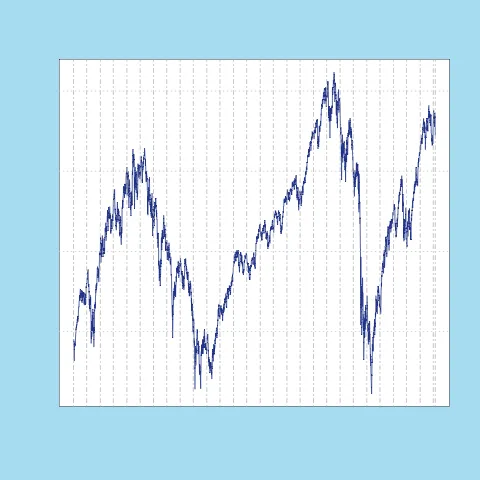
library(quantmod)
getSymbols('SPY', from='1998-01-01', to='2011-07-31', adjust=T)

GRAPH_BLUE<-rgb(43/255, 71/255,153/255)
GRAPH_BACKGROUND<-rgb(180/255, 226/255, 244/255)

par(bg=GRAPH_BACKGROUND)

plot.xtsMODIFIED(SPY, col=GRAPH_BLUE)
你遇到的错误信息 (Error in axis(1, at = xycoords$x, labels = FALSE, col = "#BBBBBB", ...) : formal argument "col" matched by multiple actual arguments.) 在之前的脚本中也出现过。这与 plot.xts 使用多个时间参数 ... 以及参数 col 同时适用于 axis 和 plot(或在我修改后的版本中,lines)有关。如果您想避免这种情况,我看到两个解决方案:
要么您希望轴与线条颜色相同,因此您需要更改以下行:
...
axis(1, at = xycoords$x, labels = FALSE, col = "#BBBBBB",
            ...)
...
介绍
...
axis(1, at = xycoords$x, labels = FALSE, ...)
...
如果你希望坐标轴具有原始 plot.xts 作者意图的颜色,那么你需要区分线条和坐标轴的颜色。
 plot.xtsMODIFIED<-function (x, y = NULL, type = "l", auto.grid = TRUE, major.ticks = "auto",
                             minor.ticks = TRUE, major.format = TRUE, bar.col = "grey",
                             candle.col = "white", ann = TRUE, axes = TRUE,
                             lcol, ...)
{
...
if(type=="l"){lines(xycoords$x, xycoords$y, lcol, ...)}
...
}
在实际调用时:
plot.xtsMODIFIED(SPY, lcol=GRAPH_BLUE)
par(new=TRUE)。 - plannapus