我有两个数据框,我想将它们映射。这些数据框具有相同的xy坐标,并且我需要一个单一的colorbar,其中包含可见的离散颜色比例尺,用于两个dfs,就像这里显示的那样。我希望颜色键中的颜色与自定义断点匹配。非常感谢提供一个更通用的解决方案,可以应用于此示例之外。
如何将色键中的值设置为与上面示例地图上显示的值相匹配的值?请注意,色键中的颜色数量应与地图上显示的颜色数量相同。
非常感谢您的帮助。您的建议将帮助我开发许多类似的地图。
谢谢。

我的代码到目前为止:
library(rasterVis)
ras1 <- raster(nrow=10,ncol=10)
set.seed(1)
ras1[] <- rchisq(df=10,n=10*10)
ras2=ras1*(-1)/2
s <- stack(ras1,ras2)
Uniques <- cellStats(s,stat=unique)
Uniques.max <- max(Uniques)
Uniques.min <- min(Uniques)
my.at <- round(seq(ceiling(Uniques.max), floor(Uniques.min), length.out= 10),0)
myColorkey <- list(at=my.at, labels=list(at=my.at))
levelplot(s, at=my.at, colorkey=myColorkey,par.settings=RdBuTheme())
如何将色键中的值设置为与上面示例地图上显示的值相匹配的值?请注意,色键中的颜色数量应与地图上显示的颜色数量相同。
非常感谢您的帮助。您的建议将帮助我开发许多类似的地图。
谢谢。
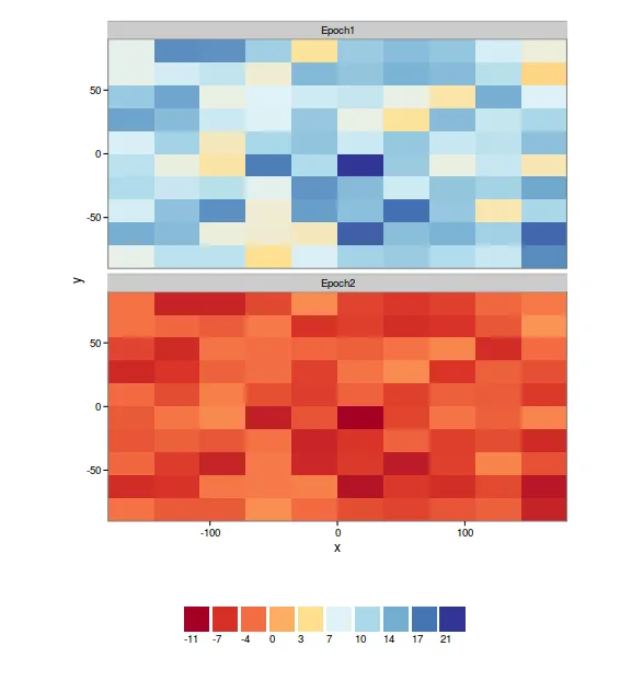
ras1 <- raster(nrow=10,ncol=10) set.seed(1) ras1[] <- rchisq(df=10,n=10*10) ras2=ras1*(-1)/2 s <- stack(ras1,ras2) Uniques <- cellStats(s,stat=unique) Uniques.max <- max(Uniques),Uniques.min <- min(Uniques) my.at <- round(seq(ceiling(Uniques.max), floor(Uniques.min), length.out= 10),0); myColorkey <- list(at=my.at, labels=list(at=my.at)) levelplot(s, at=my.at, colorkey=myColorkey,par.settings=RdBuTheme())但是你会发现,与我展示的示例地图上标注的不同,0并不在正确的位置上。我该怎么解决这个问题呢?非常感谢。 - code123;)在语句之间,以便您的代码可以运行。 - Robert Hijmans