R - ggplot2 - 使用栅格图作为灰度基础地图

4

我有两个栅格图层,一个是灰度图像,另一个是分析结果。我想在ggplot中使用一个栅格作为灰度背景,并使用颜色渐变重叠第二个栅格。这是一个示例,它可能看起来像这样(但更好):

enter image description here

我无法将不同的颜色分配给栅格图像。您知道实现此目标的方法吗?我搜索了很长时间,但似乎不可能。但是我不能(也不想)相信这一点。

如果您需要进一步的信息,请告诉我。

示例

创建测试数据

xy.1 <- expand.grid(1:10, 1:10)
df.1 <- data.frame(Longitude=xy.1[,1], Latitude=xy.1[,2], Value=xy.1[,1]+xy.1[,2])
xy.2 <- expand.grid(3:5, 3:5)
df.2 <- data.frame(Longitude=xy.2[,1], Latitude=xy.2[,2], Value=rnorm(9))

绘图

p1 <- ggplot() +
  geom_raster(data=df.1, aes(x=Longitude, y=Latitude, fill=Value)) +
  scale_fill_gradientn(colours = grey(seq(0,1,l=20))) +
  coord_equal() +
  theme(legend.position="none")

p1 + geom_raster(data=df.2, aes(x=Longitude, y=Latitude, fill=Value)) +
  scale_fill_gradient(low="red", high="white")

结果:

enter image description here


2
我模糊地记得也曾尝试过这样做,并通过谷歌了解到这是出于设计原因而避免的:https://github.com/hadley/ggplot2/issues/578 - fanli
感谢fanli的回答。我查看了链接,那里的最后一条评论说ggvis支持这个。我会尝试使用ggvis来实现,并在成功后发布答案。 - bask0
在查看了ggvis之后,我认为这是错误的方法。 - bask0
出于好奇,ggvis 如何处理这个?我也会觉得有用。 - fanli
我不太了解ggvis。它是用于构建交互式图表的工具。我只是认为它似乎不是正确的工具。 - bask0
1个回答

3
我写了一个函数,可以使用ggplot2添加背景并叠加前景光栅图。
编辑:我在末尾添加了更好的解决方案
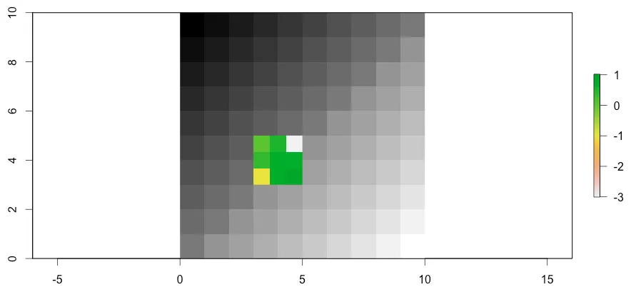
它的工作原理是:我结合两个光栅图,并移动值,使值不重叠。然后,我使用包含前景色彩比例尺(例如红色->绿色)的比例尺绘制光栅层,其中背景颜色比例尺是硬编码的(黑色->白色)。颜色数量没有限制。
光栅层的图例没有显示。为了获得不包含整个比例尺的图例(这将是黑色->白色->红色->绿色),我在背景中插入了两个虚拟点。一个带有前景数据的最小值,一个带有最大值。这仅为前景数据提供了一个图例。
如果有人知道更好的缩放和创建颜色比例尺的方法,我很乐意将其添加到该功能中。
我增加了通过分位数来调整前景数据的可能性;参数fg.quant采用两个整数的向量,用于“切割”数据。bw.scale可以使背景栅格变暗/变亮:bw.scale=c(0, 0.5)表示背景图像具有从黑色到灰色(0.5)的颜色比例尺,例如。
我知道这不是一个完美的函数。但是它对我非常有用,一旦有了一些空闲时间,我将改进它并尝试消除丑陋的部分。
测试数据
# 'background'
r.1 <- raster(x=matrix(rowSums(expand.grid(1:10, 1:10)), nrow=10),
              xmn=0, xmx=10, ymn=0, ymx=10)
# 'foreground'
r.2 <- raster(x=matrix(rnorm(16), nrow=4),
              xmn=3, xmx=7, ymn=3, ymx=7)

绘图函数

#+++++++++++++++++++++++++++++++++++++++++++++++++++++++++++++++++++++++++++++++
# BGPlot() -- plot data with background raster using ggplot2
#+++++++++++++++++++++++++++++++++++++++++++++++++++++++++++++++++++++++++++++++

BGPlot <- function(fg,
                   bg,
                   cols=c('red', 'green'),
                   fg.quant=c(0, 1),
                   bw.scale=c(0, 1),
                   plot.title='',
                   leg.name='Value') {
  # plot data with background raster using ggplot2
  #
  # Args
  #   fg: foreground raster layer
  #   bg: background raster layer
  #   cols: colors to use for fg
  #   fg.quant: scaling fg by quantiles
  #   bw.scale: makes bg darker / brighter:
  #     E.g. c(0, 0.9) -> darker / c(0.2, 1) -> brighter
  #   plot.title: title
  #   leg.name: name to be displyed at legend
  #
  # Returns
  #   ggplot object

  # load libraries
  library(ggplot2)

  # get min / max of foreground raster
  fg.q <- quantile(fg, fg.quant)
  fg.min <- fg.q[1]
  fg.max <- fg.q[2]

  # rescale fg
  fg.sc <- (fg-fg.q[1]) / (fg.q[2]-fg.q[1])
  fg.sc[fg.sc<0] <- 0
  fg.sc[fg.sc>1] <- 1
  fg.sc <- fg.sc + 0.1

  # get scale (fg values 0.1, 10, 1000 range?)
  ifelse((fg.max-fg.min)/10>=1, n.dgts <- 0, n.dgts <- 1)

  # create fg legend breaks / labels
  fg.breaks <- round(seq(fg.min, fg.max, l=5), n.dgts)
  fg.breaks[1] <- ceiling(fg.min*(10^n.dgts))/(10^n.dgts)
  fg.breaks[5] <- floor(fg.max*(10^n.dgts))/(10^n.dgts)

  fg.labs <- paste0(c(paste0(round(fg.min, n.dgts+1), '-'),'','','',''),
                    fg.breaks,
                    c('','','','',paste0('-', round(fg.max, n.dgts+1)))
  )


  # rescale bg
  bg.sc <- (bg-minValue(bg)) /
    (maxValue(bg)-minValue(bg)) *
    (bw.scale[2]-bw.scale[1]) + bw.scale[1] -1.1


  # merge rasters, fg over bg
  r <- merge(fg.sc, bg.sc)

  # convert raster to data.frame
  r.df <- as.data.frame(rasterToPoints(r))
  names(r.df) <- c('Longitude', 'Latitude', 'Value')

  # get center of r
  mid.Lon <- mean(r.df$Longitude)
  mid.Lat <- mean(r.df$Latitude)

  # set scale positions
  vals <-c(-1.1,-0.1, seq(0.1,1.1,l=length(cols)))

  # set dummy-point values
  dp <-seq(fg.min,fg.max,l=length(cols))


  # plotting; 
  p <-
    ggplot() +
    # dummy points: points not visible, needed to display custom scale-bar
    geom_point(data=data.frame(x = rep(mid.Lon, length(cols)),
                               y = rep(mid.Lat, length(cols)),
                               c = dp),
               aes(x, y, color=c)) +
    scale_color_gradientn(colours = cols,
                          breaks=fg.breaks,
                          labels=fg.labs,
                          name=leg.name) +
    # raster; no scale-bar plotted
    geom_raster(data=r.df, aes(x=Longitude, y=Latitude, fill=Value)) +
    scale_fill_gradientn(colours  = c('black', 'white', cols),
                         values   = vals,
                         rescaler = function(x,...) x,
                         oob      = identity,
                         guide    = "none") +
    ggtitle(label=plot.title) +
    theme_light() +
    labs(list(x='Lon', y='Lat')) +
    theme(axis.text.y=element_text(angle=90, hjust=0.5)) +
    coord_equal()

  return(p)
}

函数调用

BGPlot(fg=r.2, bg=r.1, cols=c('red', 'green'), fg.quant=c(0.01, 0.99), bw.scale=c(0, 0.8), plot.title='Chlorophyll Concentration', leg.name='CHL')
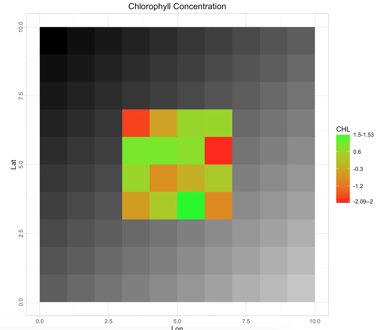
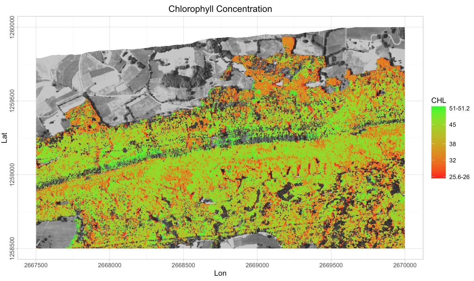
enter image description here

这是一个“真实世界”的例子:

enter image description here

编辑:使用R软件包'RStoolbox'更好的解决方案

使用软件包RStoolbox可以得到一个非常简单且完美工作的解决方案,函数ggR产生灰度背景图像,函数ggRGB产生RGB背景图像。

library(ggplot2)
library(RStoolbox)
ggR(BACKGROUND_IMAGE, geom_raster=FALSE) +
geom_raster(...) # here comes standard raster plot

网页内容由stack overflow 提供, 点击上面的
可以查看英文原文,
原文链接