我正在尝试将ESRI Grid绘制为表面的光栅图像。我已经知道如何绘制,但不知道如何控制R的色彩比例。
# open necessary libraries
library("raster")
library("rgdal")
library("ncdf")
# goal: select an ESRI Grid ASCII file and plot it as an image.
infile <- file.choose("Results")
r <- raster(infile)
# read in metadata from ESRI output file, split up into relevant variables
info <- read.table(infile, nrows=6)
NCOLS <- info[1,2]
NROWS <- info[2,2]
XLLCORNER <- info[3,2]
YLLCORNER <- info[4,2]
CELLSIZE <- info[5,2]
NODATA_VALUE <- info[6,2]
XURCORNER <- XLLCORNER+(NCOLS-1)*CELLSIZE
YURCORNER <- YLLCORNER+(NROWS-1)*CELLSIZE
# plot output data - whole model domain
pal <- colorRampPalette(c("purple","blue","cyan","green","yellow","red"))
par(mar = c(5,5,2,4)) # margins for each plot, with room for colorbars
par(pin=c(5,5)) # set size of plots (inches)
par(xaxs="i", yaxs="i") # set up axes to fit data plotted
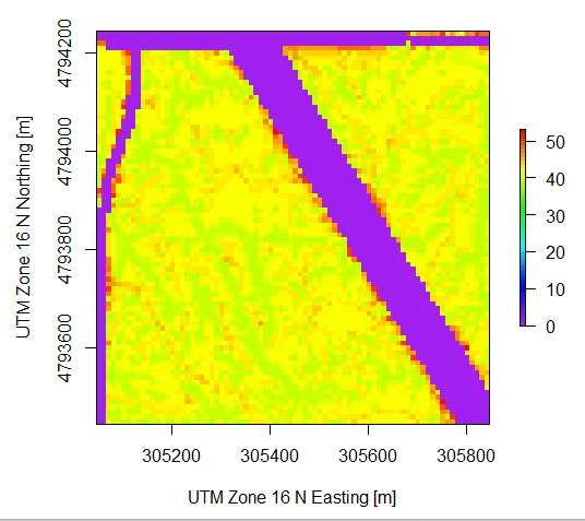
plot(r, xlim=c(XLLCORNER, XURCORNER), ylim=c(YLLCORNER, YURCORNER), ylab='UTM Zone 16 N Northing [m]', xlab='UTM Zone 16 N Easting [m]', col = pal(50))
“infile”的一个例子可能是这样的:”
NCOLS        262
NROWS        257
XLLCORNER     304055.000
YLLCORNER    4792625.000
CELLSIZE         10.000
NODATA_VALUE    -9999.000
42.4 42.6 42.2 0 42.2 42.8 40.5 40.5 42.5 42.5 42.5 42.9 43.0 ...
42.5 42.5 42.5 0 0 43.3 42.7 43.0 40.5 42.5 42.5 42.4 41.9 ...
42.2 42.7 41.9 42.9 0 0 43.7 44.0 42.4 42.5 42.5 43.3 43.2 ...
42.5 42.5 42.5 42.5 0 0 41.9 40.5 42.4 42.5 42.4 42.4 40.5 ...
41.9 42.9 40.5 43.3 40.5 0 41.9 42.8 42.4 42.4 42.5 42.5 42.5 ...
...
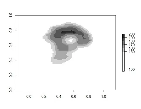
问题在于数据中的0值拉伸了颜色轴,超出了我需要的范围。请参见下面:
基本上,我想告诉R将颜色轴从25-45拉伸,而不是0-50。我知道在Matlab中我会使用命令caxis。R有类似的东西吗?