你应该能够使用
Axes.text() 来完成这个任务。
在调用
mpf.plot() 之后,再调用。
ax1.text()
对于您想要的每个文本(在您的情况下,对于每个蜡烛),都有一个重要的警告与传递给ax1.text()的x轴值相关:
- 如果您没有指定
show_nontrading=True,则默认为False,在这种情况下,您传递给ax1.text()的x轴值用于文本位置的必须是相应蜡烛所在行的行号,从DataFrame中的第一行开始计数,编号从0开始。
- 另一方面,如果您设置了
show_nontrading=True,则传递给ax1.text()的x轴值将需要是matplotlib datetime。您可以将DataFrame DatetimeIndex中的pandas datetimes转换为matplotlib datetimes,方法如下:
import matplotlib.dates as mdates
my_mpldates = mdates.date2num(idf.index.to_pydatetime())
我建议使用第一种选项(DataFrame行号),因为它更简单。我目前正在开发一个mplfinance增强功能,它将允许您将x轴值输入为任何类型的日期时间对象(这是更直观的方法),但可能需要一个月或两个月才能完成该增强功能,因为它并不是微不足道的。
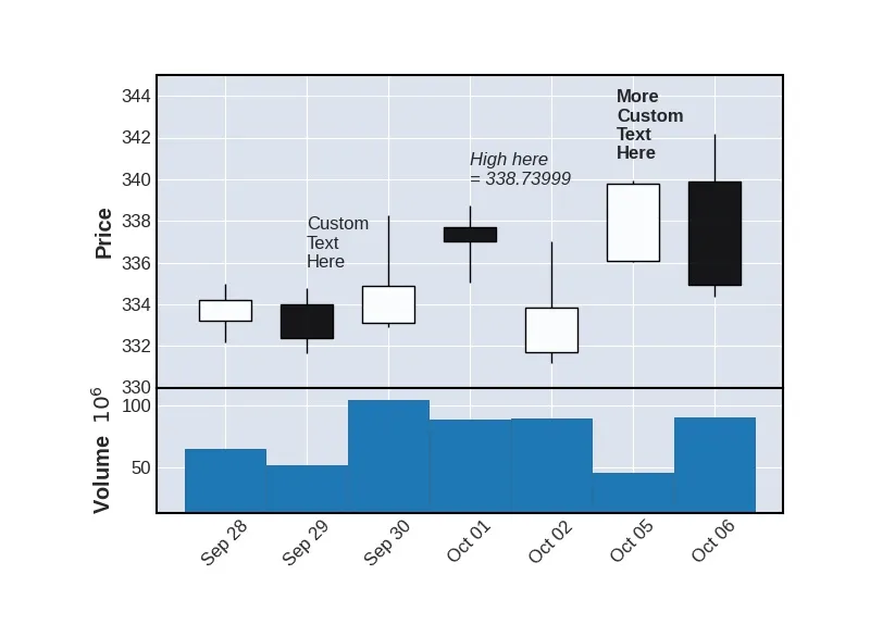
使用
mplfinance存储库示例数据文件夹中的数据,以下是代码示例:
import pandas as pd
import mplfinance as mpf
infile = 'data/yahoofinance-SPY-20200901-20210113.csv'
df = pd.read_csv(infile, index_col=0, parse_dates=True).iloc[18:25]
fig, axlist = mpf.plot(df,type='candle',volume=True,
ylim=(330,345),returnfig=True)
x = 1
y = df.loc[df.index[x],'High']+1
axlist[0].text(x,y,'Custom\nText\nHere')
x = 3
y = df.loc[df.index[x],'High']+1
axlist[0].text(x,y,'High here\n= '+str(y-1),fontstyle='italic')
x = 5
y = df.loc[df.index[x],'High']+1
axlist[0].text(x-0.2,y,'More\nCustom\nText\nHere',fontweight='bold')
mpf.show()
上述代码示例的评论:
I am setting the ylim=(330,345) in order to provide a little extra room above the candles for the text. In practice you might choose the high dynamically as perhaps high_ylim = 1.03*max(df['High'].values).
Notice that the for first two candles with text, the text begins at the center of the candle. The 3rd text call uses x-0.2 to position the text more over the center of the candle.
For this example, the y location of the candle is determined by taking the high of that candle and adding 1. (y = df.loc[df.index[x],'High']+1) Of course adding 1 is arbitrary, and in practice, depending on the maginitude of your prices, adding 1 may be too little or too much. Rather you may want to add a small percentage, for example 0.2 percent:
y = df.loc[df.index[x],'High']
y = y * 1.002
Here is the plot the above code generates: