如何在Python中绘制带字符串轴的混淆矩阵,而不是整数。

44

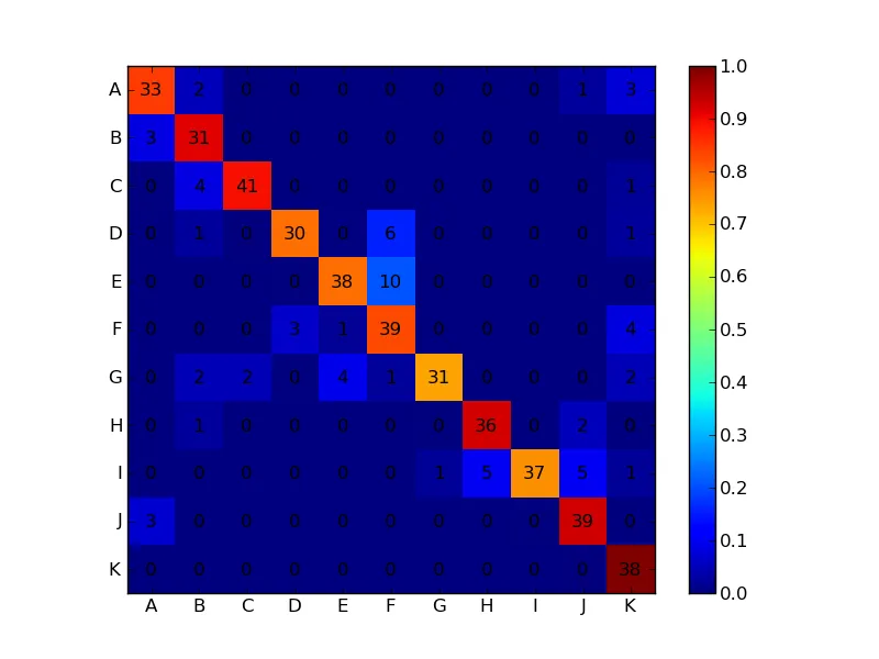
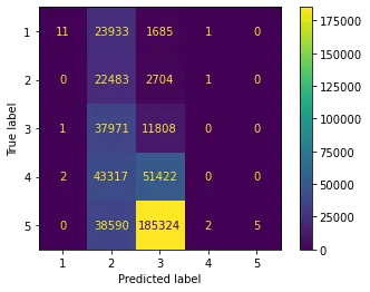
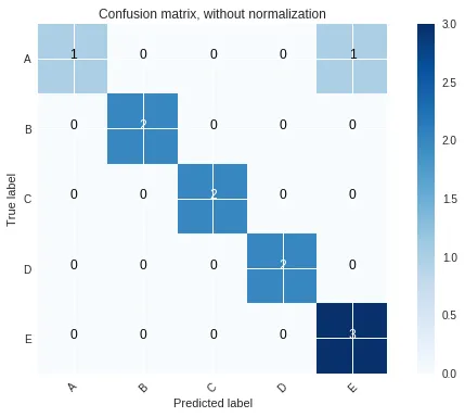
我正在跟进一篇关于如何在 Matplotlib 中绘制混淆矩阵的线程。脚本如下所示:

from numpy import *
import matplotlib.pyplot as plt
from pylab import *

conf_arr = [[33,2,0,0,0,0,0,0,0,1,3], [3,31,0,0,0,0,0,0,0,0,0], [0,4,41,0,0,0,0,0,0,0,1], [0,1,0,30,0,6,0,0,0,0,1], [0,0,0,0,38,10,0,0,0,0,0], [0,0,0,3,1,39,0,0,0,0,4], [0,2,2,0,4,1,31,0,0,0,2], [0,1,0,0,0,0,0,36,0,2,0], [0,0,0,0,0,0,1,5,37,5,1], [3,0,0,0,0,0,0,0,0,39,0], [0,0,0,0,0,0,0,0,0,0,38] ]

norm_conf = []
for i in conf_arr:
        a = 0
        tmp_arr = []
        a = sum(i,0)
        for j in i:
                tmp_arr.append(float(j)/float(a))
        norm_conf.append(tmp_arr)

plt.clf()
fig = plt.figure()
ax = fig.add_subplot(111)
res = ax.imshow(array(norm_conf), cmap=cm.jet, interpolation='nearest')


for i,j in ((x,y) for x in xrange(len(conf_arr))
            for y in xrange(len(conf_arr[0]))):
    ax.annotate(str(conf_arr[i][j]),xy=(i,j))

cb = fig.colorbar(res)
savefig("confusion_matrix.png", format="png")

我想把图表的坐标轴改成字母字符串,比如(A, B, C,...),而不是整数(0,1,2,3,..10)。 有什么方法可以做到这一点。


scikit-learn文档中有一个很好的函数:http://scikit-learn.org/stable/auto_examples/model_selection/plot_confusion_matrix.html - Enrique Pérez Herrero
正如已经指出的那样,现在可以使用Scikit的内置绘图功能,如此处所示:https://scikit-plot.readthedocs.io/en/stable/Quickstart.html - gented
不是一个答案,但这个matplotlib教程中有相关的例子:https://matplotlib.org/stable/gallery/images_contours_and_fields/image_annotated_heatmap.html#sphx-glr-gallery-images-contours-and-fields-image-annotated-heatmap-py - cydonian
8个回答

65

我猜您想要这个:

enter image description here
import numpy as np
import matplotlib.pyplot as plt

conf_arr = [[33,2,0,0,0,0,0,0,0,1,3], 
            [3,31,0,0,0,0,0,0,0,0,0], 
            [0,4,41,0,0,0,0,0,0,0,1], 
            [0,1,0,30,0,6,0,0,0,0,1], 
            [0,0,0,0,38,10,0,0,0,0,0], 
            [0,0,0,3,1,39,0,0,0,0,4], 
            [0,2,2,0,4,1,31,0,0,0,2],
            [0,1,0,0,0,0,0,36,0,2,0], 
            [0,0,0,0,0,0,1,5,37,5,1], 
            [3,0,0,0,0,0,0,0,0,39,0], 
            [0,0,0,0,0,0,0,0,0,0,38]]

norm_conf = []
for i in conf_arr:
    a = 0
    tmp_arr = []
    a = sum(i, 0)
    for j in i:
        tmp_arr.append(float(j)/float(a))
    norm_conf.append(tmp_arr)

fig = plt.figure()
plt.clf()
ax = fig.add_subplot(111)
ax.set_aspect(1)
res = ax.imshow(np.array(norm_conf), cmap=plt.cm.jet, 
                interpolation='nearest')

width, height = conf_arr.shape

for x in xrange(width):
    for y in xrange(height):
        ax.annotate(str(conf_arr[x][y]), xy=(y, x), 
                    horizontalalignment='center',
                    verticalalignment='center')

cb = fig.colorbar(res)
alphabet = 'ABCDEFGHIJKLMNOPQRSTUVWXYZ'
plt.xticks(range(width), alphabet[:width])
plt.yticks(range(height), alphabet[:height])
plt.savefig('confusion_matrix.png', format='png')

32

这是你想要的内容:

from string import ascii_uppercase
from pandas import DataFrame
import numpy as np
import seaborn as sn
from sklearn.metrics import confusion_matrix

y_test = np.array([1,2,3,4,5, 1,2,3,4,5, 1,2,3,4,5])
predic = np.array([1,2,4,3,5, 1,2,4,3,5, 1,2,3,4,4])

columns = ['class %s' %(i) for i in list(ascii_uppercase)[0:len(np.unique(y_test))]]

confm = confusion_matrix(y_test, predic)
df_cm = DataFrame(confm, index=columns, columns=columns)

ax = sn.heatmap(df_cm, cmap='Oranges', annot=True)

示例图像输出在这里: 输入图像描述


如果您想要一个更完整的混淆矩阵,作为matlab默认设置,包括总数(最后一行和最后一列),以及每个单元格上的百分比,请查看下面的这个模块。

由于我搜遍了互联网,没有在Python上找到像这个矩阵那样的混淆矩阵,因此我开发了一个带有这些改进功能并在git上分享的。


REF:

https://github.com/wcipriano/pretty-print-confusion-matrix

输出示例在这里: 输入图像描述


如果有人遇到图形未显示的问题,需要在最后调用matplotlib:import matplotlib.pyplot as plt; plt.show() - Nishad
我在哪里可以找到“pretty-print-confusion-matrix”存储库的确切示例? - Francisco Maria Calisto
Francisco,这个repo中:https://github.com/wcipriano/pretty-print-confusion-matrix,你有“入门”部分。 - Wagner Cipriano

14

只需使用matplotlib.pyplot.xticksmatplotlib.pyplot.yticks即可。

例如:

import matplotlib.pyplot as plt
import numpy as np

plt.imshow(np.random.random((5,5)), interpolation='nearest')
plt.xticks(np.arange(0,5), ['A', 'B', 'C', 'D', 'E'])
plt.yticks(np.arange(0,5), ['F', 'G', 'H', 'I', 'J'])

plt.show()

在此输入图片描述


谢谢Joe提供的解决方案。我已经采纳了你的建议,但是我得到了一个错位的图形。我正在使用Python 2.6.4版本。 - Musa Gabere
@user729470 - 嗯,你不能只是复制粘贴它并让它工作。看一下xticksyticks所需的参数。第一个是刻度的位置,第二个是标签列表。在上面的示例中,我将刻度放置在[0, 1, 2, 3, 4]处。在你的情况下,你想要在不同的位置放置刻度。如果你只是复制粘贴上面的代码,它会将刻度放置在由range(5)指定的位置。 - Joe Kington
感谢Joe提供的解决方案。我已经采纳了你的建议,但是我得到了一个错位的图形。我正在使用Python 2.6.4版本。我得到的绘图如下:http://apps.sanbi.ac.za/~musa/confusion/confusion_matrix.png。我想要得到以下绘图:http://apps.sanbi.ac.za/~musa/confusion/DogTable4.gif。 - Musa Gabere
如果你只是复制粘贴我上面的内容,是的,就会发生这种情况,正如我所解释的那样。你不想在0,1,2,3,4处放置刻度,而是想要它们出现在其他位置 (range(0,10,2) 在你的情况下)。你需要调整这个“示例”来适应你的情况。或者,如果你只想更新标签本身而不想改变刻度的位置,你可以使用 ax.set_xticklabels - Joe Kington
@JoeKington-我正在尝试理解你的脚本。然而,我发现另一个问题,即画布没有正确缩放,导致坐标轴标签和刻度被裁剪掉了。你的图表在坐标轴标签内看起来完美。请参见http://apps.sanbi.ac.za/~musa/confusion/plot.png上保存的图像。有什么解决方法吗? - Musa Gabere

5
要获得与sklearn创建的相似的图形,只需使用他们的代码!
from sklearn.metrics import confusion_matrix
# I use the sklearn metric source for this one
from sklearn.metrics import ConfusionMatrixDisplay
classNames = np.arange(1,6)
# Convert to discrete values for confusion matrix
regPredictionsCut = pd.cut(regPredictionsTDF[0], bins=5, labels=classNames, right=False)
cm = confusion_matrix(y_test, regPredictionsCut)
disp = ConfusionMatrixDisplay(confusion_matrix=cm,display_labels=classNames)
disp.plot()

我通过访问https://scikit-learn.org/stable/modules/generated/sklearn.metrics.plot_confusion_matrix.html并点击“源代码(source)”链接来解决这个问题。
这是生成的图表:

A Confusion Matrix Generated Via the Sklearn Source Code


3

如果你的结果已经存储在CSV文件中,你可以直接使用这种方法,否则你可能需要对其进行一些修改以适应你的结果结构。

sklearn官网的例子进行修改:

import itertools
import numpy as np
import matplotlib.pyplot as plt
from sklearn.metrics import confusion_matrix

def plot_confusion_matrix(cm, classes,
                          normalize=False,
                          title='Confusion matrix',
                          cmap=plt.cm.Blues):
    """
    This function prints and plots the confusion matrix.
    Normalization can be applied by setting `normalize=True`.
    """
    if normalize:
        cm = cm.astype('float') / cm.sum(axis=1)[:, np.newaxis]
        print("Normalized confusion matrix")
    else:
        print('Confusion matrix, without normalization')

    print(cm)

    plt.imshow(cm, interpolation='nearest', cmap=cmap)
    plt.title(title)
    plt.colorbar()
    tick_marks = np.arange(len(classes))
    plt.xticks(tick_marks, classes, rotation=45)
    plt.yticks(tick_marks, classes)

    fmt = '.2f' if normalize else 'd'
    thresh = cm.max() / 2.
    for i, j in itertools.product(range(cm.shape[0]), range(cm.shape[1])):
        plt.text(j, i, format(cm[i, j], fmt),
                 horizontalalignment="center",
                 color="white" if cm[i, j] > thresh else "black")

    plt.ylabel('True label')
    plt.xlabel('Predicted label')
    plt.tight_layout()


#Assumming that your predicted results are in csv. If not, you can still modify the example to suit your requirements
df = pd.read_csv("dataframe.csv", index_col=0)

cnf_matrix = confusion_matrix(df["actual_class_num"], df["predicted_class_num"])

#getting the unique class text based on actual numerically represented classes
unique_class_df = df.drop_duplicates(['actual_class_num','actual_class_text']).sort_values("actual_class_num")

# Plot non-normalized confusion matrix
plt.figure()
plot_confusion_matrix(cnf_matrix, classes=unique_class_df["actual_class_text"],
                      title='Confusion matrix, without normalization')

输出结果大概如下:

使用字符串类文本的混淆矩阵图


1
我们可以像这样使用sklearn的内置函数:

我们可以使用sklearn的内置函数,如下所示:

>>> import matplotlib.pyplot as plt
>>> from sklearn.datasets import make_classification
>>> from sklearn.metrics import plot_confusion_matrix
>>> from sklearn.model_selection import train_test_split
>>> from sklearn.svm import SVC
>>> X, y = make_classification(random_state=0)
>>> X_train, X_test, y_train, y_test = train_test_split(
...         X, y, random_state=0)
>>> clf = SVC(random_state=0)
>>> clf.fit(X_train, y_train)
SVC(random_state=0)
>>> plot_confusion_matrix(clf, X_test, y_test)  
>>> plt.show()

在此输入图片描述

代码和图片源自这里


plot_confusion_matrix自1.0版本起已被弃用,并将在1.2版本中删除(请参见文档)。因此,如果您更新答案以使用新选项之一ConfusionMatrixDisplay.from_predictionsConfusionMatrixDisplay.from_estimator,那将是很好的。 - a_guest

1

个人而言,我更喜欢将mlxtend与sklearn结合使用:

from mlxtend.plotting import plot_confusion_matrix
from sklearn.metrics import confusion_matrix

plot_confusion_matrix(confusion_matrix(y_true, y_pred))

0
这是一个纯Matplotlib的另一个例子:

Confusion matrix

Python代码 - 实用函数conf_matrix_creator和一个使用第一个函数的示例函数conf_matrix_example

import matplotlib.pyplot as plt
import numpy as np

def conf_matrix_creator(mat, settings):
    colormap = settings['colormap'] if 'colormap' in settings else None
    figsize = settings['figsize'] if 'figsize' in settings else None
    plt.figure(figsize = figsize)
    plt.imshow(mat, cmap =  colormap)
    
    view_colorbar = settings['colorbar']['view'] if 'colorbar' in settings else True
    if view_colorbar:
        ticks = np.arange(*settings['colorbar']['arange']) if 'colorbar' in settings and 'arange' in settings['colorbar'] else None
        cbar = plt.colorbar(ticks = ticks)
        if 'colorbar' in settings and 'text_formatter' in settings['colorbar']:
            cbar.ax.set_yticklabels([settings['colorbar']['text_formatter'](v) for v in ticks])
    if 'cell_text' in settings:
        for x in range(mat.shape[1]):
            for y in range(mat.shape[0]):
                text_color = settings['cell_text']['color_function'](mat[y,x]) if 'color_function' in settings['cell_text'] else 'black'
                va = settings['cell_text']['vertical_alignment'] if 'vertical_alignment' in settings['cell_text'] else 'center'
                ha = settings['cell_text']['horizontal_alignment'] if 'horizontal_alignment' in settings['cell_text'] else 'center'
                size = settings['cell_text']['size'] if 'size' in settings['cell_text'] else 'x-large'
                text = settings['cell_text']['text_formatter'](mat[y,x]) if 'text_formatter' in settings['cell_text'] else str(mat[y,x])
                plt.text(x, y, text, va = va, ha = ha, size = size, color = text_color)
    axes = plt.axes()
    if 'xticklabels' in settings:
        if 'labels' in settings['xticklabels']:
            labels = settings['xticklabels']['labels']
            axes.set_xticks(range(len(labels)))
            axes.set_xticklabels(labels)
        if 'location' in settings['xticklabels']:
            location = settings['xticklabels']['location']
            # By default it will be at the bottom, so only regarding case of top location
            if location == 'top':
                axes.xaxis.tick_top()
        if 'rotation' in settings['xticklabels']:
            rotation = settings['xticklabels']['rotation']
            plt.xticks(rotation = rotation)
    if 'yticklabels' in settings:
        if 'labels' in settings['yticklabels']:
            labels = settings['yticklabels']['labels']
            axes.set_yticks(range(len(labels)))
            axes.set_yticklabels(labels)
        if 'location' in settings['yticklabels']:
            location = settings['yticklabels']['location']
            # By default it will be at the left, so only regarding case of right location
            if location == 'right':
                axes.yaxis.tick_right()
        if 'rotation' in settings['yticklabels']:
            rotation = settings['yticklabels']['rotation']
            plt.yticks(rotation = rotation)
    plt.show()
    

使用方法:

def conf_matrix_example():
    mat = np.zeros((5,8))
    for y in range(mat.shape[0]):
        for x in range(mat.shape[1]):
            mat[y,x] = y * x / float((mat.shape[0] - 1) * (mat.shape[1] - 1))
    
    
    settings = {
        'figsize' : (8,5),
        'colormap' : 'Blues',
        'colorbar' : {
            'view' : True,
            'arange' : (0, 1.001, 0.1),
            'text_formatter' : lambda tick_value : '{0:.0f}%'.format(tick_value*100),
        },
        'xticklabels' : {
            'labels' : ['aaaa', 'bbbbb', 'cccccc', 'ddddd', 'eeee', 'ffff', 'gggg', 'hhhhh'],
            'location' : 'top',
            'rotation' : 45,
        },
        'yticklabels' : {
            'labels' : ['ZZZZZZ', 'YYYYYY', 'XXXXXXX', 'WWWWWWW', 'VVVVVVV'],
        },
        'cell_text' : {
            'vertical_alignment' : 'center',
            'horizontal_alignment' : 'center',
            'size' : 'x-large',
            'color_function' : lambda cell_value : 'black' if cell_value < 0.5 else 'white',
            'text_formatter' : lambda cell_value : '{0:.0f}%'.format(cell_value*100),
        },
    }
    
    conf_matrix_creator(mat, settings)
  

网页内容由stack overflow 提供, 点击上面的
可以查看英文原文,
原文链接