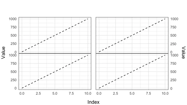
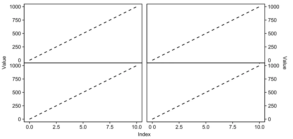
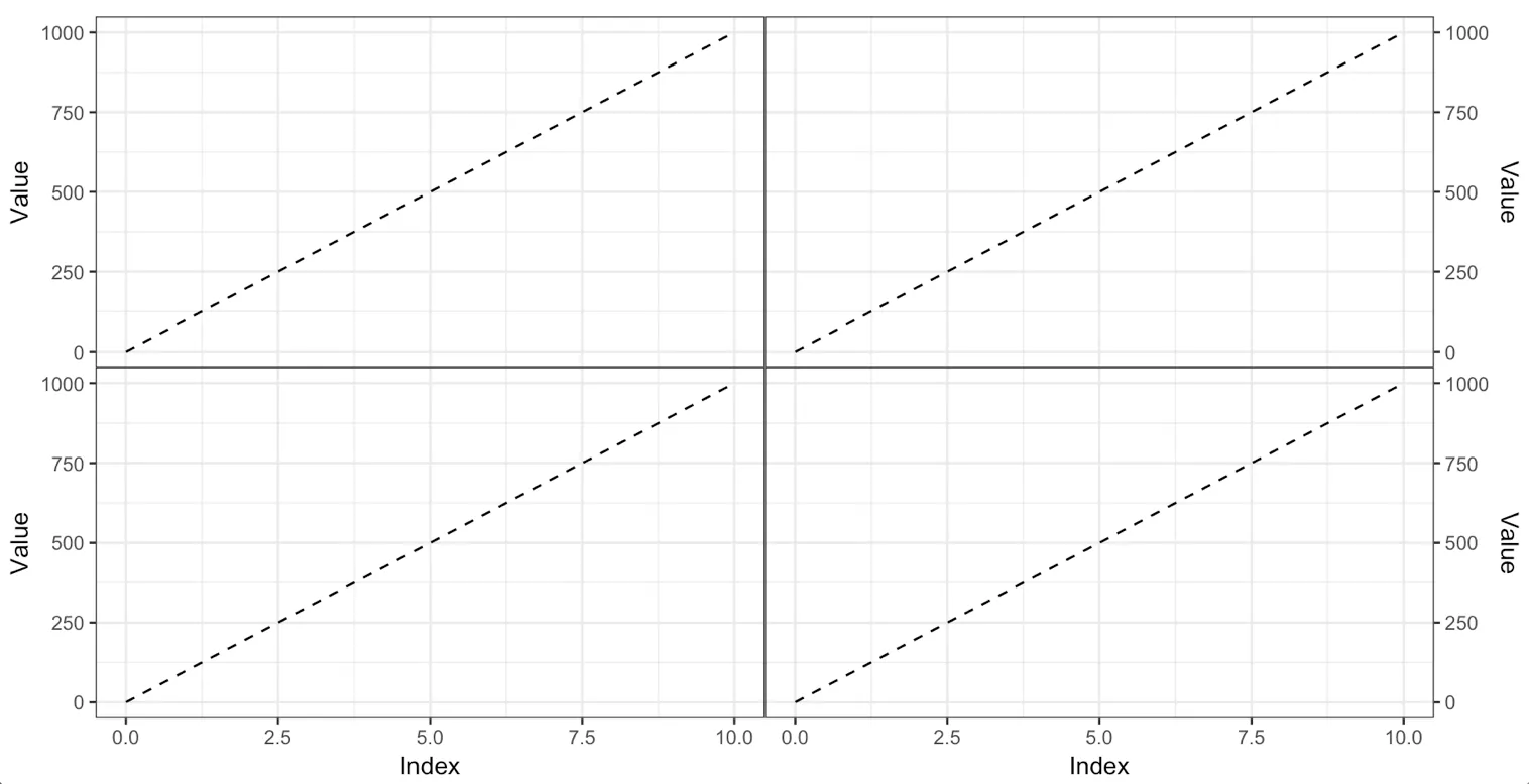
如何使用plot_grid无间距地放置绘图?

8

我正在进行一个2x2图的排列。这些图共享同一坐标轴,所以我想把它们放在一起,例如:

以下是代码:

library(ggplot2)
library(cowplot)

Value <- seq(0,1000, by = 1000/10)
Index <- 0:10
DF <- data.frame(Index, Value)


plot <- ggplot(DF, aes(x = Index, y = Value)) +
  geom_line(linetype = 2) +
  theme(aspect.ratio = 0.5)

plot_grid(plot, plot, plot, plot, align = "hv", ncol = 2)

生成结果为:

enter image description here

但我想要类似于这样的效果:

enter image description here

我该如何实现类似的效果?

2个回答

8
我认为这是使用egg包中的ggarrange()函数的情况。使用plot_grid()将需要无尽地摆弄,不值得。技术原因是plot_grid()保持网格中每个图的总面积恒定,但如果某些图具有x轴而其他图则没有,则它们占用的面积不同。可以尝试通过使用rel_heights参数来规避此问题,但是没有好的方法来计算rel_heights的正确值,所以只能通过试错来解决。相比之下,ggarrange()分别查看绘图面板和周围元素,并确保绘图面板具有相同的大小。

以下是使用ggarrange()的代码:

Value <- seq(0,1000, by = 1000/10)
Index <- 0:10
DF <- data.frame(Index, Value)


pbase <- ggplot(DF, aes(x = Index, y = Value)) +
  geom_line(linetype = 2) +
  theme_bw()

ptopleft <- pbase +
  scale_x_continuous(position = "top") +
  theme(plot.margin = margin(5.5, 0, 0, 5.5),
        axis.title.x = element_blank(),
        axis.text.x = element_blank(),
        axis.ticks.x = element_blank())

ptopright <- pbase +
  scale_y_continuous(position = "right") +
  scale_x_continuous(position = "top") +
  theme(plot.margin = margin(5.5, 5.5, 0, 0),
        axis.title.x = element_blank(),
        axis.text.x = element_blank(),
        axis.ticks.x = element_blank())

pbottomleft <- pbase +
  theme(plot.margin = margin(0, 0, 5.5, 5.5))

pbottomright <- pbase +
  scale_y_continuous(position = "right") +
  theme(plot.margin = margin(0, 5.5, 5.5, 0))

library(egg)      
ggarrange(ptopleft, ptopright,
          pbottomleft, pbottomright,
          ncol = 2)

这里输入图片描述

两点说明:

  1. 为了完全去除顶部图形面板下方的所有空白,我们需要将x轴移动到顶部,即使我们不显示它。这是主题机制的一个奇怪限制。我们不能完全摆脱仅一个轴。

  2. 我不太喜欢您示例中的共享轴标题。我认为每个轴都应该有一个标题。如果您想要共享轴标题,为什么不使用嵌面机制呢?


太好了!有时人们会有不同的情节类型,可能有不同的数据来源和类型,这些都无法使用分面处理。 - treetopdewdrop

4
您可以针对每个图设置微妙的 plot.margin,然后使用 grid.arrange 并添加标签。
library(ggplot2)
library(grid)
library(gridExtra)

Value <- seq(0,1000, by = 1000/10)
Index <- 0:10
DF <- data.frame(Index, Value)

plot1 <- ggplot(DF, aes(x = Index, y = Value)) +
  geom_line(linetype = 2) +
  theme_minimal() +
  theme(aspect.ratio = 0.5, 
    panel.border = element_rect(fill = NA),
    axis.text.x = element_blank(),
    axis.title = element_blank(),
    axis.ticks = element_blank(),
    plot.margin = unit(c(5.5, 5.8, -50, 5.5), "pt")) 

plot2 <- ggplot(DF, aes(x = Index, y = Value)) +
  geom_line(linetype = 2) +
  theme_minimal() +
  theme(aspect.ratio = 0.5, 
    panel.border = element_rect(fill = NA),
    axis.text.x = element_blank(),
    axis.title = element_blank(),
    axis.ticks = element_blank(),
    plot.margin = unit(c(5.5, 5.5, -50, 5.5), "pt")) +
  scale_y_continuous(position = "right")

plot3 <- ggplot(DF, aes(x = Index, y = Value)) +
  geom_line(linetype = 2) +
  theme_minimal() +
  theme(aspect.ratio = 0.5, 
    panel.border = element_rect(fill = NA),
    axis.title = element_blank(),
    axis.ticks = element_blank(),
    plot.margin = unit(c(-50, 5.8, -50, 5.5), "pt")) 

plot4 <- ggplot(DF, aes(x = Index, y = Value)) +
  geom_line(linetype = 2) +
  theme_minimal() +
  theme(aspect.ratio = 0.5, 
    panel.border = element_rect(fill = NA),
    axis.title = element_blank(),
    axis.ticks = element_blank(),
    plot.margin = unit(c(-50, 5.5, -50, 5.5), "pt")) +
  scale_y_continuous(position = "right")

grid.arrange(grobs = list(plot1, plot2, plot3, plot4), ncol = 2, bottom = 'Index', left = 'Value', right = 'Value')

最终绘图 enter image description here

网页内容由stack overflow 提供, 点击上面的
可以查看英文原文,
原文链接