ggplot 图例 - scale_colour_manual 不起作用

3

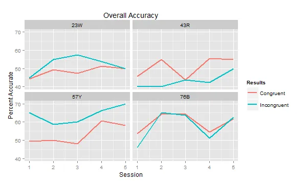
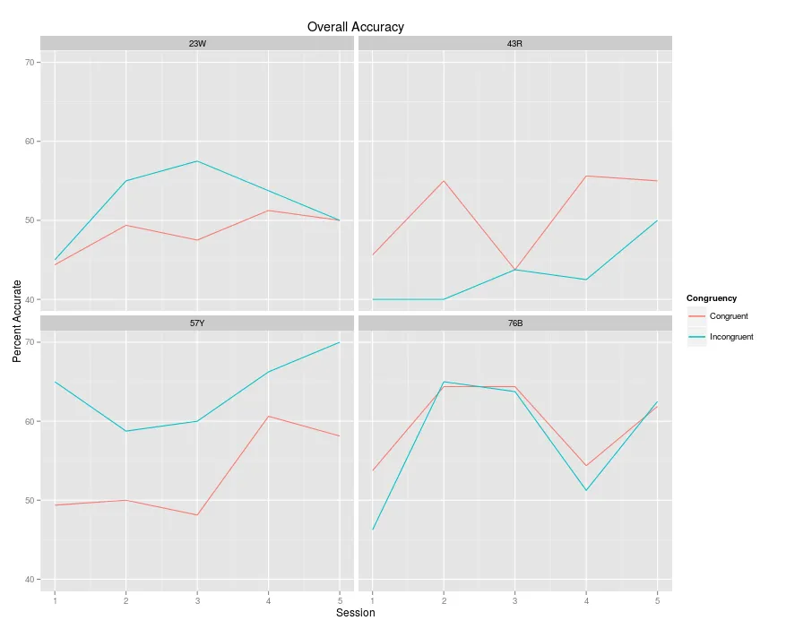
我正在尝试为我的图表添加图例,但从未显示出来。这是我拥有的代码:

ggplot(main, aes(x = ceiling(session/2))) + 
geom_line(aes(y = C_overall), colour = "blue", stat = "summary", fun.y = "mean") +
geom_line(aes(y = I_overall), colour = "red", stat = "summary", fun.y = "mean") +
labs(title = 'Overall Accuracy', x = 'Session', y = 'Percent Accurate') +
facet_wrap(~bird)

这向我展示了我想要的内容,但是没有图例。所有我看到的都建议使用scale_colour_manual来解决:
ggplot(main, aes(x = ceiling(session/2))) + 
geom_line(aes(y = C_overall), colour = "one", stat = "summary", fun.y = "mean") +
geom_line(aes(y = I_overall), colour = "two", stat = "summary", fun.y = "mean") +
labs(title = 'Overall Accuracy', x = 'Session', y = 'Percent Accurate') +
facet_wrap(~bird) +
scale_colour_manual(name = 'Congruency', values = c("one" = "blue", "two" = "red"))

这似乎对其他人都有效,但R告诉我'one'是无效的颜色名称。我已经花了几个小时来解决这个问题,但还没有任何进展。
以下是一些我的数据,如果有帮助的话:
bird   session  C_overall   I_overall
23W     1       42.5        42.5
23W     2       46.25       47.5
23W     3       51.25       57.5
23W     4       47.5        52.5
23W     5       47.5        52.5
23W     6       47.5        62.5
23W     7       52.5        52.5
23W     8       50          55
23W     9       51.25       52.5
23W     10      48.75       47.5
43R     1       47.5        42.5
43R     2       43.75       37.5
43R     3       58.75       40
43R     4       51.25       40
43R     5       51.25       52.5
43R     6       36.25       35
43R     7       53.75       40
43R     8       57.5        45
43R     9       61.25       52.5
43R     10      48.75       47.5
57Y     1       45          67.5
57Y     2       53.75       62.5
57Y     3       47.5        65
57Y     4       52.5        52.5
57Y     5       47.5        50
57Y     6       48.75       70
57Y     7       66.25       72.5
57Y     8       55          60
57Y     9       57.5        72.5
57Y     10      58.75       67.5
76B     1       51.25       50
76B     2       56.25       42.5
76B     3       60          60
76B     4       68.75       70
76B     5       73.75       75
76B     6       55          52.5
76B     7       68.75       62.5
76B     8       40          40
76B     9       57.5        55
76B     10      66.25       70

蓝线应为“全等”,红线应为“不全等”。如何制作图例的任何帮助将不胜感激!提前致谢!
2个回答

3

在绘图之前,我希望将数据转换为长格式:

library(reshape2)

main <- melt(main, c("bird", "session"))

ggplot(main, aes(x=ceiling(session/2), y=value, color=variable)) + 
  geom_line(stat="summary", fun.y="mean", size=1) +
  labs(title="Overall Accuracy", x="Session", y="Percent Accurate") +
  facet_wrap(~ bird) +
  scale_color_discrete("Results", labels=c("Congruent", "Incongruent"))

输入图像描述

这对你管用吗?


(注:该内容为HTML标记语言,本人将其翻译成了对应的中文文本)

太好了!实际上我的数据文件中还有其他列,我用它们来制作其他图表。当我将此代码与数据文件中的其他列一起使用时,会出现错误消息“度量变量之间的属性不相同;它们将被删除”,并且图表会出错,但是当我在新文档中删除额外的列时,它确实可以工作。您知道如何更改代码,以便仅使用C_overall和I_overall列吗?- 对不起,我没有在原始问题中添加这个,我不知道这会有什么区别。 - Tatiana Rochelle
尝试将您在此绘图中未使用的所有其他列添加到 melt() 函数的 id.vars 参数中,即执行 melt(main, c("bird", "session", "col1", "col2", ...)) - Sergiy Matusevych
或者,只需限制您使用的列,即执行 ggplot(main[,c("bird", "session", "C_overall", "I_overall")], aes(...)) + ... 等操作。 - Sergiy Matusevych
非常欢迎!请不要忘记接受答案 :) 附注:如果指定了scale_y_continuous(labels=percent),您还可以在y轴上拥有更好的标签(只需别忘了将值除以100并导入library(scales))。 - Sergiy Matusevych

1

geom_linescale_color_discrete 进行以下更改,即可开始。

ggplot(main, aes(x = ceiling(session/2))) + 
## changes in line below
geom_line(aes(y = C_overall, colour = "Congruent"), stat = "summary", fun.y = "mean") +
## changes in line below
geom_line(aes(y = I_overall, colour = "Incongruent"), stat = "summary", fun.y = "mean") +
labs(title = 'Overall Accuracy', x = 'Session', y = 'Percent Accurate') +
facet_wrap(~bird) +
# changes in line below
scale_color_discrete("Congruency")

enter image description here


这不是长期可行的解决方案。虽然这是一种在这种情况下有效的方法,但不是使用 ggplot2 的正确方式。您希望将美学映射到数据框中的变量上,如Sergiy的回答中所示 aes(color=variable) - Matt74

网页内容由stack overflow 提供, 点击上面的
可以查看英文原文,
原文链接