使用Python绘制极坐标图,如何改变网格线的粗细?

6
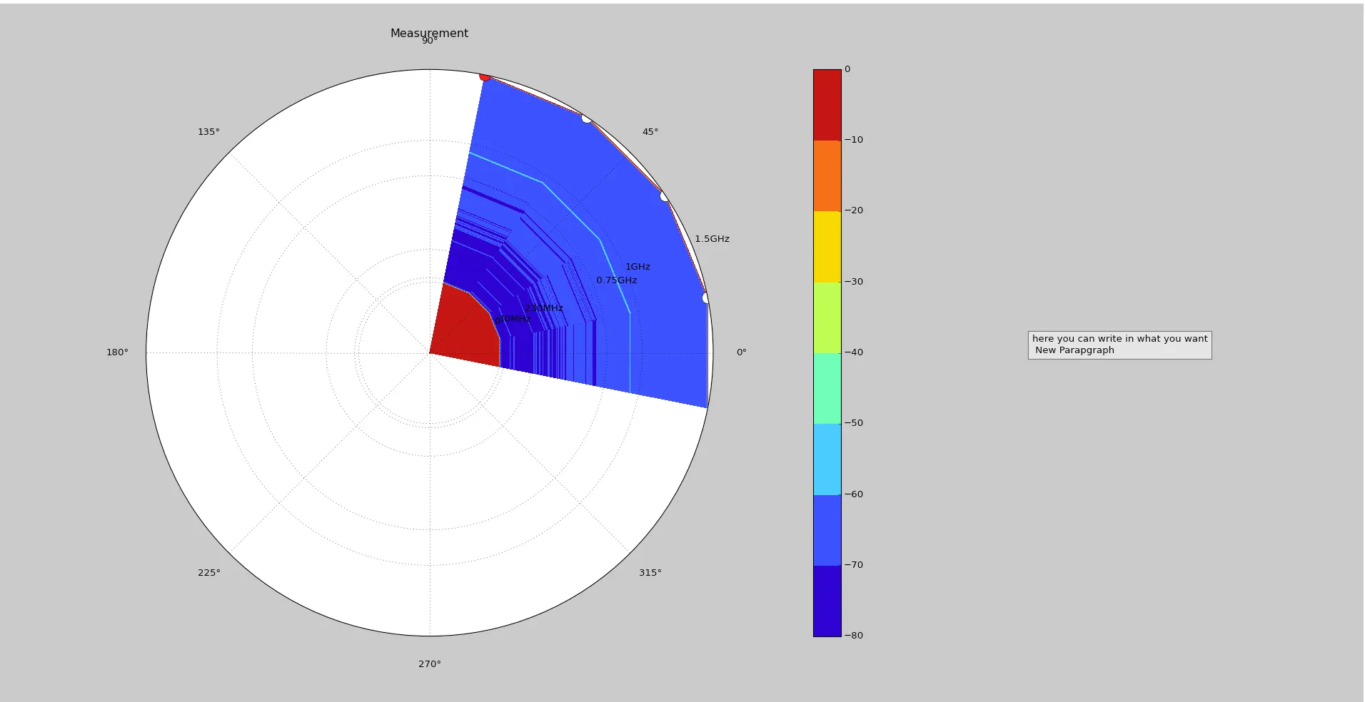
我正在使用Python 2.7处理频谱仪获取的数据,并在实时绘制极坐标图。实时绘图效果良好。我更改了y轴的标签,这些标签对应于半径。
plt.yticks((0, 30000000, 230000000, 750000000, 1000000000, 1500000000), ( 0, '30MHz', '230MHz',  ' 0.75GHz', '1GHz', ' 1.5GHz') )

这将在每个标签上给我一个网格线。

我想增加这些网格线(虚线)的厚度,以便更好地看到它们,因为它们被颜色覆盖。

我希望你能帮助我。如果需要更多代码,我很乐意与您分享。

这是我的绘图示例:

enter image description here

编辑

虽然问题已经得到回答(感谢tom),但我想和大家分享一些有用的命令。

我再次搜索并发现,您可以向grid()添加更多关键字。

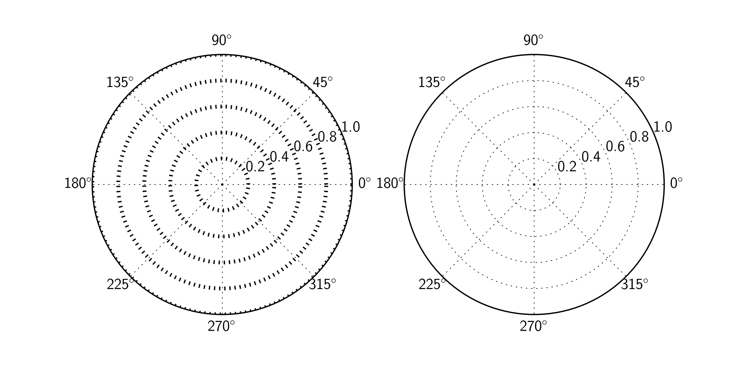
grid( color = 'r', linestyle = '-', linewidth = 3 )

color 很明显,但是使用 linestyle = '-' 会使线条穿过。


如果您分享一个图像链接(例如在imgur上),有更高声望的人可以为您嵌入它。 - tmdavison
1个回答

6

您可以通过设置 ax.gridlinewidth 来实现此操作:

import matplotlib.pyplot as plt

fig=plt.figure(figsize=(8,4))
ax1=fig.add_subplot(121,projection='polar')
ax2=fig.add_subplot(122,projection='polar')

ax1.grid(linewidth=3)

plt.show()

enter image description here

编辑

如果只想改变同心圆,你可以仅为ax.yaxis.grid设置linewidth

import matplotlib.pyplot as plt

fig=plt.figure(figsize=(8,4))
ax1=fig.add_subplot(121,projection='polar')
ax2=fig.add_subplot(122,projection='polar')

ax1.yaxis.grid(linewidth=3)

plt.show()

enter image description here


网页内容由stack overflow 提供, 点击上面的
可以查看英文原文,
原文链接