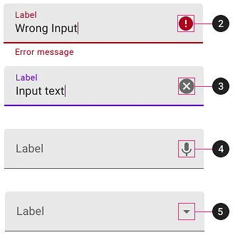
使用Material Design库中的TextInputLayout,我们可以使用各种结束图标模式来进行密码隐藏、文本清除和自定义模式。此外,如果我们使用任何Widget.MaterialComponents.TextInputLayout.*.ExposedDropdownMenu样式,它将自动应用特殊的结束图标模式,显示打开和关闭的短线。
各种图标模式的示例:
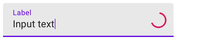
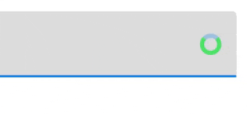
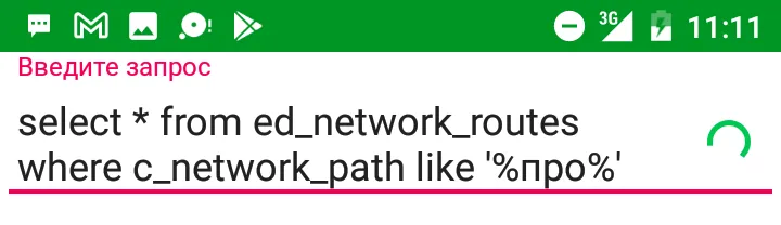
考虑到终端图标的多样性用例,我们决定在InputTextLayout中使用加载指示器,使其看起来像这样:
使用Material Design库中的TextInputLayout,我们可以使用各种结束图标模式来进行密码隐藏、文本清除和自定义模式。此外,如果我们使用任何Widget.MaterialComponents.TextInputLayout.*.ExposedDropdownMenu样式,它将自动应用特殊的结束图标模式,显示打开和关闭的短线。
各种图标模式的示例:
考虑到终端图标的多样性用例,我们决定在InputTextLayout中使用加载指示器,使其看起来像这样:
你可以像这样简单地设置自定义绘制图标,代替End Icon:
textInputLayout.endIconMode = TextInputLayout.END_ICON_CUSTOM
textInputLayout.endIconDrawable = progressDrawable
问题在于获取一个加载指示器 drawable。
我们无法使用公共的可用于加载指示器的 drawable 资源。
虽然有 android.R.drawable.progress_medium_material,但它被标记为私有的并且不能在代码中解析。复制该资源及其所有依赖的私有资源总共需要大约 6 个文件(2 个 drawable + 2 个动画器 + 2 个插值器)。虽然可以这样做,但感觉像是一种 hack。
我们可以使用 ProgressBar 来检索其 indeterminateDrawable。这种方法的问题在于 drawable 与 ProgressBar 密切相关。仅当 ProgressBar 可见时,指示器才会动画化,对一个 View 进行着色也会影响另一个 View 中的指示器,并可能导致其他奇怪的行为。
在类似的情况下,我们可以使用 Drawable.mutate() 来获取 drawable 的新副本。不幸的是,indeterminateDrawable 已经变异了,因此 mutate() 没有起到任何作用。
事实上,使 drawable 与 ProgressBar 解耦的方法是调用 indeterminateDrawable.constantState.newDrawable()。有关更多信息,请参见文档。
无论如何,这仍然感觉像是一种 hack。
虽然 drawable 资源被标记为私有,但我们可以解析某些主题属性以获取系统的默认加载指示器 drawable。主题定义了 progressBarStyle 属性,该属性引用了 ProgressBar 的样式。在这个样式中,indeterminateDrawable 属性引用了 themed drawable。在代码中,我们可以像这样解析 drawable:
fun Context.getProgressBarDrawable(): Drawable {
    val value = TypedValue()
    theme.resolveAttribute(android.R.attr.progressBarStyleSmall, value, false)
    val progressBarStyle = value.data
    val attributes = intArrayOf(android.R.attr.indeterminateDrawable)
    val array = obtainStyledAttributes(progressBarStyle, attributes)
    val drawable = array.getDrawableOrThrow(0)
    array.recycle()
    return drawable
}
太好了,现在我们有一个本地的加载指示器drawable而无需进行任何hack!
现在,如果你将这个drawable插入到这段代码中
textInputLayout.endIconMode = TextInputLayout.END_ICON_CUSTOM
textInputLayout.endIconDrawable = progressDrawable
你会发现它什么都没有显示。
实际上,它确实正确地显示了可绘制对象,但真正的问题是它没有被动画化。只是在动画开始时,可绘制对象被折叠到一个不可见点。
很不幸,我们无法将可绘制对象转换为其真实类型AnimationScaleListDrawable,因为它位于com.android.internal.graphics.drawable包中。
但幸运的是,我们可以将其类型定义为Animatable并调用start()方法:
(drawable as? Animatable)?.start()
TextInputLayout 获取或失去焦点时会有另一个意外的行为发生。此时它将根据 layout.setEndIconTintList() 定义的颜色对可绘制对象进行着色。如果您没有显式指定着色列表,它将会对可绘制对象进行?colorPrimary 着色。但在设置可绘制对象的那一刻,它仍然被着成了?colorAccent,并且在某个看似随机的时刻它会改变颜色。
因此,我建议使用相同的 ColorStateList 对 layout.endIconTintList 和 drawable.tintList 进行着色,如下所示:
fun Context.fetchPrimaryColor(): Int {
    val array = obtainStyledAttributes(intArrayOf(android.R.attr.colorPrimary))
    val color = array.getColorOrThrow(0)
    array.recycle()
    return color
}

...

val states = ColorStateList(arrayOf(intArrayOf()), intArrayOf(fetchPrimaryColor()))
layout.setEndIconTintList(states)
drawable.setTintList(states)
最终我们得到了这样的结果:
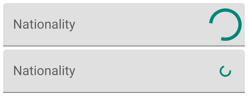
分别使用android.R.attr.progressBarStyle(中号)和android.R.attr.progressBarStyleSmall。
ProgressIndicator。 <com.google.android.material.textfield.TextInputLayout
android:id="@+id/textinputlayout"
...>
<com.google.android.material.textfield.TextInputEditText
.../>
</com.google.android.material.textfield.TextInputLayout>
ProgressIndicator : ProgressIndicatorSpec progressIndicatorSpec = new ProgressIndicatorSpec();
progressIndicatorSpec.loadFromAttributes(
this,
null,
R.style.Widget_MaterialComponents_ProgressIndicator_Circular_Indeterminate);
progressIndicatorSpec.circularInset = 0; // Inset
progressIndicatorSpec.circularRadius =
(int) dpToPx(this, 10); // Circular radius is 10 dp.
IndeterminateDrawable progressIndicatorDrawable =
new IndeterminateDrawable(
this,
progressIndicatorSpec,
new CircularDrawingDelegate(),
new CircularIndeterminateAnimatorDelegate());
 textInputLayout.setEndIconMode(TextInputLayout.END_ICON_CUSTOM);
 textInputLayout.setEndIconDrawable(progressIndicatorDrawable);
将其转换为dp的实用方法:
public static float dpToPx(@NonNull Context context, @Dimension(unit = Dimension.DP) int dp) {
    Resources r = context.getResources();
    return TypedValue.applyDimension(TypedValue.COMPLEX_UNIT_DIP, dp, r.getDisplayMetrics());
}
您可以轻松自定义circularRadius和indicatorColors以及ProgressIndicator中定义的所有其他属性:
    progressIndicatorSpec.indicatorColors = getResources().getIntArray(R.array.progress_colors);
    progressIndicatorSpec.growMode = GROW_MODE_OUTGOING;
<integer-array name="progress_colors">
    <item>@color/...</item>
    <item>@color/....</item>
    <item>@color/....</item>
</integer-array>
注意:它需要至少版本1.3.0-alpha02。
这个问题已经有了一个好的答案,不过我想发表一个更简洁、更简单的解决方案。如果你使用 AndroidX,那么你可以使用一个继承自 Drawable 的类——CircularProgressDrawable。这是我在项目中使用的一段代码:
CircularProgressDrawable drawable = new CircularProgressDrawable(requireContext());
        drawable.setStyle(CircularProgressDrawable.DEFAULT);
        drawable.setColorSchemeColors(Color.GREEN);
 inputLayout.setEndIconOnClickListener(view -> {
            inputLayout.setEndIconDrawable(drawable);
            drawable.start();
//some long running operation starts...
}
requireContext().getColorStateList(R.color.yourcolor)或者如果您正在使用Compat库,则可以使用ContextCompat.getColorStateList(requireContext(), R.color.yourColor),然后使用layout.setEndIconTintList(states)添加状态列表。 - grayFox16setEndIconTintList(null)- 目前效果非常好... (哈哈)。 - WindRider