带有圆角的TextInputLayout密码切换

19

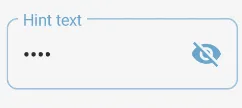
我正在使用来自Android Design Library版本25.1.1的TextInputLayout。使用以下代码:

<android.support.design.widget.TextInputLayout
  xmlns:android="http://schemas.android.com/apk/res/android"
  xmlns:local="http://schemas.android.com/apk/res-auto"
  android:layout_width="wrap_content"
  android:layout_height="wrap_content"
  local:passwordToggleEnabled="true"
  local:hintEnabled="false">
  <android.support.design.widget.TextInputEditText
    android:id="@+id/confirmationEditText"
    android:singleLine="true" />
</android.support.design.widget.TextInputLayout>

但是当密码切换图标被按下时,它的涟漪效果会在TextInput的背景上绘制: Background pressed state

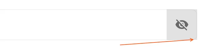
我如何为passwordToggle设置圆角半径?我能否引用其现有的背景并 "包装" 它以需要的属性 (如何找到默认可切换 drawable 的路径)?

4个回答

53

只需使用 Material Components 库和标准 TextInputLayout 组件。

添加 app:boxCornerRadiusBottomEnd="xxdp"app:boxCornerRadiusTopEnd="xxdp"app:boxCornerRadiusBottomStart="xxdp"app:boxCornerRadiusTopStart="xxdp" 属性。

类似于:

    <com.google.android.material.textfield.TextInputLayout
        style="@style/Widget.MaterialComponents.TextInputLayout.OutlinedBox"
        app:endIconMode="password_toggle"
        app:boxCornerRadiusBottomEnd="8dp"
        app:boxCornerRadiusTopEnd="8dp"
        app:boxCornerRadiusBottomStart="8dp"
        app:boxCornerRadiusTopStart="8dp"
        ...>

enter image description here

否则,您可以定义自定义样式并使用{{shapeAppearanceOverlay}}属性:
    <com.google.android.material.textfield.TextInputLayout
        android:id="@+id/custom_end_icon"
        android:hint="Hint text"
        style="@style/OutlinedRoundedBox"
        ...>

使用:

  <style name="OutlinedRoundedBox" parent="Widget.MaterialComponents.TextInputLayout.OutlinedBox">
    <item name="shapeAppearanceOverlay">@style/ShapeAppearanceOverlay.MyApp.TextInputLayout.Rounded</item>
  </style>

  <style name="ShapeAppearanceOverlay.MyApp.TextInputLayout.Rounded" parent="">
    <item name="cornerFamily">rounded</item>
    <item name="cornerSize">8dp</item>
  </style>

喜欢这个自定义样式的工作。我还想在盒子上添加一些阴影,但是没有成功。你能帮我吗?谢谢 :) - Attique Ur Rehman

9
我尝试在新项目上实现以理解您的情况。
请查看解决方案。我已附上它的屏幕截图。

enter image description here

您需要在drawable文件夹中包含可绘制对象,并将其设置为TextInputEditText的背景。

round_corner_toggle.xml

<layer-list xmlns:android="http://schemas.android.com/apk/res/android" >
    <item android:left="20dp">
        <shape android:shape="rectangle" >
            <size android:height="20dp" />
            <solid android:color="#d8d8d8" />
            <corners android:radius="5dp" />
        </shape>
    </item>

    <item android:right="60dp">
        <shape android:shape="rectangle" >
            <size android:height="20dp" />
            <solid android:color="#ecf0f1" />
            <corners android:radius="5dp" />

        </shape>
    </item>
</layer-list>

TextInputLayout的内容

            <android.support.design.widget.TextInputLayout
                android:layout_width="match_parent"
                android:layout_height="wrap_content"
                app:counterEnabled="true"
                app:counterMaxLength="8"
                android:background="#FFFFFF"
                app:passwordToggleEnabled="true"
                app:passwordToggleTint="@color/colorPrimary">

                <android.support.design.widget.TextInputEditText
                    android:id="@+id/tietPassword"
                    android:layout_width="match_parent"
                    android:layout_height="wrap_content"
                    android:hint="Password"
                    android:background="@drawable/round_corner_toggle"
                    android:inputType="textPassword"
                    android:padding="@dimen/activity_horizontal_margin"
                    android:maxLength="8" />
            </android.support.design.widget.TextInputLayout>
    </LinearLayout>

7

我知道已经有一段时间了,但是将以下代码添加到您的TextInputLayout中可以解决问题:

 app:boxCornerRadiusBottomEnd="20dp"
 app:boxCornerRadiusBottomStart="20dp"
 app:boxCornerRadiusTopEnd="20dp"
 app:boxCornerRadiusTopStart="20dp"

1
使用自定义形状来完成此操作:
  <shape xmlns:android="http://schemas.android.com/apk/res/android">
         <gradient
            android:endColor="@color/something"
            android:centerColor="@color/something_else"
            android:startColor="@color/something_else_still"
            android:angle="270" />
        <corners
            android:radius="3dp" />
        <padding
            android:left="10dp"
            android:top="10dp"
            android:right="10dp"
            android:bottom="10dp" />
    </shape>

网页内容由stack overflow 提供, 点击上面的
可以查看英文原文,
原文链接