假设您正在保存彩色图像,并稍后将其转换为灰度图像,您可以执行以下操作:
Define your colours in a list from your favourite colormap. [It's also worth noting here that using one of the new 4 colormaps (available since matplotlib 1.5: viridis, magma, plasma, inferno) means that the colours will still be distinguishable when the image is converted to grayscale].
colors = plt.cm.plasma(np.linspace(0., 1., 5))
Then, we can define a function to convert those colors to their equivalent grayscale value:
rgb2gray = lambda rgb: np.dot(rgb[...,:3], [0.299, 0.587, 0.114])
If that value is greater than 0.5, the colour is a light shade, and thus we can use black text, otherwise, change the text to a light colour. We can save those text colours in a list using the following list comprehension:
textcol = ['k' if rgb2gray(color) > 0.5 else 'w' for color in colors ]
When you plot the pie chart, use the colors=colors kwarg to use the colours you defined earlier. matplotlib returns three things from ax.pie: the patches that make up the pie chart, the text labels, and the autopct labels. The latter are the ones we want to modify.
p, t, at = ax1.pie(train_sentences_b,  autopct='%1.1f%%',
        shadow=True, startangle=90, colors=colors)
Lets define a function to loop through the text labels, and set their colours depending on the list we made earlier:
def fix_colors(textlabels, textcolors):
    for text, color in zip(textlabels, textcolors):
        text.set_color(color)
We then call this after each pie chart is plotted using:
fix_colors(at, textcol)
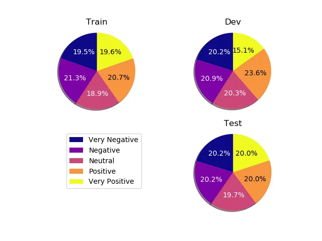
将所有这些内容放在您的脚本中(我添加了一些额外的数据以获取饼图上的所有5个类别):
import matplotlib.pyplot as plt
from matplotlib.pyplot import savefig
import numpy as np
import matplotlib.gridspec as gridspec
colors = plt.cm.plasma(np.linspace(0., 1., 5))
rgb2gray = lambda rgb: np.dot(rgb[...,:3], [0.299, 0.587, 0.114])
textcol = ['k' if rgb2gray(color) > 0.5 else 'w' for color in colors ]
def fix_colors(textlabels, textcolors):
for text, color in zip(textlabels, textcolors):
text.set_color(color)
plt.clf()
plt.cla()
plt.close()
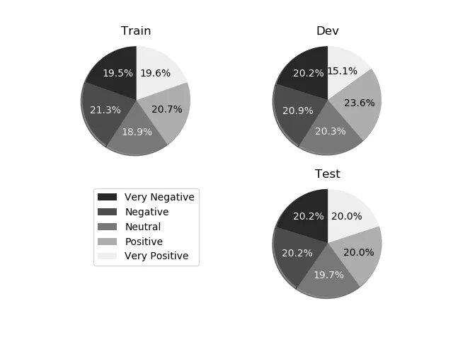
labels_b = ["Very Negative", "Negative", "Neutral", "Positive", "Very Positive"]
dev_sentences_b = [428, 444, 430, 500, 320]
test_sentences_b = [912, 909, 890, 900, 900]
train_sentences_b = [3310, 3610, 3200, 3500, 3321]
gs = gridspec.GridSpec(2, 2)
ax1= plt.subplot(gs[0, 0])
p, t, at = ax1.pie(train_sentences_b, autopct='%1.1f%%',
shadow=True, startangle=90, colors=colors)
fix_colors(at, textcol)
ax1.axis('equal')
ax1.set_title("Train")
ax2= plt.subplot(gs[0, 1])
p, t, at = ax2.pie(dev_sentences_b, autopct='%1.1f%%',
shadow=True, startangle=90, colors=colors)
ax2.axis('equal')
ax2.set_title("Dev")
fix_colors(at, textcol)
ax3 = plt.subplot(gs[1, 1])
p, t, at = ax3.pie(test_sentences_b, autopct='%1.1f%%',
shadow=True, startangle=90, colors=colors)
ax3.axis('equal')
ax3.set_title("Test")
fix_colors(at, textcol)
ax3.legend(labels=labels_b, bbox_to_anchor=(-1,1), loc="upper left")
plt.savefig('sstbinary', format='pdf')
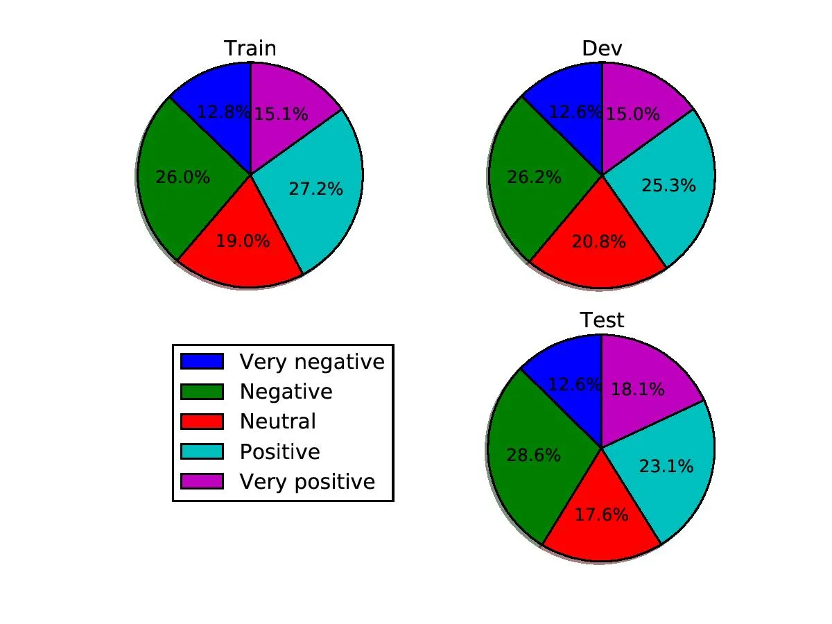
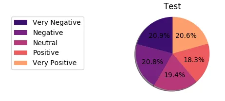
以下是生成的图像:
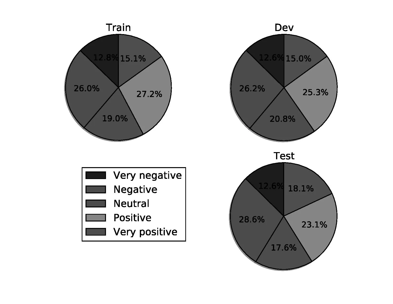
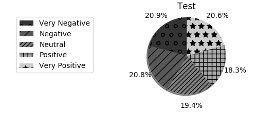
转换为灰度后: