我发现了一个非常好看的“百分比饼图”,希望能够通过CSS创建。不需要动画,只需要静态“图片”。
我明白如果想要创建这种图表,我需要使用以下类似的元素:
问题是:
1.如何创建第二个元素?
2.如何管理第二个元素的形状,以适应较小(5%)或更高(80%)的百分比值?
我明白如果想要创建这种图表,我需要使用以下类似的元素:
问题是:
1.如何创建第二个元素?
2.如何管理第二个元素的形状,以适应较小(5%)或更高(80%)的百分比值?
2021年新答案
借助一些现代技术,我们可以改进代码。您可以拥有圆角边缘,并考虑动画:
@property --p{
  syntax: '<number>';
  inherits: true;
  initial-value: 1;
}

.pie {
  --p:20;      /* the percentage */
  --b:22px;    /* the thickness */
  --c:darkred; /* the color */
  --w:150px;   /* the size*/

  width:var(--w);
  aspect-ratio:1/1;
  position:relative;
  display:inline-grid;
  margin:5px;
  place-content:center;
  font-size:25px;
  font-weight:bold;
  font-family:sans-serif;
}
.pie:before,
.pie:after {
  content:"";
  position:absolute;
  border-radius:50%;
}
.pie:before {
  inset:0;
  background:
    radial-gradient(farthest-side,var(--c) 98%,#0000) top/var(--b) var(--b) no-repeat,
    conic-gradient(var(--c) calc(var(--p)*1%),#0000 0);
  -webkit-mask:radial-gradient(farthest-side,#0000 calc(99% - var(--b)),#000 calc(100% - var(--b)));
          mask:radial-gradient(farthest-side,#0000 calc(99% - var(--b)),#000 calc(100% - var(--b)));
}
.pie:after {
  inset:calc(50% - var(--b)/2);
  background:var(--c);
  transform:rotate(calc(var(--p)*3.6deg - 90deg)) translate(calc(var(--w)/2 - 50%));
}
.animate {
  animation:p 1s .5s both;
}
.no-round:before {
  background-size:0 0,auto;
}
.no-round:after {
  content:none;
}
@keyframes p{
  from{--p:0;}
}

body {
  background:#ddd;
}<div class="pie" style="--p:20"> 20%</div>
<div class="pie" style="--p:40;--c:darkblue;--b:10px"> 40%</div>
<div class="pie no-round" style="--p:60;--c:purple;--b:15px"> 60%</div>
<div class="pie animate" style="--p:80;--c:orange;"> 80%</div>
<div class="pie animate no-round" style="--p:90;--c:lightgreen"> 90%</div>旧答案
您可以使用多个背景来实现此操作。
从0%到50%:
New answer
您可以使用多重背景实现此操作。
从0%到50%:
.box {
  width: 100px;
  height: 100px;
  display: inline-block;
  border-radius: 50%;
  padding: 5px;
  background:
    linear-gradient(#ccc, #ccc) content-box,
    linear-gradient(var(--v), #f2f2f2 50%, transparent 0),
    linear-gradient(to right, #f2f2f2 50%, blue 0);
}<div class="box" style="--v:-90deg"></div><!-- 0% -->
<div class="box" style="--v:-45deg"></div><!-- 12.5% -->
<div class="box" style="--v: 0deg"></div><!-- 25% -->
<div class="box" style="--v: 45deg"></div><!-- 37.5% -->
<div class="box" style="--v: 90deg"></div><!-- 50% -->
<p>The formula is [p = (18/5) * x - 90]. <small>Where x is the percentage and p the degree</small></p>
<p>for x = 5% --> p = -72deg </p>
<div class="box" style="--v:-72deg"></div>从50%到100%:
.box {
  width:100px;
  height:100px;
  display:inline-block;
  border-radius:50%;
  padding:5px;
  background:
    linear-gradient(#ccc,#ccc) content-box,
    linear-gradient(var(--v), blue 50%,transparent 0),
    linear-gradient(to right, #f2f2f2 50%,blue 0);
}<div class="box" style="--v:-90deg"></div><!-- 50% -->
<div class="box" style="--v:-45deg"></div><!-- 62.5% -->
<div class="box" style="--v: 0deg"></div><!-- 75% -->
<div class="box" style="--v: 45deg"></div><!-- 87.5% -->
<div class="box" style="--v: 90deg"></div><!-- 100% -->
<p>The formula is [p = (18/5) * x - 270]. <small>Where x is the percentage and p the degree</small></p>
<p>for x = 80% --> p = 18deg </p>
<div class="box" style="--v:18deg"></div>你可以像这样将它们结合起来:
.box {
  width:100px;
  height:100px;
  display:inline-block;
  border-radius:50%;
  padding:5px;
  background:
    linear-gradient(#ccc,#ccc) content-box,
    linear-gradient(var(--v), #f2f2f2 50%,transparent 0) 0/calc(var(--s)*100%)      ,
    linear-gradient(var(--v), blue    50%,transparent 0) 0/calc((1 - var(--s))*100%),
    linear-gradient(to right, #f2f2f2 50%,blue 0);
}<div class="box" style="--v:-90deg;--s:1"></div>
<div class="box" style="--v:0deg;--s:1"></div>
<div class="box" style="--v:90deg;--s:1"></div>
<div class="box" style="--v:0deg;--s:0"></div>
<div class="box" style="--v:90deg;--s:0"></div>.box {
--v:calc( ((18/5) * var(--p) - 90)*1deg);
width:100px;
height:100px;
display:inline-block;
border-radius:50%;
padding:10px;
background:
linear-gradient(#ccc,#ccc) content-box,
linear-gradient(var(--v), #f2f2f2 50%,transparent 0) 0/min(100%,(50 - var(--p))*100%),
linear-gradient(var(--v), transparent 50%,blue 0) 0/min(100%,(var(--p) - 50)*100%),
linear-gradient(to right, #f2f2f2 50%,blue 0);
}<div class="box" style="--p:5;"></div>
<div class="box" style="--p:20;"></div>
<div class="box" style="--p:50;"></div>
<div class="box" style="--p:60;"></div>
<div class="box" style="--p:75;"></div>
<div class="box" style="--p:100;"></div>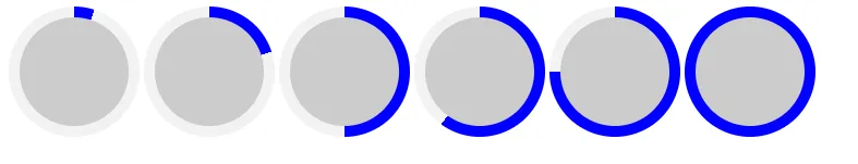
相关问题以获取另一个版本:使用CSS创建静态饼状图
我们还可以考虑使用mask来添加透明度:
.box {

  --v:calc( ((18/5) * var(--p) - 90)*1deg);

  width:100px;
  height:100px;
  display:inline-block;
  border-radius:50%;
  padding:10px;
  background:
    linear-gradient(var(--v), #f2f2f2     50%,transparent 0) 0/min(100%,(50 - var(--p))*100%),
    linear-gradient(var(--v), transparent 50%,blue        0) 0/min(100%,(var(--p) - 50)*100%),
    linear-gradient(to right, #f2f2f2 50%,blue 0);
  -webkit-mask:
    linear-gradient(#fff 0 0) content-box,
    linear-gradient(#fff 0 0);
  -webkit-mask-composite:destination-out;
  mask-composite:exclude;
}

body {
  background:linear-gradient(to right,red,yellow);
}<div class="box" style="--p:5;"></div>
<div class="box" style="--p:20;"></div>
<div class="box" style="--p:50;"></div>
<div class="box" style="--p:60;"></div>
<div class="box" style="--p:75;"></div>
<div class="box" style="--p:100;"></div>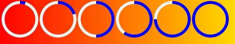
也像下面这样:
.box {

  --v:calc( ((18/5) * var(--p) - 90)*1deg);

  width:100px;
  height:100px;
  display:inline-block;
  border-radius:50%;
  padding:10px;
  background:
    linear-gradient(var(--v), transparent 50%,blue        0) 0/min(100%,(var(--p) - 50)*100%),
    linear-gradient(to right, transparent 50%,blue 0);
  -webkit-mask:
    linear-gradient(var(--v), #f2f2f2     50%,transparent 0) 0/min(100%,(50 - var(--p))*100%),
    linear-gradient(#fff 0 0) content-box,
    linear-gradient(#fff 0 0);
  -webkit-mask-composite:destination-out;
  mask-composite:exclude;
}

body {
  background:linear-gradient(to right,red,yellow);
}<div class="box" style="--p:5;"></div>
<div class="box" style="--p:20;"></div>
<div class="box" style="--p:50;"></div>
<div class="box" style="--p:60;"></div>
<div class="box" style="--p:75;"></div>
<div class="box" style="--p:100;"></div>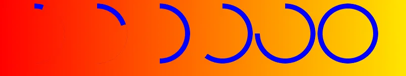
相关: 带有边框半径的边框渐变
结果图像
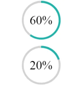
:root {
  --size: 100px;
  --bord: 10px;
}

.chart {
  width: var(--size);
  height: var(--size);
  margin: 1em auto;
  border-radius: 50%;
  background-image: conic-gradient(lightseagreen var(--value), lightgrey var(--value));
  position: relative;
  display: flex;
  justify-content: center;
  align-items: center;
}

.chart::after {
  content: "";
  position: absolute;
  left: 50%;
  top: 50%;
  transform: translate(-50%, -50%);
  width: calc(100% - var(--bord));
  height: calc(100% - var(--bord));
  background: white;
  border-radius: inherit;
}

p {
  position: relative;
  z-index: 1;
  font-size: 2em;
}

.x-60 {
  --value: 60%;
}

.x-20 {
  --value: 20%;
}<div class="chart x-60">
<p>60%</p>
</div>
<div class="chart x-20">
<p>20%</p>
</div>background-clip可以实现此功能,无需伪元素... background:
linear-gradient(white,white) padding-box,
conic-gradient(lightseagreen var(--value), lightgrey var(--value)) border-box;
:root {
  --size: 100px;
  --bord: 10px;
}

.chart {
  width: var(--size);
  height: var(--size);
  margin: 1em auto;
  border: var(--bord) solid transparent;
  border-radius: 50%;
  background: linear-gradient(white, white) padding-box, conic-gradient(lightseagreen var(--value), lightgrey var(--value)) border-box;
  position: relative;
  display: flex;
  justify-content: center;
  align-items: center;
  font-size: 2em;
}

.x-60 {
  --value: 60%;
}

.x-20 {
  --value: 20%;
}<div class="chart x-60">
<p>60%</p>
</div>
<div class="chart x-20">
<p>20%</p>
</div>嘿,你们可以添加一些小的 CSS 样式
.circle {
  position: relative;
  top: 5px;
  left: 5px;
  text-align: center;
  width: 100px;
  height: 100px;
  border-radius: 100%;
  background-color: #ffffff;
}

.circle-border {
  position: relative;
  text-align: center;
  width: 110px;
  height: 110px;
  margin-left: 30%;
  border-radius: 100%;
  background-color: #E53B3B;
  background: linear-gradient(0deg, lightgray 100%, black 0%)
}
HTML
<div class="circle-border" id="circleElement">
  <div class="circle" id="circleElementValue">
    aaa
  </div>
</div>
JS:自动显示填充百分比
// let i = 75;
//   let deg=Math.round(1.8*i);
//   let completed=0;
//   let remaining=100-i;
//   // completed = (remaining>50)? 50 : completed;
// let backgroundStlye = 'linear-gradient('+deg+'deg, lightgray '+remaining +'%, black '+completed + '%)';
//   setTimeout(function(){
//     console.log(backgroundStlye);
//   document.getElementById("circleElement").style.background =backgroundStlye;
// },i*100);

for(let i=1;i<=100;i++){
  let deg=Math.round(1.8*i);
  let completed=i;
  let remaining=100-i;
  completed = (remaining<50)? 0 : completed;
let backgroundStlye = 'linear-gradient('+deg+'deg, lightgray '+remaining +'%, black '+completed + '%)';
  setTimeout(function(){
    console.log(backgroundStlye);
  document.getElementById("circleElement").style.background =backgroundStlye;
    document.getElementById("circleElementValue").innerHTML = i+'%';
},i*100);
}
我创建了一个示例https://codepen.io/arun-b-shet/pen/mdVVWXo
希望你喜欢呀!