也许您正在寻找交叉相关性:
scipy.signal.signaltools.correlate(A, B)
交叉相关中峰值的位置将是相位差的估计。
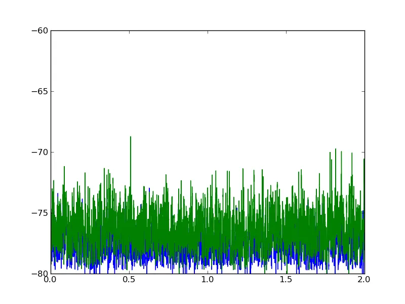
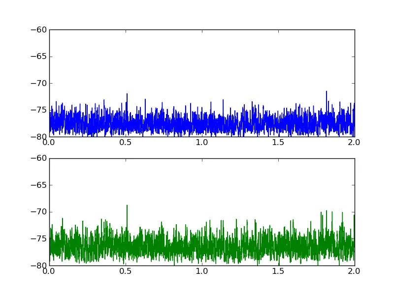
编辑 3: 现在我已经查看了真实数据文件,有两个原因导致您发现相移为零。首先,您的两个时间序列之间的相移确实为零。如果您在 matplotlib 图形上水平缩放,就可以清楚地看到这一点。其次,首先对数据进行规范化(最重要的是减去平均值),否则数组末端的零填充效果会淹没交叉相关中的真实信号。在下面的示例中,我验证了我找到“真实”峰值的方法,通过添加人工位移,然后检查是否正确恢复。
import numpy, scipy
from scipy.signal import correlate
A = numpy.loadtxt("vb-sync-XReport.txt")[:,1:].mean(axis=1)
B = numpy.loadtxt("vb-sync-YReport.txt")[:,1:].mean(axis=1)
nsamples = A.size
A -= A.mean(); A /= A.std()
B -= B.mean(); B /= B.std()
time_shift = 20
A = numpy.roll(A, time_shift)
xcorr = correlate(A, B)
dt = numpy.arange(1-nsamples, nsamples)
recovered_time_shift = dt[xcorr.argmax()]
print "Added time shift: %d" % (time_shift)
print "Recovered time shift: %d" % (recovered_time_shift)
编辑:以下是使用虚假数据演示其工作原理的示例。
编辑2:添加了一个示例的图表。
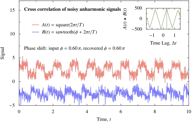
import numpy, scipy
from scipy.signal import square, sawtooth, correlate
from numpy import pi, random
period = 1.0
tmax = 10.0
nsamples = 1000
noise_amplitude = 0.6
phase_shift = 0.6*pi
t = numpy.linspace(0.0, tmax, nsamples, endpoint=False)
A = square(2.0*pi*t/period) + noise_amplitude*random.normal(size=(nsamples,))
B = -sawtooth(phase_shift + 2.0*pi*t/period) + noise_amplitude*random.normal(size=(nsamples,))
xcorr = correlate(A, B)
dt = numpy.linspace(-t[-1], t[-1], 2*nsamples-1)
recovered_time_shift = dt[xcorr.argmax()]
recovered_phase_shift = 2*pi*(((0.5 + recovered_time_shift/period) % 1.0) - 0.5)
relative_error = (recovered_phase_shift - phase_shift)/(2*pi)
print "Original phase shift: %.2f pi" % (phase_shift/pi)
print "Recovered phase shift: %.2f pi" % (recovered_phase_shift/pi)
print "Relative error: %.4f" % (relative_error)
from pyx import canvas, graph, text, color, style, trafo, unit
from pyx.graph import axis, key
text.set(mode="latex")
text.preamble(r"\usepackage{txfonts}")
figwidth = 12
gkey = key.key(pos=None, hpos=0.05, vpos=0.8)
xaxis = axis.linear(title=r"Time, \(t\)")
yaxis = axis.linear(title="Signal", min=-5, max=17)
g = graph.graphxy(width=figwidth, x=xaxis, y=yaxis, key=gkey)
plotdata = [graph.data.values(x=t, y=signal+offset, title=label) for label, signal, offset in (r"\(A(t) = \mathrm{square}(2\pi t/T)\)", A, 2.5), (r"\(B(t) = \mathrm{sawtooth}(\phi + 2 \pi t/T)\)", B, -2.5)]
linestyles = [style.linestyle.solid, style.linejoin.round, style.linewidth.Thick, color.gradient.Rainbow, color.transparency(0.5)]
plotstyles = [graph.style.line(linestyles)]
g.plot(plotdata, plotstyles)
g.text(10*unit.x_pt, 0.56*figwidth, r"\textbf{Cross correlation of noisy anharmonic signals}")
g.text(10*unit.x_pt, 0.33*figwidth, "Phase shift: input \(\phi = %.2f \,\pi\), recovered \(\phi = %.2f \,\pi\)" % (phase_shift/pi, recovered_phase_shift/pi))
xxaxis = axis.linear(title=r"Time Lag, \(\Delta t\)", min=-1.5, max=1.5)
yyaxis = axis.linear(title=r"\(A(t) \star B(t)\)")
gg = graph.graphxy(width=0.2*figwidth, x=xxaxis, y=yyaxis)
plotstyles = [graph.style.line(linestyles + [color.rgb(0.2,0.5,0.2)])]
gg.plot(graph.data.values(x=dt, y=xcorr), plotstyles)
gg.stroke(gg.xgridpath(recovered_time_shift), [style.linewidth.THIck, color.gray(0.5), color.transparency(0.7)])
ggtrafos = [trafo.translate(0.75*figwidth, 0.45*figwidth)]
g.insert(gg, ggtrafos)
g.writePDFfile("so-xcorr-pyx")
所以它可以很好地工作,即使是非常嘈杂的数据和不和谐的波形。